Screenshots
Comments Featured collection
82 examples found
Comments
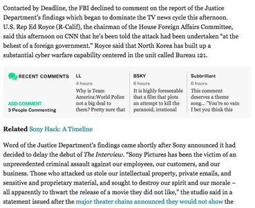
From deadline.com
Comments
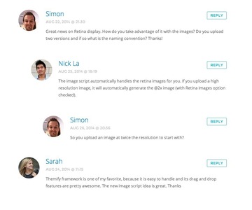
From themify.me
Advertisement
Comments
From smashingmagazine.com
Comments
From threadless.com
Comments
From attackofdesign.com
Comments
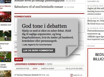
From politiken.dk
Comments
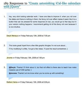
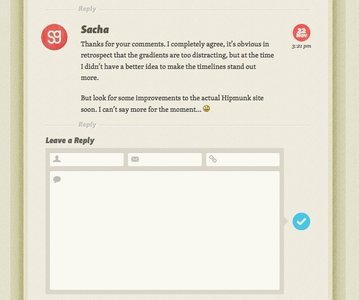
From stefanoverna.com
Comments
From workawesome.com
Comments
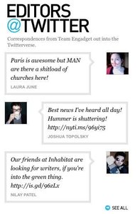
From engadget.com
Comments
Comments
From webdesignerwall.com
Comments
From smart.fm
Comments
From last.fm
Comments
From thenewhumanism.org
Comments
From jontangerine.com
Comments
From usefulusability.com
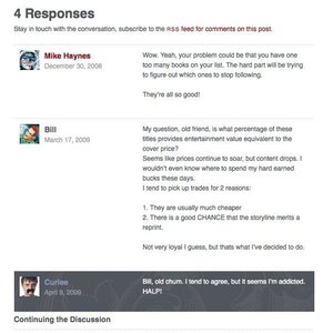
Comments
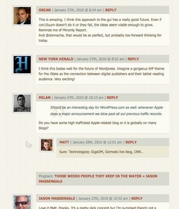
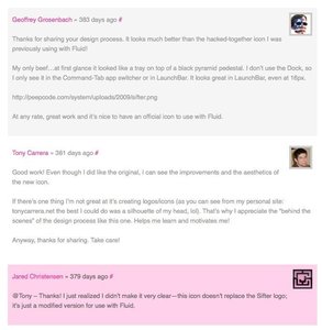
From ma.tt
Comments
From freakcomics.com
Comments
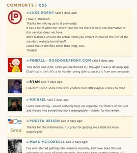
From hicksdesign.co.uk
Comments
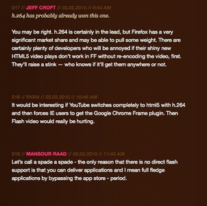
From jeffcroft.com
Comments
Comments
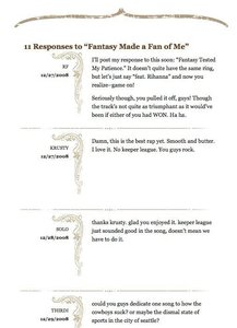
From jaredigital.com
Comments
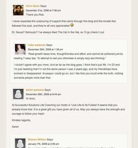
From lifecoachesblog.com
Comments
From monsieurlam.com
Comments
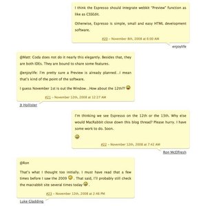
From macrabbit.com
Comments
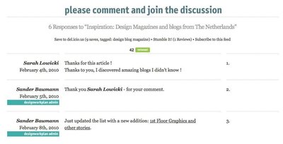
From designworkplan.com
Comments
From designsnack.com
Comments
From creativecurio.com
Comments
From blogdesignblog.com
Comments
From tutorial9.net
Comments
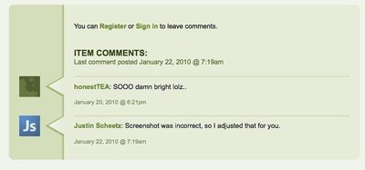
From intype.info
Comments
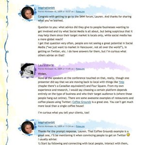
From 404uxd.com