Screenshots
Displaying data Featured collection
55 examples found
Displaying data
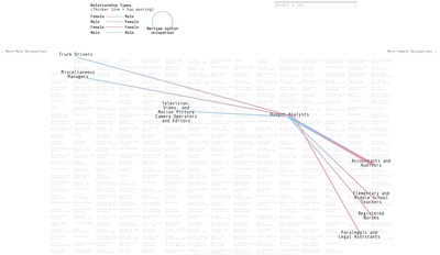
From bloomberg.com
Displaying data
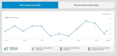
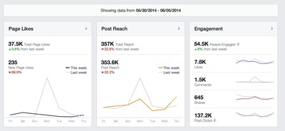
From linkedin.com
Advertisement
Displaying data
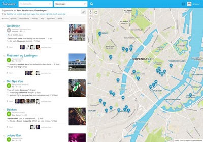
From foursquare.com
Displaying data
Displaying data
Displaying data

From version2.dk
Displaying data
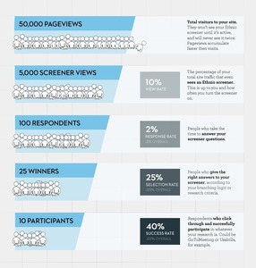
From ethn.io
Displaying data
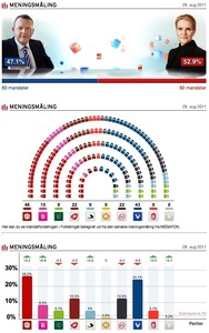
From valget.tv2.dk
Displaying data

From edition.cnn.com
Displaying data

From torrentfreak.com
Displaying data
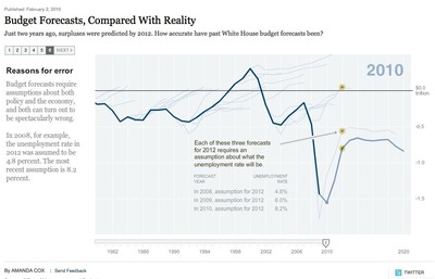
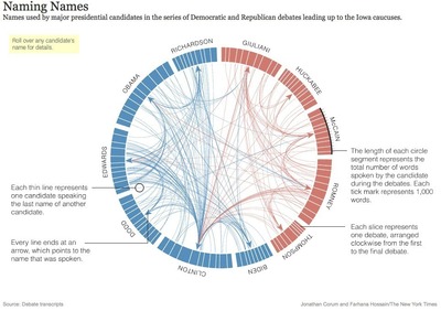
From nytimes.com
Displaying data
From nytimes.com
Displaying data
From dribbble.com
Displaying data
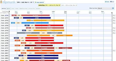
From hipmunk.com
Displaying data

From mag.ma
Displaying data
Displaying data
Displaying data

Displaying data
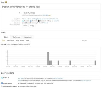
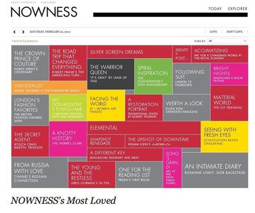
From bit.ly
Displaying data
Displaying data
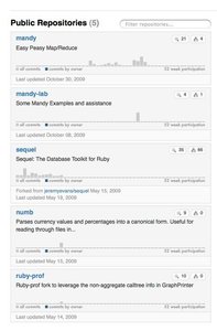
From github.com
Displaying data
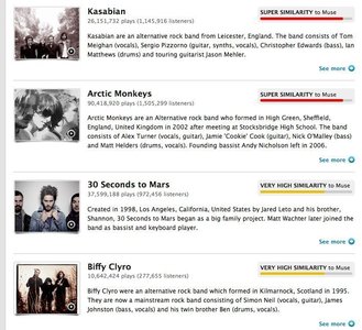
From last.fm
Displaying data
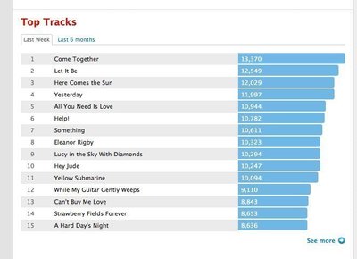
From last.fm
Displaying data
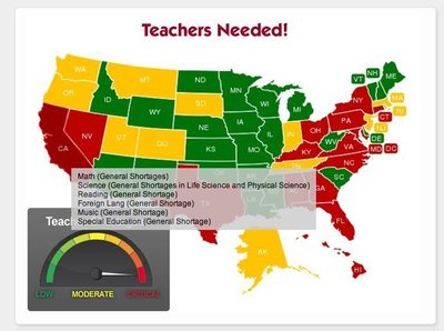
From railstips.org
Displaying data
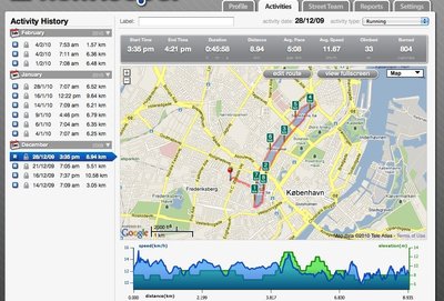
From runkeeper.com
Displaying data
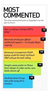
From engadget.com
Displaying data
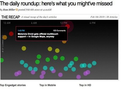
From engadget.com
Displaying data

From digitalpodge.co.uk
Displaying data
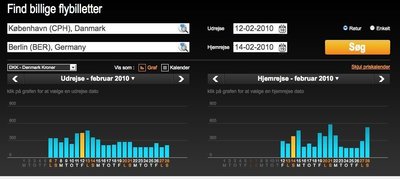
From tv2.da.momondo.com
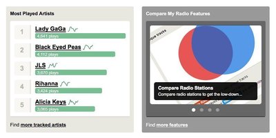
Displaying data
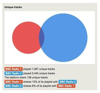
From comparemyradio.com
Displaying data
From comparemyradio.com
Displaying data

From dailymile.com