Screenshots
Pricing Tables User collection
4 examples found
Pricing Tables
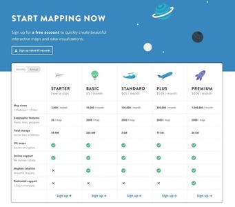
From mapbox.com
Pricing Tables
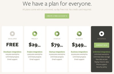
From segment.io
Advertisement
Pricing Tables
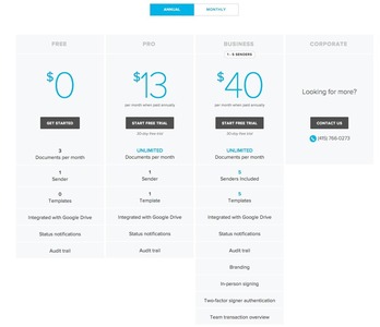
From hellosign.com
Pricing Tables
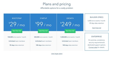
From rollbar.com