Screenshots
Portfolios Featured collection
26 examples found
Portfolios
From davidjonsson.com.au
Portfolios

From carloscabrera.com.ar
Advertisement
Portfolios
From lionite.com
Portfolios
From branded07.com
Portfolios
Portfolios

From ambercouch.co.uk
Portfolios
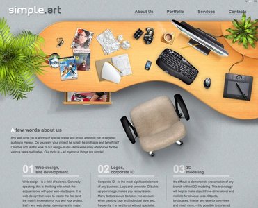
From simpleart.com.ua
Portfolios

From kavoon.com
Portfolios

From henryjones.us
Portfolios
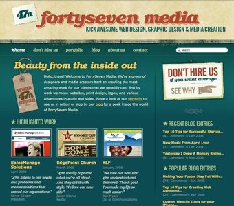
From fortysevenmedia.com
Portfolios
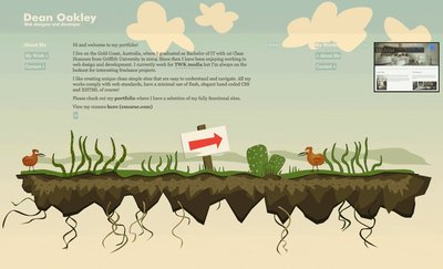
From deanoakley.com
Portfolios

Portfolios
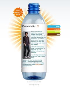
From popmatik.co.uk
Portfolios
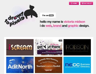
From drawn2pixels.co.uk
Portfolios

From adaptd.com
Portfolios
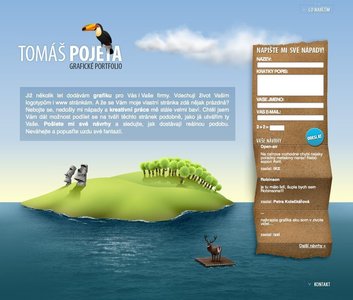
From pojeta.cz
Portfolios
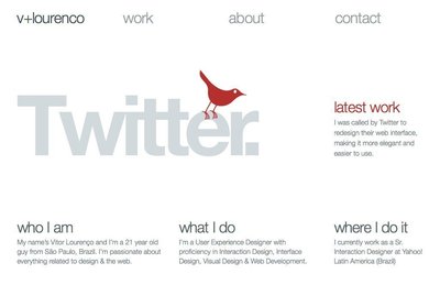
From vlourenco.com
Portfolios
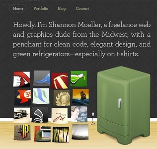
From shannonmoeller.com
Portfolios
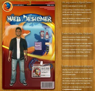
From ayushsaran.com
Portfolios

From ceegraphics.com
Portfolios
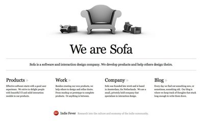
From madebysofa.com
Portfolios

From emotionslive.co.uk
Portfolios
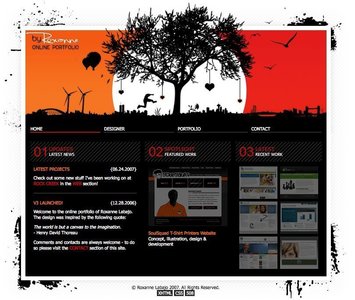
From byroxanne.com
Portfolios
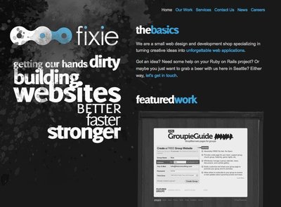
From fixieconsulting.com
Portfolios
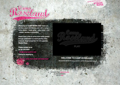
From camproseland.com
Portfolios

From jameslaicreative.com