Every now and then, I stumble upon a blog post or article suggesting that hyperlinks should always be blue and purple to hint that the link is a link. While, I do believe that it should always be possible to spot what is clickable and what is not – without clicking on- or hovering over the object – I do not believe that the actual link color needs to be anything else than distinctive.
It’s about affordance: giving visual clues to the function of an object. I would postulate that wether the link is red, blue, green, black, or white does not make much difference as long as it is distinguishable from non-clickable content. It is not the color of the link alone that makes it recognizable as a link: the color is not the pattern, a different color and underlining is.
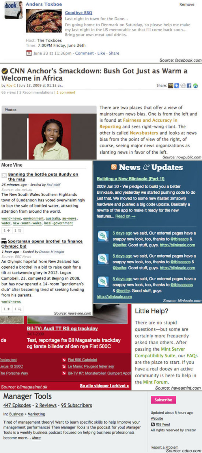
Consider the image below. It has snapshots of 7 different sites, where only one features blue link color. Still, it is not harder to spot the where the links are located in the other 6 snapshots.

If anything should be said about the visual design of text links, a number of principles can be listed:
- A color different from the color of the main content enhances the link’s distinguishability.
- Choosing a color that is brighter than- or at least in contrast to- the main text color enhances the link’s distinguishability.
- Underlining a link enhances the links distinguishability.
- Any mouse-over behavior should have a highlighting effect.
- Links with different targets (for instance target=“_blank” for external links) should be clearly distinguishable.
- Title attributes should be descriptive as to where the link will take you.
14 comments
Anup on Jul 16, 2009
Nice post. I wonder if it is worth adding as a consideration that reliance on color alone isn’t always ideal — underline (or even bold, maybe???) or something else that helps with people who are color blind or have some other visual deficiency may be useful.
MDX on Jul 18, 2009
I agree with Anup. If users had at least 2 ways to distinguish a link it would be an almost fail safe method for displaying links.
Dilini on Aug 15, 2009
I agree with Anup as well. I was also wondering how you suggest distinguishing links with different targets. Many sites now use an icon to show external links. What’s your view on that?
Web Redesign on Aug 27, 2009
The title attributes are important not only from an SEO perspective but also from a usability perspective. Can the titles be styled as well?
Josh Johnson on Aug 27, 2009
Yeah, the idea of differentiating based on target seems a little ‘off’, because there may be a variety of reasons to change the default target. The more interesting differentiation for most users is whether or not the link leaves the current site, and that’s the case I commonly see where the link has an icon. If a site had an internal link that pops up in a new window/tab, I think it would surprise most users if that was given the same treatment as a link that goes to another site.
Anders Toxboe on Aug 27, 2009
@Dilini and @Josh Johnson: In regards to distinguishing between different targets, I was especially thinking about the “external” icon that for instance wikipedia uses. There could of course be situations where you would use a target=“_blank” for staying on the same page -and that might be ok. It all depends on the context.
The only thing that matters is that the user has a good idea about what is going to happen once he or she clicks on a certain link. It’s about not surprising (and frustrating) the user.
Josh Johnson on Sep 02, 2009
Yep, surprises are good on your birthday, but not in your UI designs. :)
Brad Pyne on Oct 27, 2009
I agree, the only thing that matters is how distinguished it is from the content.
22i on Nov 12, 2009
So how would you clearly distinguish links that are targeted to _blank?
22i on Nov 12, 2009
Also how would you automate the coding of external links so that a content manager doesn’t have to manually add, for example, the image to an link opening in _blank whilst not appending it to internal links?
Jason on Dec 03, 2009
I’ve been debating about this for a few hours now – playing around with css file sheets. Blue seems to be the “universal link color” – but, I wanted to do something more unique. Your post gave me some clarity and I just wanted to leave a note to say thanks.
Regards,
Jason Lanier
Patrick Kallie on Dec 10, 2009
This is something that I have been debating for sometime now, I think your link should be a color that stick out. So people will have no problem with were your links are. I usually use a brighter color, when I was using a color that was similar to my text my click through ratio was way down.
You will have a much better click through when you have a link that is bright color. Do some experimenting to see which ones have the better click through rate, this will tell you which one you should use. Hope this has been help full.
Patrick Kallie
AJ on May 18, 2010
Agreed. If it looks different than the normal text it is most likely a link. Whether it is blue or green is irrelevant. It really depends on your site’s design.
Tom on Jul 12, 2010
Why has US english become standard english all of a sudden?
Who invented the english language?
Comments have been closed