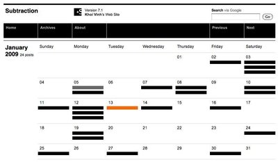
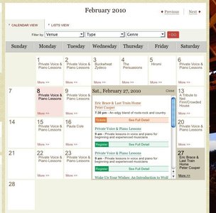
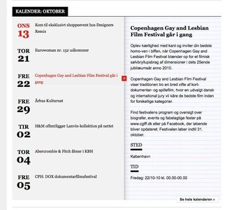
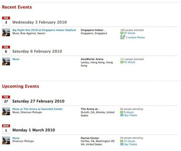
6 of 7 Calendar screenshots examples collected by archanab_14
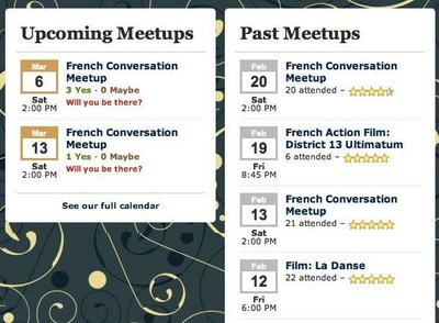
Calendar screenshots at hd-live.co.uk
- hd-live.co.uk (source)
- Browsing Calendar screenshots collection by archanab_14
- Added to collection by archanab_14
- First added to the Design considerations for event calendars collection
- Added on 2010-09-12
More Calendar screenshots screenshots
More screenshots from hd-live.co.uk
From hd-live.co.uk
From hd-live.co.uk
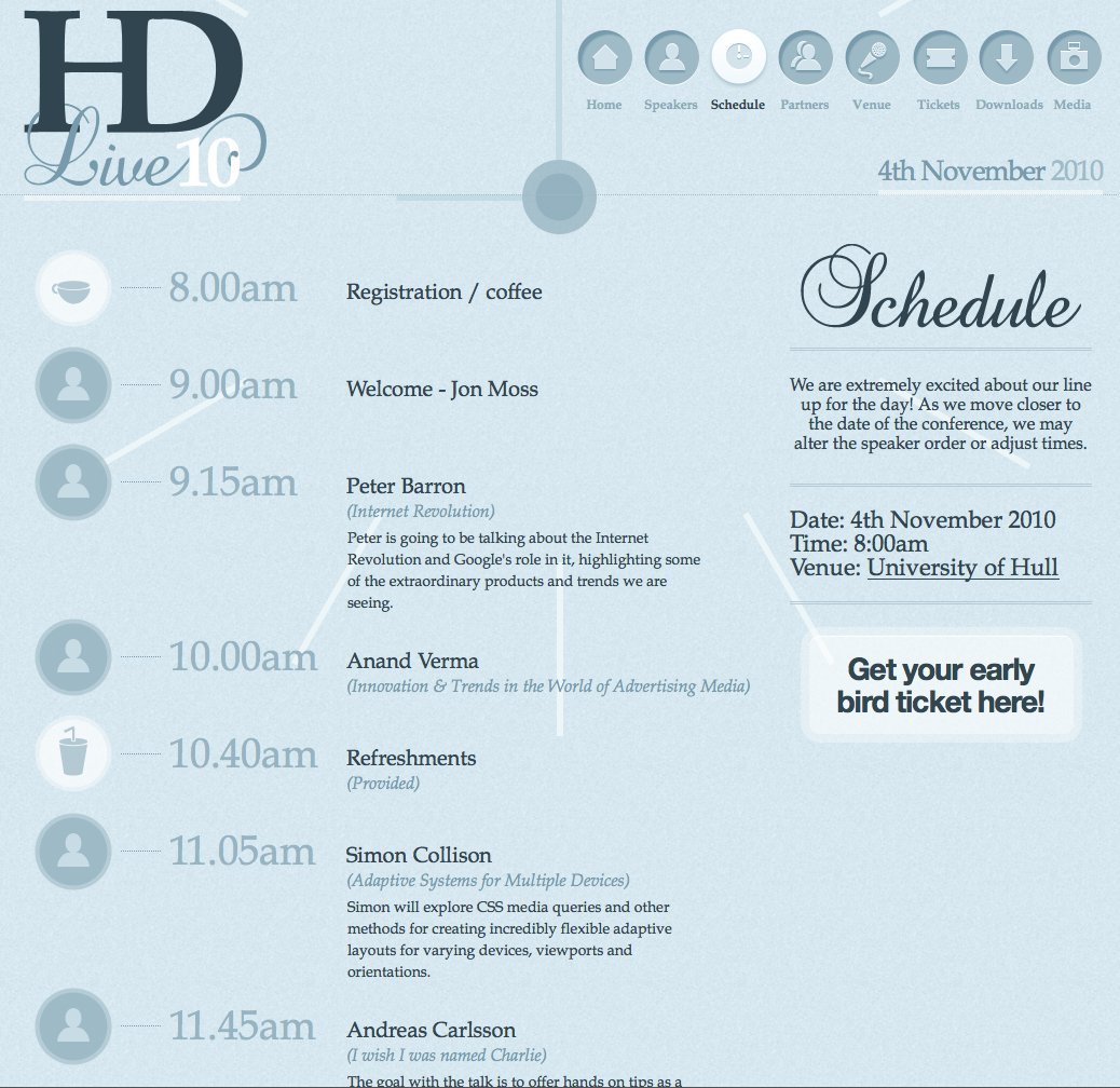
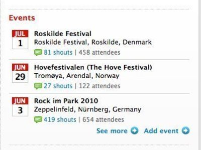
2 comments
on Sep 14, 2010
Thanks for featuring HDLive, much appreciated!
Best wishes,
Jon
on Mar 29, 2011
All though I love this design, I think it looks more like a well designed print piece. I don’t think it has good usability. The eye is drawn around to data and places that aren’t important, such as the event or website name in the top left corner. Repeat of current or event date in the same area.
Comments have been closed