4 of 16 Graceful UI examples collected by bonzooznob
Graceful UI
- (source)
- Browsing Graceful UI collection by bonzooznob
- Added to collection by bonzooznob
- First added to the Breadcrumbs collection
- Added on 2008-02-07
More Graceful UI screenshots

From digg.com

From bloglines.com
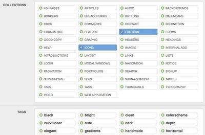
From patterntap.com
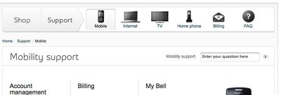
From bell.ca
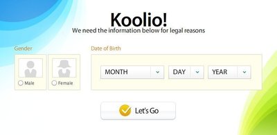
From kontain.com
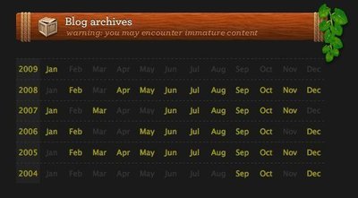
From komodomedia.com

From penzu.com

1 comment
275 on Feb 15, 2009
In the above example the user has found a product in the ‘Airport & Wireless’ category. I would just like to add that if the user has not yet made that choice yet, the arrow to the right of ‘Airport & Wireless’ is not displayed.
I personally would then also put more emphasis on that item by i.e. colouring that menu item black.
Comments have been closed