One a website delivering editorial content, the article teaser is one of the most important design elements besides the design of the article itself. The article teaser is part of an article list, and its main purpose to lure visitors to keep on browsing.
The most pure form of article lists is seen on magazine and news websites, but the convention is also relevant to all other sites trying to tease another click out of the visitor.
I’m going to take you through a few design tips, common mistakes, and finish off by defining the common elements of an article list.
Design tips for designing great article lists
Don’t over-design it: scanning is the main feature
The main purpose of the article list is to lure users to click on a story – so let them find one that they find interesting! One of your proudest objectives as a designer should be to get out of the way and let the user perform his or her task. The interface you design should afford scanning.
Too many ornaments and other unnecessary design elements hinder scanning. They have no other purpose than making the designer show off.
Longer lists are good – when they are scannable
Pagination is overrated due to two reasons:
- From the world of content to the world of navigation. Every time the user needs to use pagination to view more stories, he or she is pulled from the world of content to the world of navigation. The user is then no longer thinking about what stories they should read, but about how to find more to read. Using pagination creates a natural pause that lets the user reevaluate if he or she wants to keep going or leave the site.
- Pagination numbers have no meaning. What does page 2, 3, or 4 mean? It’s an abstract construction without root in anything real. For the user, being on page 2, 3, or 4 only indicates the inability to find anything interesting on page 1. Being on page 4 is a reminder of a lengthy website visit without finding anything of value. Instead, find a meaningful way to group articles: by week, month, year, category, tag, or by alphabet. Long lists are not a problem if they are scannable.
Long lists are not bad – as long as you can scan it easily and without effort.
Setting the scene with category labels
Category labels set the scene of what the user can expect. They communicate what the title of the article sometimes can’t and by that helps set the context of the title.
An article with the title “Chanel goes crazy” can have several different meanings. If the article is about Chanel’s last economic quarter, the title possibly conveys a rising crisis for the company, however if the article is about Chanel’s new designer collection, the meaning of the title is totally different.
In this way, the category label help set the user’s expectations for what is to be found behind the link. By labeling the story with either “Fashion” or “Financial news”, the correct meaning of the title is set in stone.
Get out of the way and let the user perform his or her task.
Listing related articles
Especially on news sites articles about a subject does not come alone. News is published in fragments as they come in. To accommodate for this, many news sites not only displays the main article on the front page, but also lists related article to the subject in the near vicinity (most often below).
There are many aspects of a story which each turn different people on. If the main story will not catch the attention of a specific reader, then the chances that one of the prior articles about the same subject are good.
Also, the list of articles on the same subject works as a great starting point for exploring the full story, and thus provides a good opportunity to increase the pages per visit.
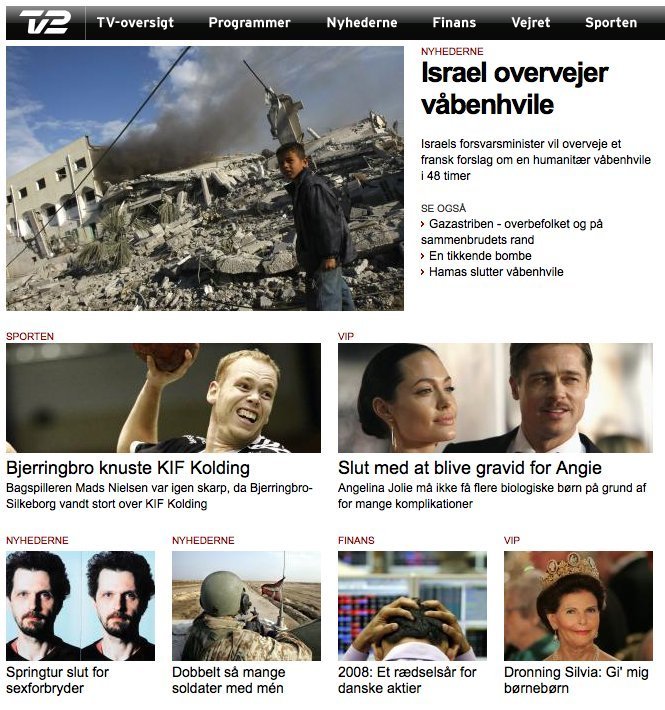
At the Danish television company, TV2, articles are listed by category. The top story (the latest) in each category is shown with a wide thumbnail image, header, and description. This is followed by the a list of the next 3 articles from the same category.
Comment count as an indicator for interestedness
If an article is well commented, we tell ourselves that it must be a more interesting read than articles with less comments. This effect is called social proof. We judge the popularity of something by the actions of others.
If you have a high comment activity on your site, listing comment count can help people stick around: “this must be an interesting site as people keep on commenting”. If your site have little to no comments on articles, you will communicate the opposite by showing comment count on article lists.
Include the author when your articles are opinionated
Everything is about the context. Always! Consider what kind of articles you are presenting. The author is relevant to an article teaser if it is opinionated – just like comment count is relevant to an article teaser if there are lots of them.
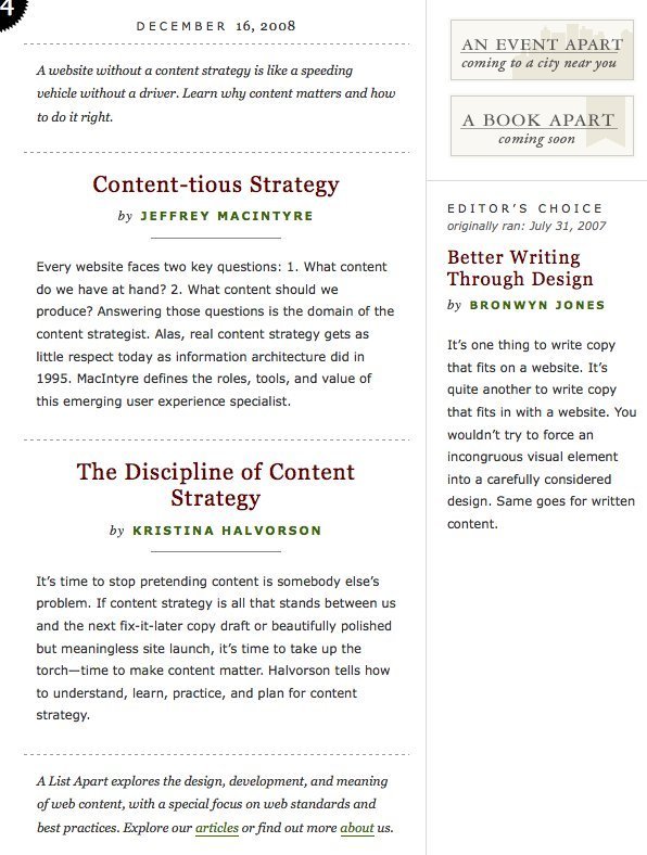
Each article at alistapart.com receives a large header and author line followed by an introductory text written especially for the front page
Highlight as featured article
If you want to attract attention to articles you believe will interest a lot of people, or that you put a lot of work into (the first is way more important), it can be a good idea to find a way to highlight the article.
One kind of highlighting is with an attached label in bright colors, another is changing the background color of the article list item. A third option is to find a prominent position for the article: e.g. at the top of the list with a larger thumbnail image.
Remember the call out
Remember to call out for action! Much have been said about the old-school “click here” call out, but whoever used it was on to half of the truth. The bad thing about “click here” is that it does not set expectations: “what is going to happen when I click on it?”. The good thing about “click here” is that it tells people what they should do. It calls out for action and does not require the user to think.
To get the call out right, you need to set expectations. If the user is taken to watch a video, then have a link saying “watch the video”. If you print out the first paragraph of text, then have a link that says “read more”.
You can also include call-outs in other parts of the teaser than just the text link. On video teasers a “play” icon placed over a thumbnail picture work great.
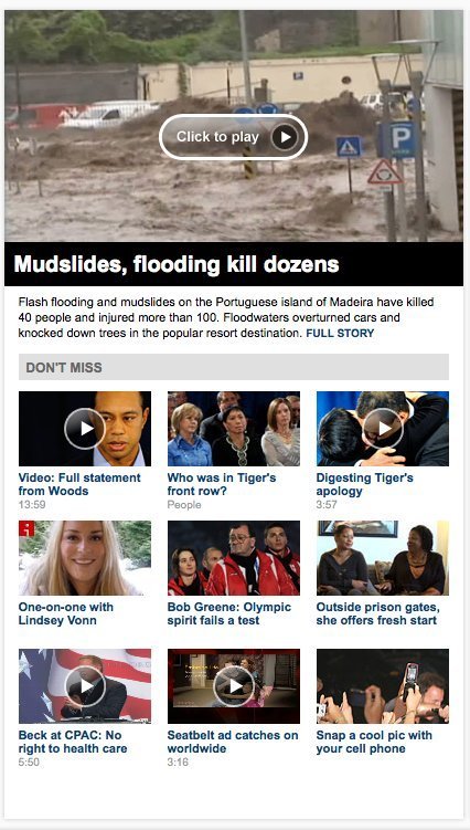
Great combination of video stories and regular text stories in this article list at cnn.com
Common pitfalls of article list design
When the visible difference between the header and the subheader is too little, the user has to spend unnecessary energy on decoding which is which.
No visual difference between headline and subheading.
The visual hierarchy between the elements of an article teaser is important. For scanning purposes, the shorter heading affords better scanning than the subheading does. When the visible difference between the header and the subheader is too little, the user has to spend unnecessary energy on decoding which is which.
Forgetting to make everything a link
Make sure that the user can click on any part of the article teaser to go to the article itself: title, image, description, comment count, and call out. People are used to being able to click anywhere to go where they want.
Showing comment count when there are none
If your site does not have much comment activity, you will communicate that you have a boring site with unengaged users if you list comment count for a bunch of articles with no comments.
The elements of an article list item
For an article list to work, you must provide a series of information for it to be useful. Like always, everything depends on the context. If your articles are opinionated and more editorial than they are a news story, then the author is an important part. If you have different types of content on your site (news stories, quizzes, battles, etc.), then you would want to label your articles accordingly so that you set expectations.
Regardless of the context, there seems to be some details that are always important:
- Title the article
- Short description
- Publication date
- Call out to action (read more, continue reading, see more, etc.)
A series of details occur often, but are not present in all lists.
- Category label
- Thumbnail image
- Comment count
- Picture count (in gallery)
- Author
Think from the user's perspective - not your own
It should be no surprise that you should put yourself in the shoes of the user. An article that will create many hits or in general be public with your audience is not necessarily the ones you spend the most time on, or the ones that you find interesting. Constantly evaluate an article’s value from the reader’s perspective when deciding to highlight it or not.
Put yourself in the users’ shoes when you decide on what data you want to present to them. Do you want to have different kinds of article list items – for instance one for galleries, one for blog posts, one for events, and one feature articles? It might make sense. Think about how you can make it easier for the user and stop forcing the user to think like you.
Think about how you can make it easier for the user and stop forcing the user to think like you.
2 comments
Martijn van Vreeden on Feb 24, 2010
Excellent article. I agree with your comments on pagination. However, I have experienced issues with pages that were too long and increasing the loading time. Obviously there is a max to the amount of articles you can put on one page. :)
In addition to sorting your articles, I like the option to filter them on several parameters even better.
Muhammad Ghazali on Jun 12, 2010
Great articles! I’ll make it as reference material. Thank you.
Comments have been closed