Blog
Some are outdated. Others are misused. And a few were never that useful to begin with. Yet they continue to show up in project briefs, design sprints, and stakeholder requests—not because they work, but because they’re familiar.
A friendly and pattern-focused UI design guide
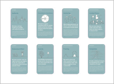
The Persuasive Patterns card decks is a powerful tool for shaping user experiences. They help teams integrate behavioral science into design, leveraging principles like scarcity, reciprocity, and commitment to encourage user action. But what...
Have you ever marveled at the effortless way LEGO bricks click together? It’s not just a matter of clever engineering; it’s a testament to brilliant design. Each brick is a standardized component, designed to seamlessly integrate...
Ever feel like you’ve landed on a website in a foreign language, even though it’s clearly in English? That’s the frustration of encountering an interface that throws all conventions out the window. We crave familiarity, and...
Implementing a design system takes more than the creation of the system itself. It is more important to focus strategic integration within an organization's workflows and culture than it is to design a great system.
Creating a user-centric culture in your new role
In the quest of becoming a good UI designer, you can come a long way by reading books, attending conferences, formally educating yourself, trying out tutorials, or just experimenting on your own. However, if you want to go into hyper-speed i...
Design psychology is a powerful tool for creating effective user experiences, but it must be used responsibly. Designers must understand the complexities of human behavior and create experiences that work both for its users and their busines...
Behavior change is a complex process that requires a deep understanding of the factors that drive people’s actions. To help designers create effective behavior change interventions, the COM-B model has emerged as a popular framework fo...
From the archive
- Sell before writing a single line of code
- When business plans are a waste of time
- Making the Hook Model actionable
- Making the Fogg Behavior Model actionable
- The tipping point of Persuasive Design
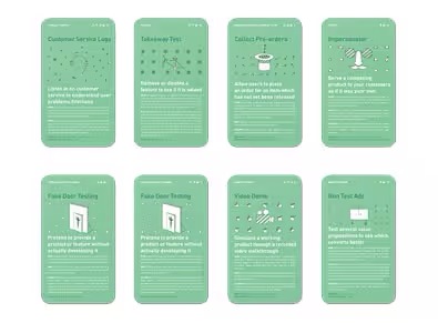
- Introducing the Validation Patterns Card Deck
- Beyond usability: Designing with persuasive patterns
- Mapping design goals to tactics
- 11 tips to increase form conversion
- Nir Eyal: Trigger users' actions and reward them to build habits
- Design effective rewards structures in web design
- Designing for push and pull in web design
- Optimization vs innovation
- The three levels of design patterns: Implementation, flow, and context