Way too often I come across websites with poorly designed event calendars. The most common ways to browse an event calendar is either through a text list of events, through a month table, or a combination of both.
The text list is great for providing a view of events for a given period of time: for a certain day, week, month, or simply the nearest future. With a packed calendar, it can however be overwhelming to get and overview of everything.
The calendar box (month table) is good for browsing between days and for getting an overview of when the action happens. In isolation it however reveals close to no information about the events in the calendar. Furthermore, the boxed calendar renders almost useless without data. If you only have one or two events a month, the usefulness of the calendar box becomes minimal – left to merely showing when the next weekend is up.
When combined, the calendar box can be used as a device for navigating through periods of time, while text lists can show details. Again, the boxed month calendar renders useless if you only have 2 events a month, where you might be better off with a mere list of years or no time navigation.
Introducing buckets of time
As humans, we don’t think in dates. We think in “buckets” of time: tonight, this weekend, next week, in a few weeks, next month, or this year.
Parting your events into buckets of time that make sense to the user is a great way to provide the user with an overview. Part events into groups of “tonight”, “next week”, or “next month”.
Consider experimenting with different designs for each bucket of time. The user might be more interested in details this week than next month. Listing the starting time in the list of events this week might make more sense than listing it for events next month. It’s all about the situation the user is in when he or she browses your calendar. Take a moment to think the design through from the user’s perspective.
Common pitfalls of event calendar design
The most common design mistakes of event calendar design that I most often run into are:
Thinking in outlook and the calendar box
Designers are working people. They spend most of their day designing – but also a recognizable part of the day in Outlook, Google Calendar, or iCal. They use calendars for planning their daily schedule and for planning the next few months with the help of these calendars. For this purpose, boxed calendars are great. Unfortunately a lot of designers forget to realize that these types of calendar designs are made for day-to-day planning (for which they work well) – they are not designed to provide an overview of upcoming events: the main purpose of the event calendar.
Listing events without a start time
I browse event calendars in different contexts. One context is when I want to find out if anything interesting is happening over the next few weeks or in the next month. In this context, I am not interested in when the event starts, but merely what date it is. Once I have decided to go to an event, I will use the event calendar with a different purpose: to check up on the details – was it 19:00 or 20:00 that it started?
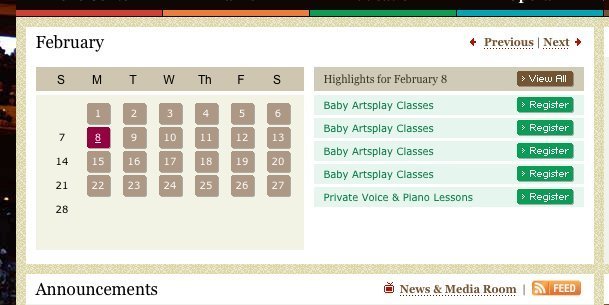
Another and perhaps even more critical flaw is when events have similar titles. The example below shows a list of the same class happening several times a day. The title of the class stays the same, but the time doesn’t. With missing start times, the event list is useless.

Missing start times makes the event list useless

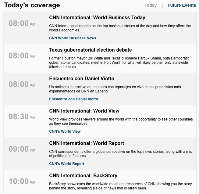
The event list at live.cnn.com does a great job listing start times that are easy to scan as well.
Missing other relevant data
If I am going to a concert, the venue makes an important difference in my decision to go or not. I want to know if it’s going to be cramped and intimate, big and bold, or if it’s that place with the crappy sound.
Take a moment to think about what makes the kinds of events you are designing for special. Prioritize the information that let your users scan events and decide whether it is of interest or not.
Impossible to scan
Don’t make me think. Make it easy for me to scan an event based on the data that is important for the types of events you list. If one event is bigger or more important than another, then let the user know by highlighting it. The same goes for events that I might already have checked out or even better – have decided to attend.
Another great way of highlighting an important event is through social metrics such as ratings, attendance count, etc. Showing an event’s rating through for instance stars makes it easy to quickly scan the list for the highest rated event. Similarly, a larger attendance count will have a larger number and by that be easy to spot. You can also try to play around with different font sizes, text colors, and backgrounds (shades of gray?) to highlight certain events.
Huge lists
A list that just goes on and on without any visual prioritization or grouping renders a calendar useless. If a list is too big to show in a few folds, consider how you can part it up based on either time constraints (buckets of time) or other data like category, venue, genre, or rating.
No filtering options
Make it possible for me to only view the events I am interested in. If I like funk music, then let me browse only funk concerts. If I want to see what bands are playing at my favorite local club, then let me browse venues. If I only have time next weekend, then let me limit my search to next weekend.
The elements of an event list
For an event calendar to work, you must provide a range of different types of information for it to be useful. It all depends on the context. If you are listing concert events then ticket prices, availability of tickets, and band name a important. For a conference calendar, the presenter, room name, conference track name, and duration of the talk might be important.
Regardless of the context, there seems to be some details that are always important:
- Title of the event
- Date of the event
- Start time
- Location
- Organizer
- Description of the event
Use the user's abstractions - not your own
You might for organizational purposes divide events up into different types, which you give different priority in your daily work. You might for instance prioritize sponsored events over user submitted events. In your own mind, the difference is huge!
The difference for the user is however not always that radical. If the user wants to know what funk concerts is happening next week, he or she does not care if it is sponsored or not. From the user’s perspective parting events into two groups does not make sense – so list them all together.
Good luck!
5 comments
Ralph on Feb 17, 2010
I’m loving these posts. The English is a bit flaky at times, but don’t let that stop you — writing and content are still great, and very accessible.
Anders Toxboe on Feb 17, 2010
@Ralph: Thank you for the nice words.
Just went through the post – you’re right -there were quite a few errors. Could I get you to read it through again and let me know if the language is still flaky. Thanks!
Ian Hallworth on Feb 18, 2010
Great article which touches upon some key points. Well timed too for me as I’m struggling with an event calendar for an organisation that runs lots of repeating events each week with up to 8 events per day where event times regularly overlap. Filtering by category is possible to cut down on noise, but I’m beginning to think that approaching the calendar as a timetable is perhaps a good way to approach this particular set-up. Shame there’s no wordpress timetable plugin (or even a decent calendar).
Richard on Jun 21, 2010
Nice article, but would be improved if you had examples of good implementation.
What are your current favourite calendars?
Web Banner Design on Oct 21, 2011
A good calendar is a very good tool, and if part of the whole calendar has a good design is not only functional but also look just right
Comments have been closed