The UI pattern survey initiative was launched without much fuss last week [editor: 2009]. With over 1000 replies, the data collected is slowly gaining momentum, and even though it is too early to make any empirically sound deductions from the results, I thought I’d share the outlook of what is to come.
Coordinate questions
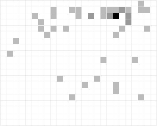
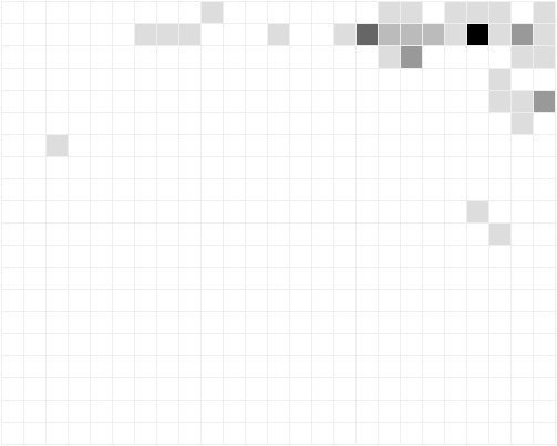
The following questions were answered by the user being asked to locate a certain element. He or she then pointed the cursor to the element on an iframe and clicked it. The coordinate the user clicked on was recorded and the images below were the result.
All sites were viewed in a 1024×800 dimensioned iframe, which the images below illustrate. Each square on the image equals a 40px X 40px square in the iframe. White color means that nobody clicked on that particular square. Darker color means more clicks – that is more sites have the respective element located in this location.
All replies to questions are summed up per site basis and thrown away if the standard deviation is too big. If the data is valid, it is included in the final results.
Location of the search form or link

Graphical survey results: Location of the search form or link
Location of login link or form

Graphical survey results: Location of login link or form