The UI pattern survey initiative was “launched” in April 2009 and has slowly been collecting replies ever since. With over four thousand replies, the data collected has considerable momentum.
The purpose of the survey was to crowd-source locating various standard elements on some of the biggest sites out there. The survey had two types of questions: coordinate questions and regular closed-option questions.
Coordinate questions
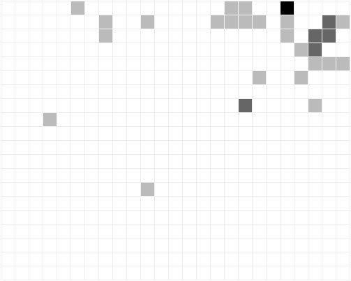
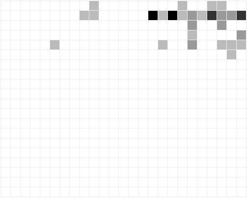
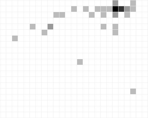
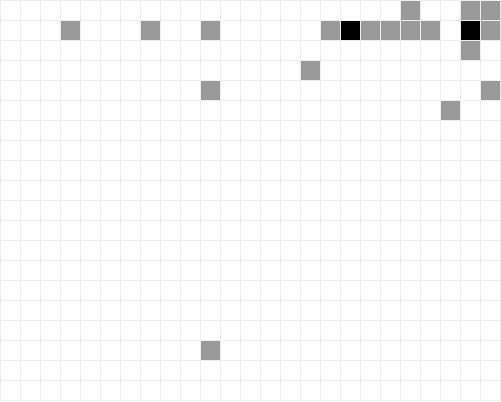
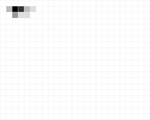
The following questions were answered by the user being asked to locate a certain element. He or she then pointed the cursor to the element on an iframe and clicked it. The coordinate the user clicked on was recorded and the images below were the result.
All sites were viewed in a 1024×800 dimensioned iframe, which the images below illustrate. Each square on the image equals a 40px X 40px square in the iframe. White color means that nobody clicked on that particular square. Darker color means more clicks – that is more sites have the respective element located in this location.
All replies to questions are summed up per site basis and thrown away if the standard deviation is too big. If the data is valid, it is included in the final results.
Location of account creation (sign up) link or form
Graphical survey results: Location of account creation (sign up) link or form
Location of login link or form
Graphical survey results: Location of login link or form
Location of the search form or link
Graphical survey results: Location of the search form or link
Location of the global home link
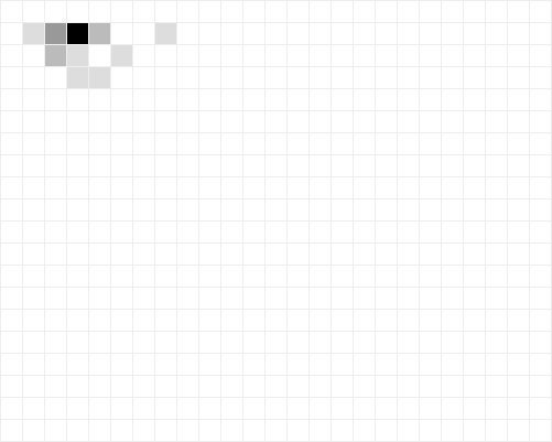
Graphical survey results: Location of the global home link
Location of the ‘Get help’ link
Graphical survey results: Location of the 'Get help' link
Location of the top left corner of the main navigation
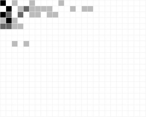
Graphical survey results: Location of the top left corner of the main navigation
Location of the main logo graphics
Graphical survey results: Location of the main logo graphics
Closed option questions
The closed option questions was about the look or form of specific elements on each website. The results were:
The login link or form is represented by a…
- Form 20.73% (on 17 sites)
- Text Link 67.07% (on 55 sites)
- Text button 6.10% (on 5 sites)
- Icon 1.22% (on 1 sites)
- Icon button 2.44% (on 2 sites)
- Other 0.00% (on 0 sites)
Can you refine your search by more options than a text-field
- No, there is only a text field and a search button 43.90% (on 36 sites)
- Yes, there is also a drop down that allows me to seach particular parts of the site 18.29% (on 15 sites)
- Yes, I can click on links that leads me to new search pages. 2.44% (on 2 sites)
- Yes, there is an advanced search option. 7.32% (on 6 sites)
- There is no search function on the site. 19.51% (on 16 sites)
If a manage account link exists, what kind of icon is it represented by?
- Writing instrument (pen, pencil, etc.) 2.38% (on 2 sites)
- Folder/file box 1.19% (on 1 sites)
- Check mark 0.00% (on 0 sites)
- Documents 0.00% (on 0 sites)
- Key (representing “Loginâ€) 5.95% (on 5 sites)
- No icon used 66.67% (on 56 sites)
What orientation does the main navigation menu have?
- It’s a horizontally laid out menu 79.52% (on 66 sites)
- It’s a vertically laid out menu 12.05% (on 10 sites)
Is the main navigation tab based?
- Yes 24.39% (on 20 sites)
- No 73.17% (on 60 sites)
Is the colorscheme of the site light or dark?
- Light 83.95% (on 68 sites)
- Dark 16.05% (on 13 sites)
In what section is the sign-up link (not form) placed?
- In the header 71.08% (on 59 sites)
- In a prominent position of the page (not the header) 21.69% (on 18 sites)
- In a not prominent position of the page (not the header) 0.00% (on 0 sites)
How is the sign-up link (not form) titled?
- Start here 3.61% (on 3 sites)
- Other 8.43% (on 7 sites)
- Join 9.64% (on 8 sites)
- Sign up 44.58% (on 37 sites)
- Register 15.66% (on 13 sites)
- Create account 7.23% (on 6 sites)

6 comments
iconoclast on Sep 04, 2009
Thanks for this informative survey. I am very interested in GUI and usability issues, since I am largely responsible for my company’s Web site. This will help as we upgrade the site design in the future.
Anders Kragelund on Sep 27, 2009
Really cool investigation and results. Have you though of continuing running other questions like "Where to find the “contact customer service” link", “Where to find company location” etc.?
Anders Toxboe on Sep 27, 2009
@Anders Kragelund: How fun that you mention it… a colleague of mine came up with that exact idea a couple of months ago. ;-) I’ll get it up soon… just need time…
rapid4me on Nov 13, 2009
Thanks, really very interesting and informative
Jasper on Apr 28, 2010
I’ve been working on the similar project on my previous work. Thanks for the post.
Erik van der Molen on Sep 04, 2014
I don’t think I learned anything new but wanted to know your thoughts on reasons to deviate from these standards. I think this kind of research keeps us in the box. I hate the box, it is shallow, dull, unchallenging, lacks creativity, and most of is a fall back for ordering simple elements that stem not from research but practices that came before their time. They have forced us into defaults almost impossible to demonstrate our way out of. How do forging language’s/sites differ? If my experience is best logged in, why put the login on the far right? I’m appalled by the resistance to change. I will take low marks and low grades in the name of challenging convention and asking my users to think/explore. Understandably the bottom line drives these decisions, but where do moments exist where the norm has been challenged and stood above the crowd, shifting the bottom line in the right direction. I think first of what Uniqulo has done, but there are a good dozen others, including how micro sites use to explore immersive environments and push those boundaries. Everything is getting boring, and this is research is a stamp of approval for it.
Comments have been closed