This blog post is one out of several blog posts on improving your user interface sketching techniques. You might want to be interested in reading the first post: Drawing corners.
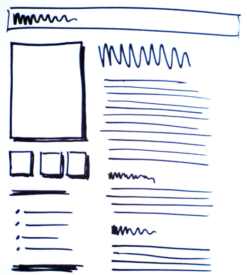
Remember the photoshop technique that first was loved then later became an effect, and after that suffered being way to overused in the corniest designs ever? I’m talking about “drop shadow”. Using it for sketching paper mockups of your user interface will help you distinguish graphical elements from text, alternating backgrounds, and borders.
Drop Shadow
This technique will help your user interface draw attention to specific parts of your design. Most often these are graphical elements such as photos or other varying graphical elements that will rarely be seen as a seamless part of the user interface.

Using drop shadow for sketching paper mockups of your user interface will help you distinguish graphical elements from text, alternating backgrounds, and borders.
2 comments
nicolas on Feb 24, 2009
very useful
Anand on Apr 21, 2009
Good tip. I’m going to use this.
Comments have been closed