Hopefully, you find yourself drawing mockup paper prototypes for the software products you are working on. It’s a fast and versatile way of testing your initial ideas. Seeing your UI ideas on paper gives you immediate feedback and thus lets your explore many different approaches in a short time.
Without any formal drawing training, I often found myself drawing elements that looked more like an abstract cubistic painting than actual user interface elements. A few of my co-workers however taught me a few tips that drastically improved my sketches into being recognizable as a user interface. If you are experienced in art and drawing, these techniques might seem basic to you, but if you like me is just learning, they will help you immensely.
Each tip will be presented in a separate blog post, as they each take a fair amount of time to prepare.
First technique: Drawing corners and boxes.
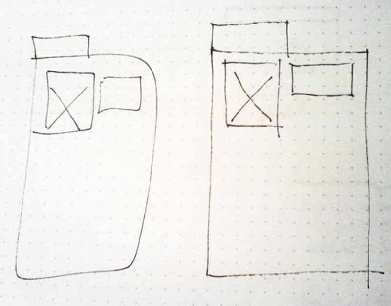
User interfaces is most often a set of boxes aligned in a certain manner making up a user interface. When I first started drawing such boxes, I would draw the entire box in one connected line slowing down the speed of the pencil in each corner. Most often some corners would be half way okay, but the rest would be rounded and the lines would be far from parallel or perpendicular.
First off, stop thinking about the line surrounding the box as one long connected line. Think of the box as four separate lines. Instead of looking at the drawing tool in slow motion, look at the endpoint of your line: fixate the goal and draw the line in a fast movement.
As the movement of the pen slows down in speed, the pen is more likely to change direction and the pressure of the pen on the paper is likely to increase. Some sketchers draw lines a little too long as they will then be as close to straight as possible in its full intended length.
Because of this the corners of my boxes now always have small crosses, which is a compromise I gladly accept in turn of drawing what actually looks like a rectangular box.
Sketching tip: Draw separate straight lines instead of one long one when drawing boxes.

4 comments
web design on Aug 25, 2009
For a person without any formal drawing training you did well and. I never thought that User interface sketching can be learnt that way as well.
Website Redesign on Aug 27, 2009
That was quite superb
Drew on Dec 18, 2009
Great tips!
Another one I learned back in a mechanical drawing class is that we tend to draw straighter lines by pulling downward for vertical and going from left to right (lefties, switch that around) to make horizontal lines.
In other words, pulling tends to go in a straight line more consistently than pushing.
So, not only should you make your boxes with four strokes, but if both sides are drawn downward and tops & bottoms are drawn to the right, your boxes are likely to look like they were stenciled in there… though Jay’s stencil kit is waay cool as well.
-justdrew
shibin mechanical projects on Nov 04, 2010
The pictorial representation will be more helpful to grasp the ideas with more ease..its an alternate way to sketch the user interface diagram….
Comments have been closed