Practical UI by Adham Dannaway is a refreshing UI design book that feels like a personal coach guiding you through the essentials. With a logic-driven approach to designing intuitive, accessible, and beautiful interfaces, it’s perfect for designers keen to sharpen their UI skills
In this review, we’ll explore what makes Practical UI stand out: Its hands-on advice, alignment with UI design patterns, and the stellar visual presentation. With decades of UI design pattern experience (I coined the term), we’ll also discuss how you can effectively put it to use in your own design workflow.
A logic-driven approach to UI design
From the get-go, Practical UI emphasizes designing with purpose and rationale, not just aesthetics. Dannaway, who is a seasoned UI designer, argues that every detail in an interface should have a logical reason behind it, improving usability and user experience.
This perspective seems like a perfect practical guide to both UI Patterns and Persuasive Design Patterns. It encourages designers to base decisions on principles and evidence (like usability heuristics and laws) rather than personal opinion. “I just like it” is not helpful feedback – instead we should articulate why a design choice works or not. UI Patterns provide such a shared vocabulary for communicating design intent.
Practical UI, 2nd edition by Adham Dannaway
By grounding each guideline in a clear rationale, Practical UI helps you build confidence in your design choices and communicate them convincingly to stakeholders.
One of the core themes is risk reduction in design:
- Could this text be hard to read for someone with low vision?
- Might that icon be confusing without a label?
- Are we inadvertently violating accessibility standards?
Dannaway advises minimizing such risks early by following the best practices of UI Patterns and design heuristics – for instance by using sufficiently high color contrast and clear labels to avoid confusion
By proactively addressing these issues, designers can cater to a wider audience and save time on fixes later.
This pragmatic, preventative mindset is one of the book’s strongest values. Another standout philosophy is the idea that UI design is not magic, but logic.
The book demystifies great interface design by breaking it down into logical guidelines. As readers, we’re shown that behind every sleek UI there are deliberate decisions about spacing, alignment, contrast, and more – all based on common-sense rules and patterns.
By proactively addressing these issues, designers can cater to a wider audience and save time on fixes later.
You don’t have to rely on elusive “creative genius” to design well.
For junior designers especially, this approach is empowering. it shows how you don’t have to rely on elusive “creative genius” to design well. Instead, learn the guidelines, apply them step by step, and you’ll see the design come together. The writing style is friendly and encouraging, very much like a coach saying “You can do this – just follow these principles.”
Built on UI design patterns & best practices
If you’re a fan of UI design patterns, you’ll feel right at home with Practical UI. In fact, many of the book’s recommendations echo the philosophy of using tried-and-true patterns to solve common design problems that I defined back in 2007.
Dannaway explicitly encourages designers to “use common design patterns” and stick with familiar conventions that users already know. In that way, he echoes what we’ve been preaching for decades, but goes a step further to show how it’s done – in practical terms.
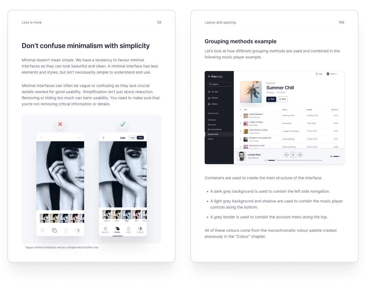
Two beautifully designed pages of the Practical UI book by Adham Dannaway
Using familiar conventions that users already know is not about playing it safe just for the sake of it, but about usability. Why reinvent the wheel if there’s a standard navigation menu or form layout that people find intuitive? By leveraging existing patterns, you tap into users’ built-in expectations (their mental models of how things should work), which means they can accomplish tasks with less effort.
The result: lower cognitive load and fewer usability issues.
The result: lower cognitive load and fewer usability issues. One great example in the book is the use of an accordion component for FAQs. Accordions are a classic UI pattern to conserve space by expanding/collapsing content sections. Practical UI not only recommends such patterns but also explains why they work. An accordion makes a list of questions scannable, and lets users reveal the answers they care about while ignoring others.
Throughout the chapters, similar pattern-based advice appears: use a standard hamburger menu on mobile if needed, follow common iconography (e.g. a magnifying glass for search), place forms in familiar layouts, etc.
All of this aligns perfectly with the ethos of UI-Patterns.com: the idea that building on established design patterns leads to more usable interfaces. Importantly, Practical UI also addresses the balance between convention and innovation. Dannaway acknowledges that always playing it safe could seem “boring,” but he wisely points out that by reusing common patterns for the basics, you free up energy to innovate where it truly counts.
In his words, “you can save a lot of time and money on usability testing by sticking with what people are used to… It will also give you time to focus on solving more important problems… I’m not saying you shouldn’t be creative and try to innovate, but do so where it counts.”
This is gold advice. It means you don’t waste your users’ effort (or your project budget) on re-teaching something like a scrollbar or a checkbox, and instead you apply your creativity to your product’s unique value or complex challenges. The book’s stance is that following design patterns for common UI elements is not anti-creative, but merely smart design that ultimately benefits the user. And when you want to break a convention, at least know why you’re doing it and test thoroughly.
Beautiful design and reader experience
A book about UI design should itself be well-designed, and Practical UI delivers on that front. In fact, Adham Dannaway not only authored the content but also designed the book’s layout and visuals himself.
This shows on every page. The book is full-color with a clean, modern aesthetic: plenty of white space, legible typography, and nicely organized headings and callouts. Reading it is a pleasure because it practices what it preaches: information hierarchy is clear (chapter titles, section headings, tips, and examples are visually distinct), and nothing feels cluttered or confusing.
Pages are often laid out with side-by-side examples (e.g., a “bad design” vs “good design” comparison) that immediately illustrate the effect of a guideline. For visual learners, this is invaluable. For instance, when the text talks about a form with poor alignment, right next to it you might see a corrected version of that form with proper grid alignment – the improvement literally jumps off the page.
The use of color and typography in the book’s design is also noteworthy. It’s super consistent. The book uses a limited palette primarily for highlight purposes (fitting, since it advises designers to do the same). Headings and body text are in sans-serif, easy to scan; code or key terms might be in a different style.
The tone stays friendly and encouraging. When reading, you almost hear the voice of a mentor or a workshop instructor, not a dry professor. This tone likely comes from the author’s conscious effort to be educational but not patronizing. Even when introducing a known concept like Fitts’s Law or Hick’s Law, Dannaway does so in plain English with relevant context, so beginners won’t feel lost. In short, Practical UI is extremely well-designed both in content and format – making it a standout example of user experience in book form.
A worthy addition to your UX library
Practical UI (2nd Edition) lives up to its name. It is one of the most pragmatic and useful UI design books to come out in recent years. Adham Dannaway has managed to condense a wealth of fundamental knowledge into an accessible, logically structured guide that benefits designers at any level.
For beginners, it’s a crash course in doing things right from the start (potentially saving you from learning design lessons the hard way). For experienced designers, it’s a great refresher and reference to have on hand – even pros can forget a guideline or need to justify a design choice with evidence. The tone of the book makes you feel like you have a mentor who wants you to succeed and build stuff that really works for users. What sets Practical UI apart is how it bridges the gap between theory and practice.
The Practical UI book doesn’t drown you in academic concepts, nor does it just showcase pretty dribbble shots without context. Instead, it offers just enough theory (the whys) alongside a ton of practice (the hows).
The result is a book that inspires confidence. You come away thinking, “I can tackle this UI design, I have a playbook to guide me.” It’s also refreshing to see an emphasis on accessibility and user-centric measures throughout, ensuring that “beautiful interfaces” in the book’s subtitle are also functional and inclusive.
In terms of alignment with design patterns and modern UX workflows, Practical UI fits in perfectly. It reinforces the value of pattern libraries, design systems, and evidence-based design decisions, which many teams are already embracing. If your workflow involves using a design system (or you’re building one), the book’s advice will help you make that system solid.
And if you like to facilitate design exercises or workshops, the combination of this book and tools like the Persuasive Patterns and UI Patterns cards can level up your sessions, injecting both proven principles and playful collaboration.
Above all, Practical UI is a positive, encouraging read. It doesn’t scold bad design; it gently shows a better way. By the end, you truly feel that good UI design is learnable – it’s a craft with principles you can study and apply, not an innate talent only a few possess. That message is empowering for the community of design learners.
Is this book for you?
If you’re someone who designs user interfaces, whether websites, mobile apps, or SaaS platforms, and you want a resource that you can repeatedly turn to for guidance, then yes, absolutely.
It’s especially useful if you are working with or creating design patterns, as it will validate many of your choices and give you the vocabulary to discuss them. It’s not a high-level strategy or psychology book (and it doesn’t try to be); instead it shines at the tactical level of UI execution.
In that sense, it complements other resources: for instance, if you pair Practical UI with a deeper UX book on research or with pattern toolkits like Anders Toxboe’s card decks, you’ll cover both the “what should we design?” and “how should we design it?” spectrums.
Practical UI is more than just a book about UI design. It’s a practical companion to have alongside your projects, much like a cookbook for interface designers.
It’s honest in its advice, clear in its examples, and decidedly optimistic about our ability to create better user experiences by applying a little logic and a lot of heart. Highly recommended for anyone looking to elevate their UI design skills with a pattern-based, user-first approach.
Read it. Keep it nearby.
Sources
1 Dannaway, Adham. Practical UI: Quick and practical UI design guidelines to design intuitive, accessible, and beautiful interfaces. 2nd ed., 2024.
3 Dannaway, Adham: The process behind the creation of the Practical UI book
3 Bryan Anthonio, My Top Takeaways from ‘Practical UI (2024).
