1 of 2 Header examples collected by hmKavousi
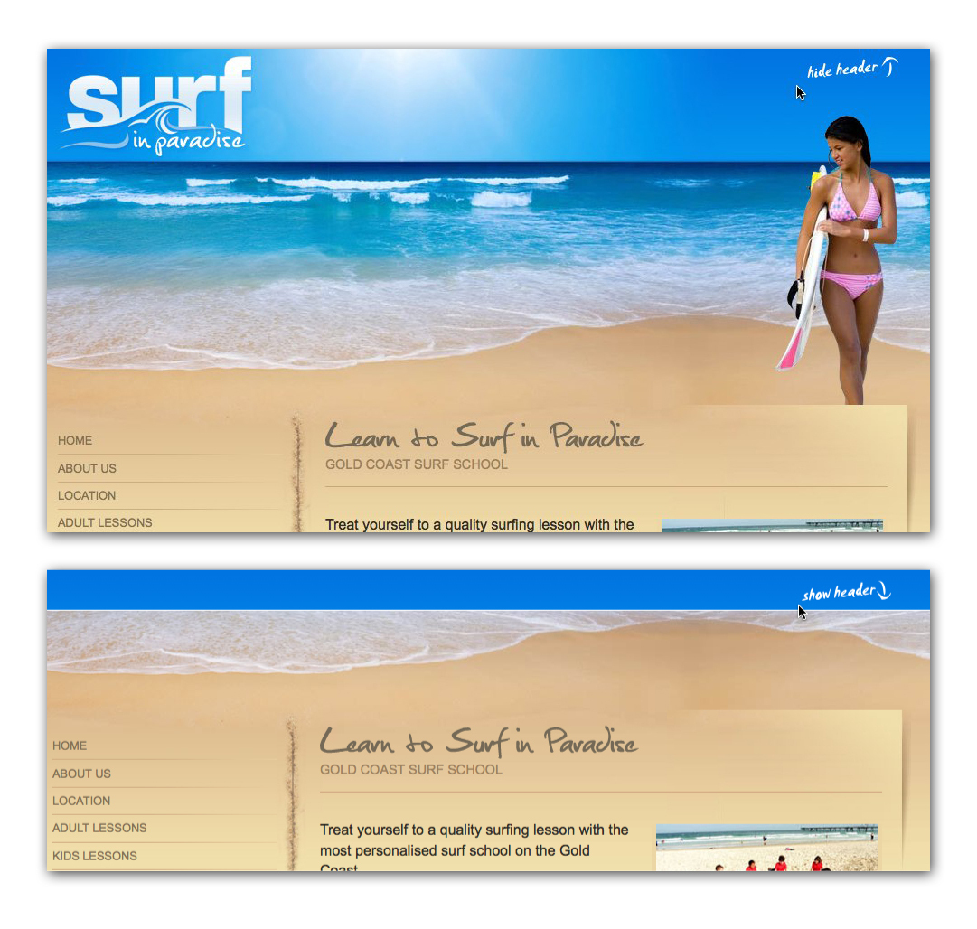
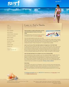
Header at surfinparadise.com.au
- surfinparadise.com.au (source)
- Browsing Header collection by hmKavousi
- Categorized under convenience
- Added to collection by hmKavousi
- First added to the Adaptable View collection
- Added on 2008-12-25
More Header screenshots

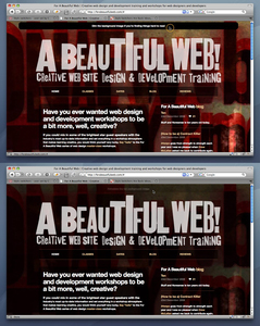
From forabeautifulweb.com


2 comments
275 on Feb 14, 2009
The above example is very good in showing how not to use this mechanism. First the way the menu & content is half presented to start makes it look like there is something wrong with the page, what is the added value of this setup, why not use a splash screen or only presenting the menu items across the bottom of the screen? The caption is unclear ‘hide header’ is a little too technical, something like ‘find out more about surfing’ would be more inviting and meaningful. Furthermore the placing of the element would be better on the content that will actually be moving up. And lastly I would advise against removing the ‘Surf in Paradise’ logo, it is a powerful and recognisable element, which should also serve as an extra home link.
on Sep 26, 2011
Why would you want to hide the lovely lady ;-)
I do like the functionality, sure it can be used in many ways.
Comments have been closed