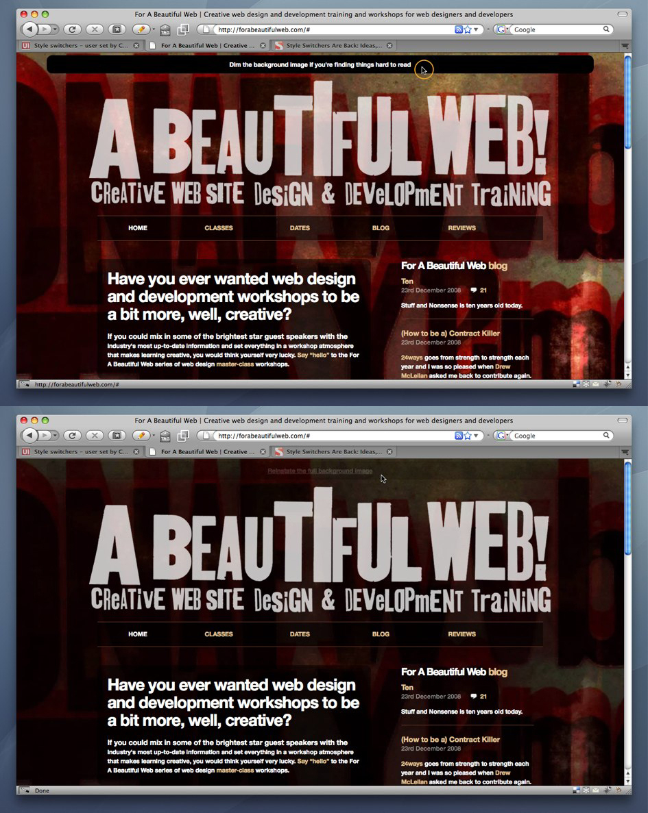
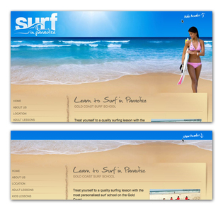
2 of 2 Header examples collected by hmKavousi
Header at Forabeautifulweb
- forabeautifulweb.com (source)
- Browsing Header collection by hmKavousi
- Categorized under usability
- Added to collection by hmKavousi
- First added to the Adaptable View collection
- Added on 2008-12-25


2 comments
on Jan 07, 2009
Or he could have just made a usable design that wasn’t hard to read for some (or maybe many) in the first place.
The other examples are good. This one is just a bad design for the web.
on Aug 26, 2011
It is a nice example, but I think it might be an anti-pattern if the designer is considering that there are chances that the user might find things hard to read.
Comments have been closed