Persuading people to commit to a transaction online can be achieved by applying any number of psychological techniques. And although the term ‘persuasion’ may, at times, been seen to have certain negative connotations there are plenty of way…
One such technique is known as the ‘Goldilocks Effect’ (or ‘Goldilocks Pricing’). The term derives from the Brothers Grimm tale in-which Goldilocks eats three bowls of porridge; the first being too hot, the next too cold, but the final one “just right”.
The goldilocks effect describe the practice of providing a premium as well as a budget option alongside a regularly priced product to make the latter seem more appealing. A good example of this is present in most mainstream coffee shops where the options range from small to large, with regular in the middle. The goal of this type of pricing is to push people who might usually buy the cheapest into buying the more expensive option.
This method of effecting behaviour exploits our psychological aversion to extremes, manipulating people into choosing the option that yields the greatest profit by providing three options and placing the most profitable item centrally within the range.
Below are 24 examples of the goldilocks effect in action.
Too hot
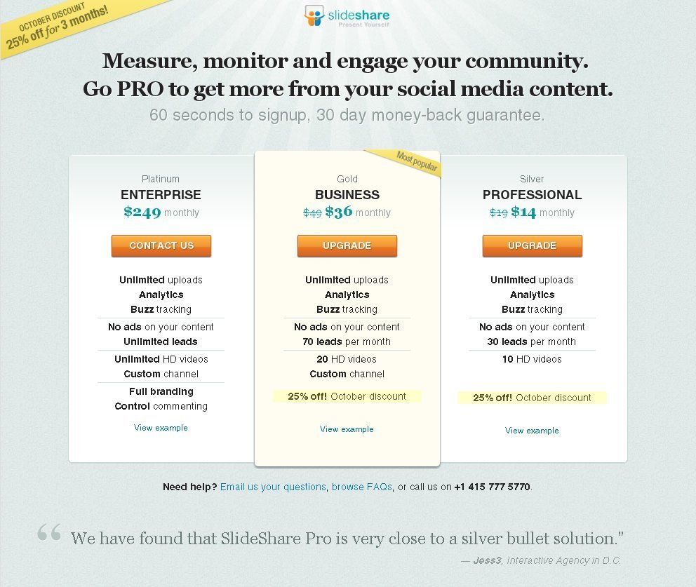
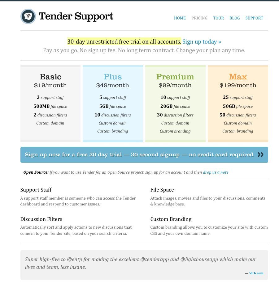
Although in the story Goldilocks is confronted by 3 options the pricing pattern doesn’t necessarily have to be limited in the same way. It does, however, make sense to limit the options to lessen the chance of overwhelming the customer while also providing enough choice for the technique to work. The following examples keep it simple, providing only a minimal number of choices.
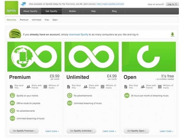
Pricing table at Spotify.com
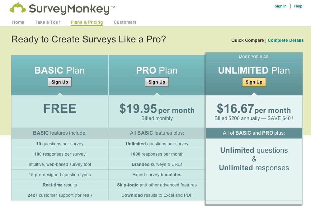
Pricing table at survey monkey
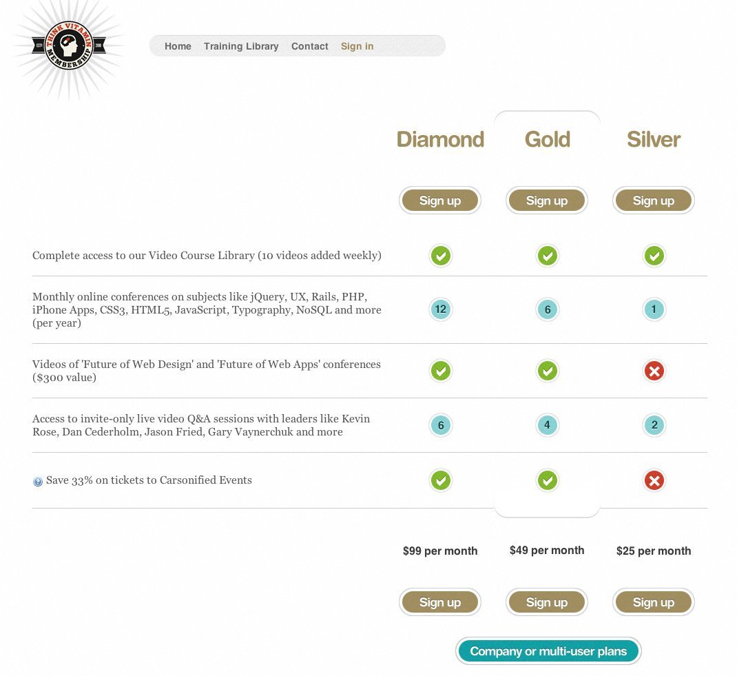
Pricing table at ThinkVitamin
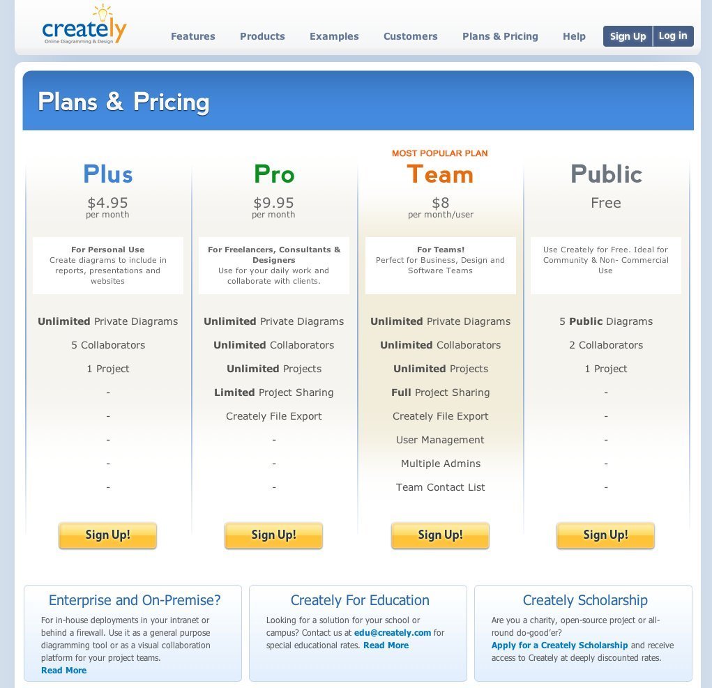
Pricing table at creately
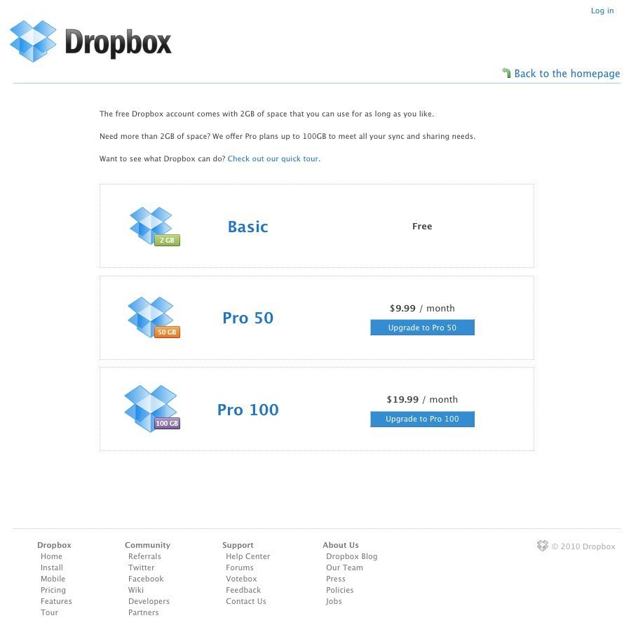
Dropbox' pricing table
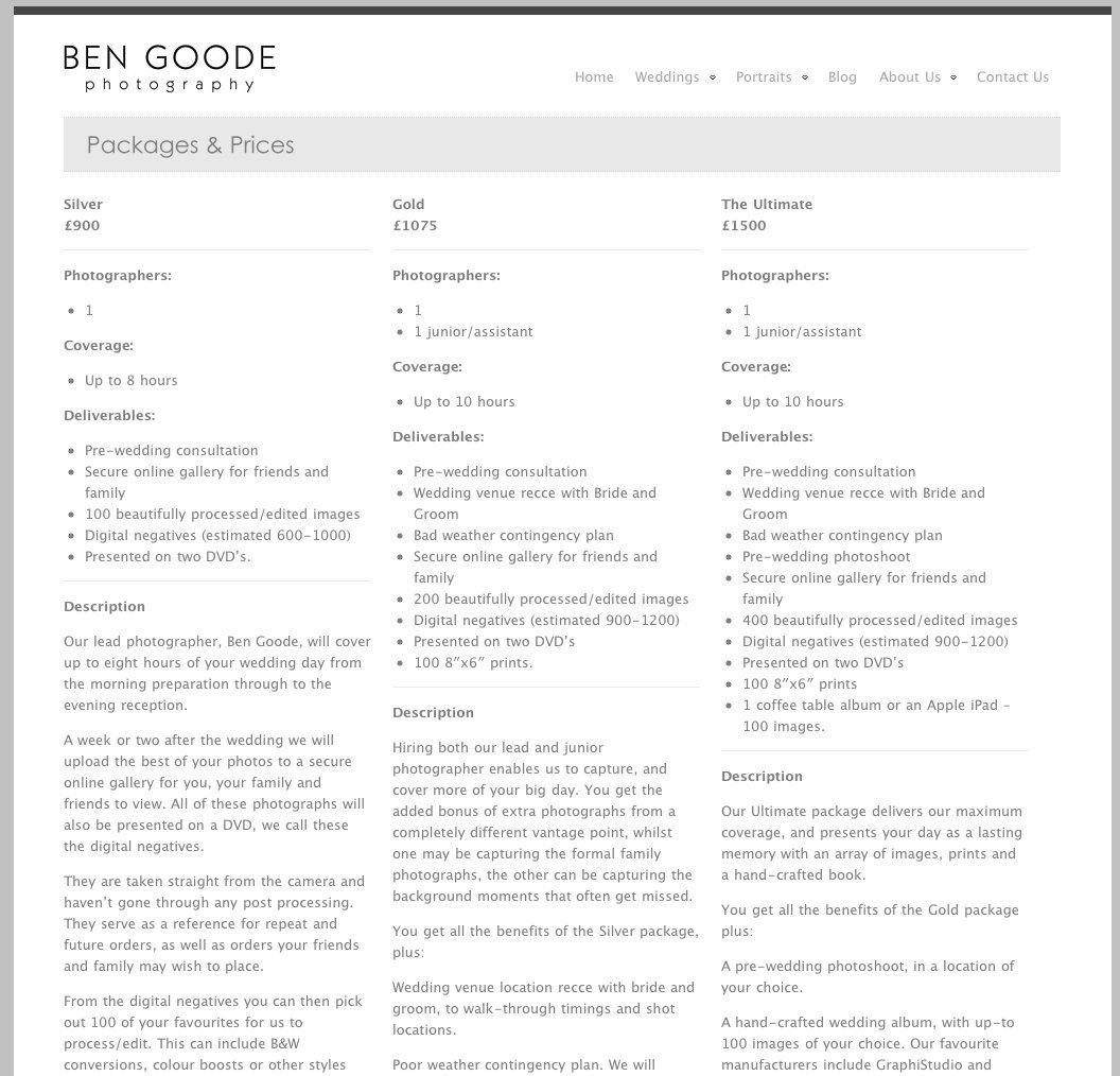
Pricing at Ben Goode
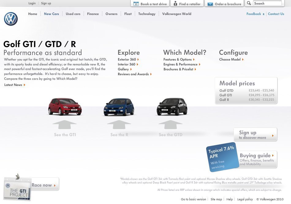
Pricing tables are even at work for physical products. Here it's for the Volkswagen Golf GTI
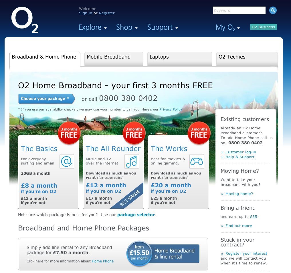
Pricing table at O2
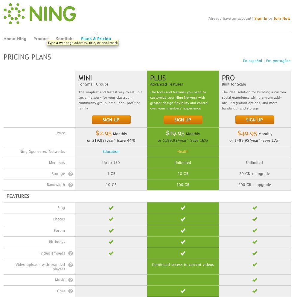
Pricing table at Ning.com
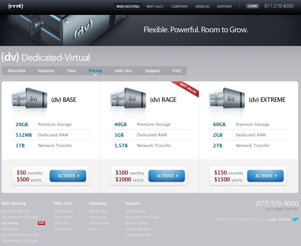
Pricing table for Media Temple
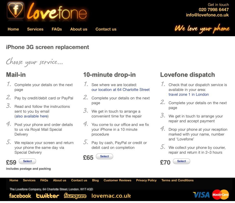
Pricing table at Love Phone
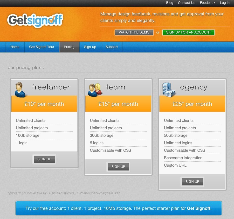
3-tier pricing table at Get Sign Off
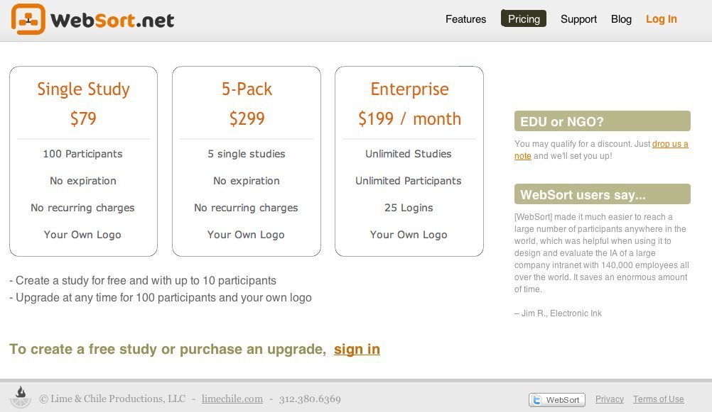
Pricing table at web sort
Although, with the iPad, Apple provide 6 options they’re conveniently divided so that once you’ve made the simple decision to go 3G or not the remaining choices conform to the principle.
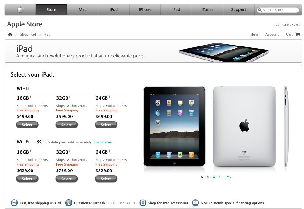
Pricing table for one of Apple's earlier iPads.
Too cold
When the range of products or services exceeds 4 placing them side by side and comparing price and benefits/features (as above) seems the best solution, however, there is a danger that customers will be overwhelmed by choice.
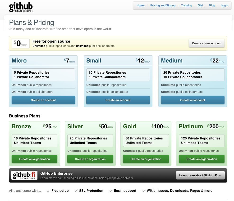
The pricing table at Github.com is parted into personal and business. Free is only for open source.
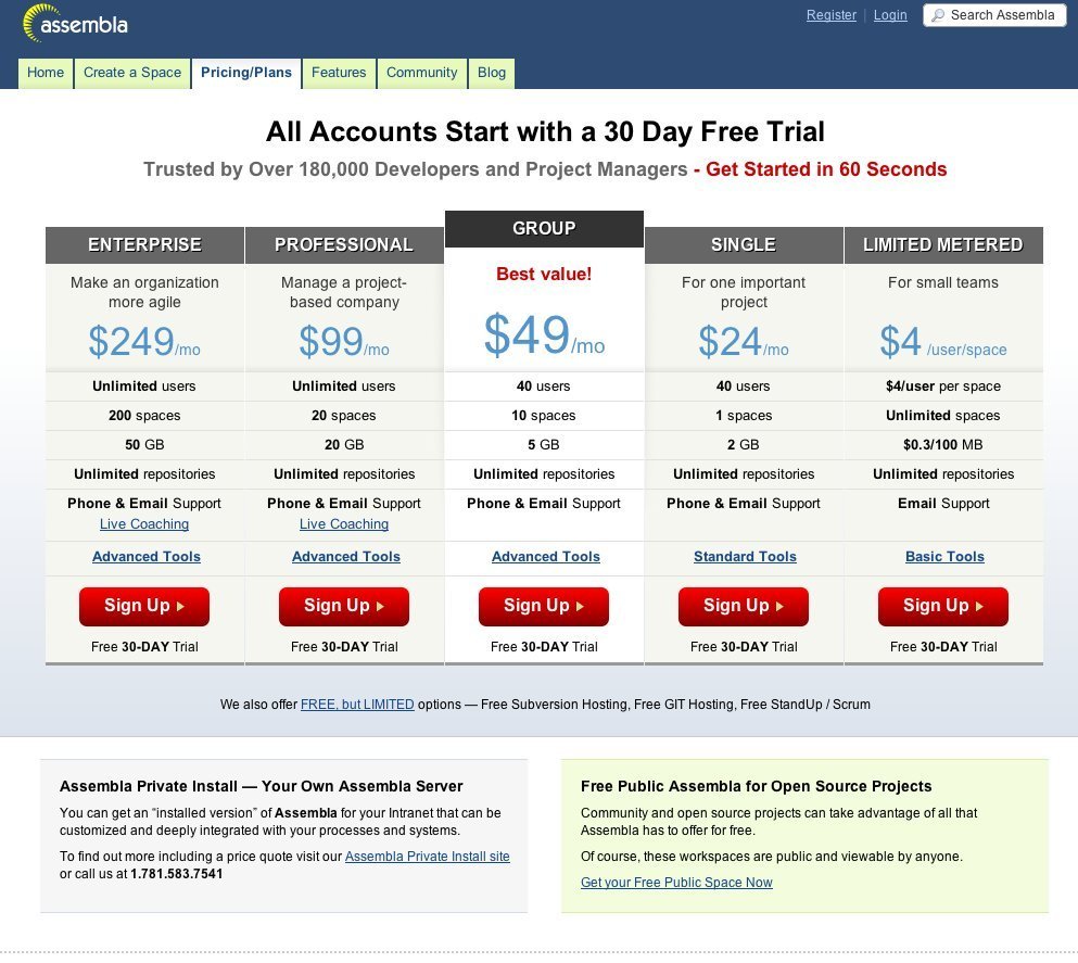
Assembla brings you a myriad of pricing plans.
Just right
Although the above examples arguably provide too much choice visually a couple of them deal with it nicely by highlighting the preferred option. Sites like Basecamp do this beautifully. The choices are kept to a minimum, the preferred option is given prominence and, in the case of Basecamp, it’s also highlighted as the most popular or best value.
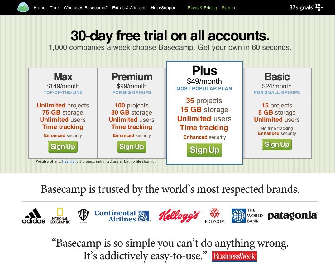
Basecamp's pricing table
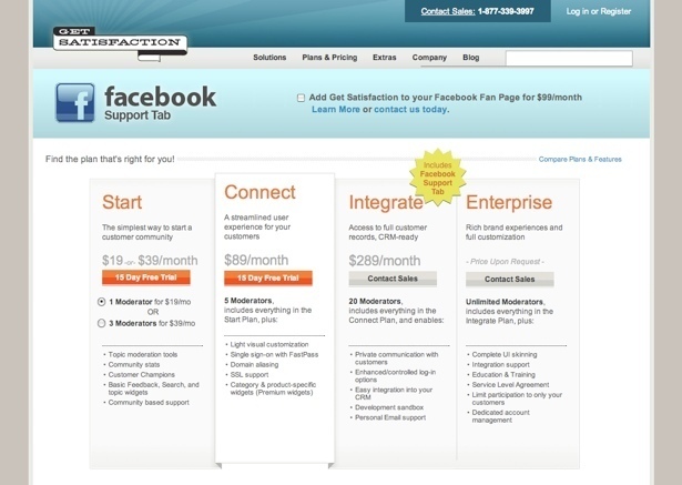
Get Satisfaction's pricing table
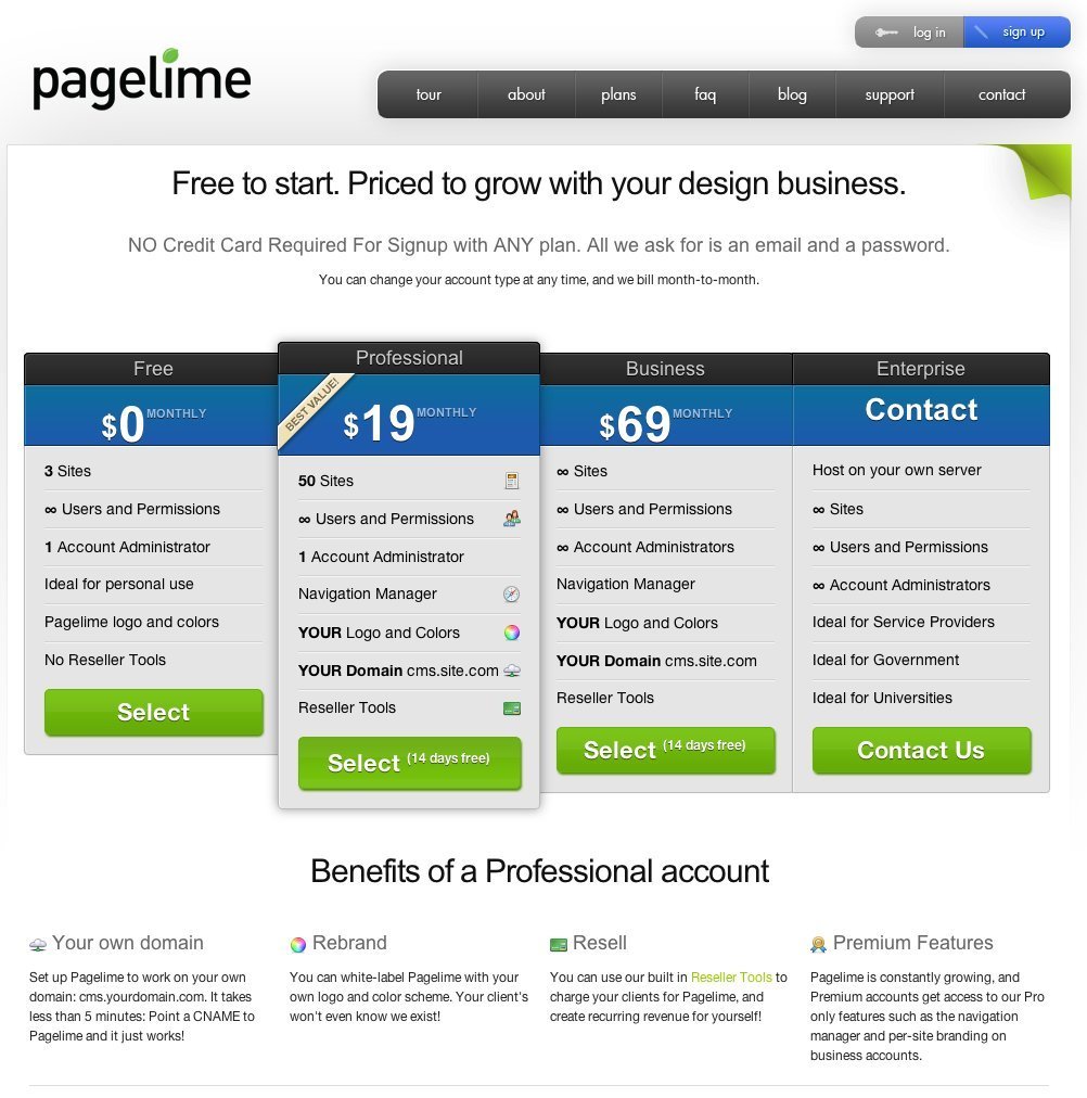
Pricing at PageLime
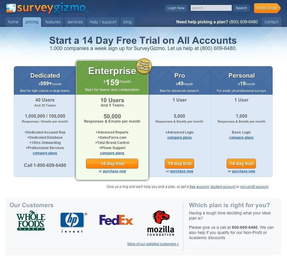
Pricing at SurveyGizmo
This post was written by Paul Seys, an experienced Interaction Designer and Head of User Experience at Redweb a digital agency based in the United Kingdom. Paul regularly writes for his blog shortboredsurfer.com. Follow him on twitter @paulseys.
Have you had any experience of the goldilocks effect that you’d like to share? Or maybe you have some good examples of it in action that we might have missed? Let us know in the comments section below.

11 comments
Jack on Nov 03, 2010
Very good post Paul. Great examples included too. Thank you for sharing.
Paul Seys on Nov 04, 2010
Thanks Jack, glad you like them.
Wendell on Nov 05, 2010
Absolutely love your website. I’ve been following it for years. I wanted to comment and say thanks for a great post. Thanks Paul!
gef05 on Nov 05, 2010
“The term derives from the Brothers Grimm tale in-which Goldilocks eats three bowls of porridge”
Dude! Love the post, but it’s not the Brothers Grimm.
Paul Seys on Nov 09, 2010
Oops, is it not?
Best Web Design on Dec 02, 2010
I am hearing the word Goldilock for the first time. It sounds interesting.
Jonathan on Jan 07, 2011
Great post Paul, this is so often overlooked by web designers. Rather than spending a fortune driving additional traffic to a website there are some basic principles, like the Goldilocks effect, which are tried and tested.
drupal web developer on Mar 21, 2011
Great post pual. you are doing a good job to all web developers & web designers. i was using this site wondering with this site.
Steve Gillman on Apr 08, 2011
I have seen this effect, and even when we are aware of it it works on us. The classic experiments in behavioral economics puts two items on a shelf – let’s say two microwave ovens, and tracks sales. Then, when a third is added that is much more expensive, the middle-priced one suddenly sells more. This suggests that we offer high-priced options that we never even need to sell, just to boost sales of the next-lower-priced option.
Steve Gillman on May 03, 2011
Good post. I actually suffer from “decision paralysis” quite often when there are too many choices. I have walked away (or clicked away) from more than one purchase because it got too confusing.
Darren Roberts on Sep 18, 2011
Great examples of many ‘Goldilocks’ effects there Paul,
I see this all over the place for hosting plans especially.
And the Dropbox example is also very familiar!
Many Thanks,
Darren.
Comments have been closed