This blog post is one out of several blog posts on improving your user interface sketching techniques. You might want to read the first two posts: Drawing corners and boxes as well as Drop Shadow.
Use a thick Sharpie
Sketching out a user interface is not about details but about concepts. It is about sketching – not drawing. When you draw, you tend to worry too much about making the details look good. This is why you might want to choose to utilize a medium or broad point permanent marker (Like a Sharpie pen or similar) to sketch your interface, instead of a thin point one – or a bullet point pen. So sketch big and focus in on loose form rather than tight line accuracy.
This is also why many find sketching interfaces on a whiteboard especially useful. Being forced not to draw details constraints your thought process into focusing on the concept and ignoring the details.
Some people prefer using crayons over Sharpies as Sharpies often bleed through the paper.

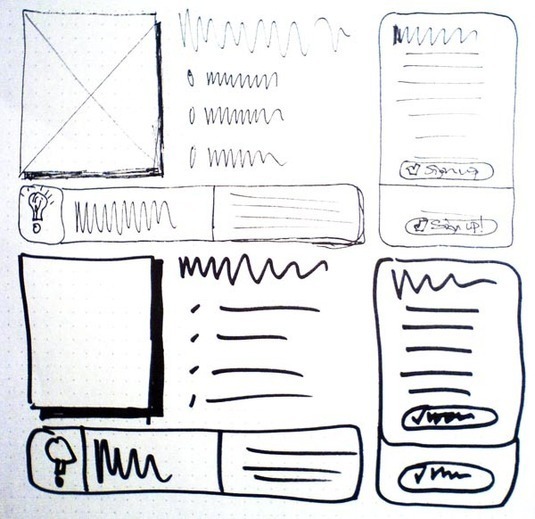
User interface sketching using a thin marker vs. a thick marker.
The above illustration illustrates how the sketcher tends to get into details when drawing with a thin marker. The thin sketch is both more correct and more appealing, but at the same time feedback on the thin sketch revolved more around details than the concept. The thick sketch was drawn about 10 times faster, and has its focus more on the concept. With the thick sketch, the sketch could be redrawn and iterated 10 times faster than with the thin sketch. It’s all about rapid prototyping and instant feedback!
5 comments
tim gummer on Feb 23, 2009
good point [ooh NPI.. seriously] – But better still for me is a really thick soft pencil lead – IE the whole thing is normal pencil proportions but entirely made of(coated) pencil lead – my fave is a 9B. Its softer than a pen and feels less committal. Of course it can be rubbed out, but the real security is that it FEELs like it can be rubbed out, and still has tbe ‘broadbrush’ simplifiying effect like to the [un]sharpie you suggested.
Website Redesign Services on Aug 27, 2009
This is just so true. Attention to details is something of paramount importance but can get a back seat at the time of prototyping. Great study and a valid conclusion.
Web 2.0 Development on Aug 31, 2009
Nice information on sketchers.
Steve on Mar 14, 2011
Why didn’t I think of this before. With all the UI’s I have worked on, I always drew on paper (in pen of course!) I am getting a whiteboard tomorrow.
Anders Toxboe on Mar 15, 2011
@Steve… why don’t you just buy a thick pen?
Comments have been closed