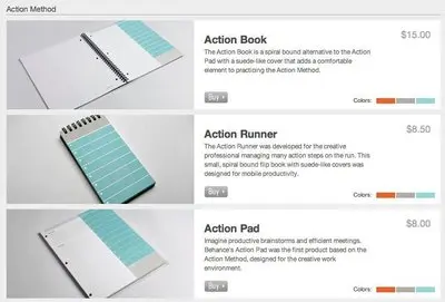
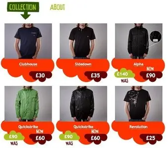
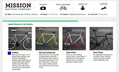
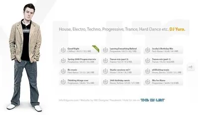
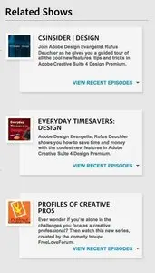
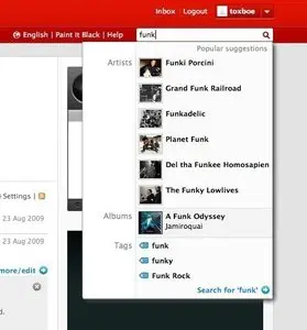
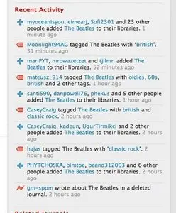
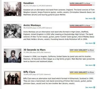
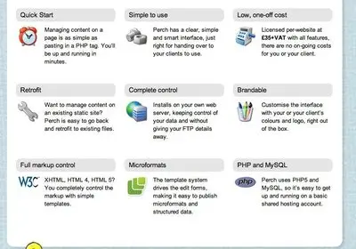
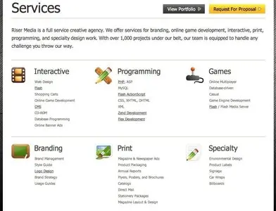
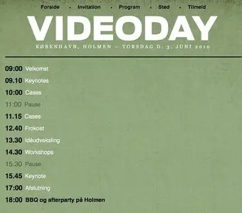
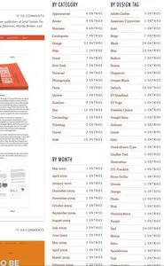
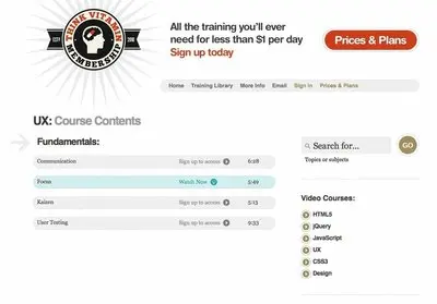
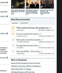
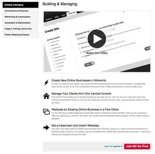
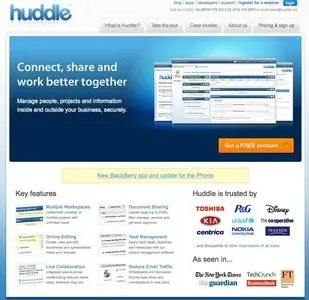
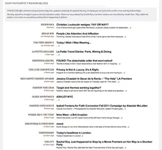
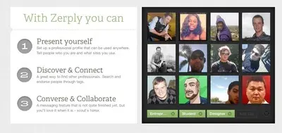
The 100 examples in the Lists screenshot collection show how much you can do with a repeated row, a few words, and a clear visual rhythm. Contacts, recipes, songs, products, features, and articles all use lists, but they ask people to make different decisions.
This guide explains the patterns to look for in the collection and how to choose between them. The screenshots are historical references, not evidence that these sites still look or behave this way. Use their enduring ideas about grouping, hierarchy, and comparison, then check your implementation against current accessibility and interaction requirements.
Jump to the 100 examples below.
Start with the task the list supports
Before choosing cards, icons, or separators, decide what people need to do.
| User’s task | Useful structure | What to prioritize |
|---|---|---|
| Find a known person, song, or document | Compact rows with consistent fields | Distinctive names, predictable order, search |
| Browse recipes, products, or portfolios | Image-led rows or a card grid | Recognizable images, meaningful titles, key attributes |
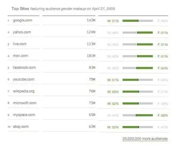
| Compare options | Aligned rows or a data table | The same attributes in the same positions |
| Follow a sequence or understand a ranking | Ordered list | Visible order and an explanation of what it means |
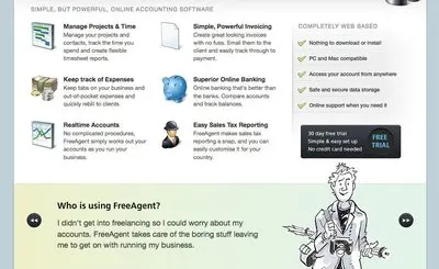
| Understand benefits or features | Short grouped list | Clear headings and concrete differences |
| Review changing results | Filterable list | Result count, active filters, stable navigation |
A card grid gives images room, but makes comparison harder when descriptions have different lengths. Compact rows fit more results, but need stronger alignment to keep metadata readable. A table becomes useful when people compare several attributes across items; a list is usually simpler when each item has one primary destination.
1. Repeat a consistent item structure
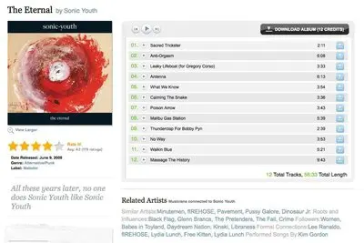
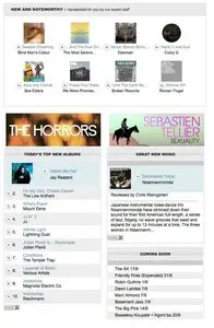
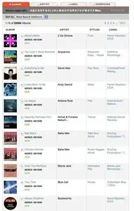
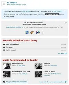
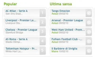
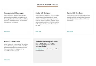
A recurring pattern across the collection is a predictable place for each piece of information. The contact-list example from Ballpark, the album and song lists from eMusic, and the job-opening list from Shake each organize a different kind of item. The shared design question is which information lets someone recognize the right result quickly.
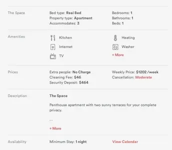
Give every item a primary label. Add secondary information only when it helps the decision: a contact’s company, a song’s artist and duration, or a job’s location. Keep that information in the same order throughout the list. If some records lack a field, make sure the remaining fields still make sense rather than shifting them into misleading columns.
Try it: write three representative items before styling the list: the shortest, the longest, and one with missing information. If the structure only works for the neatest record, revise it.
2. Use spacing to explain what belongs together
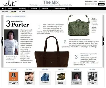
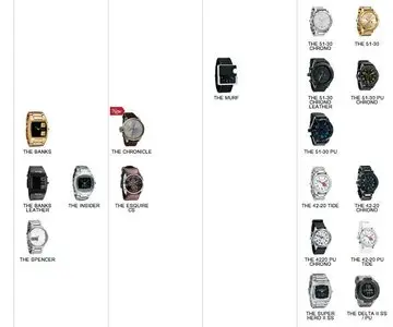
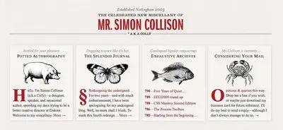
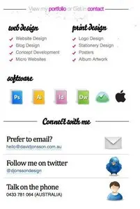
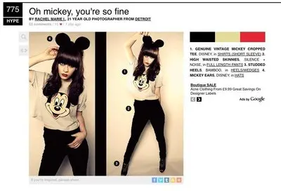
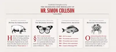
The collection includes whitespace-focused lists from David Jonsson and Jason Santa Maria, while the Vogue example calls attention to alignment and spacing. These references illustrate an enduring principle: spacing communicates relationships.
Keep the gap between a title and its metadata smaller than the gap between two items. Align repeated text edges so the eye can follow a stable path. Use a divider when adjacent items are otherwise difficult to distinguish; adding a border around every element can give minor information too much emphasis.
Dense lists can work well for frequent users scanning familiar records. More generous spacing can help when each entry needs explanation. Test both with realistic content and the screen sizes people actually use.
3. Make images and icons earn their space
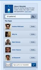
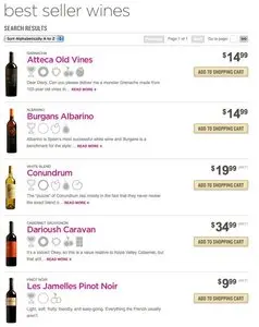
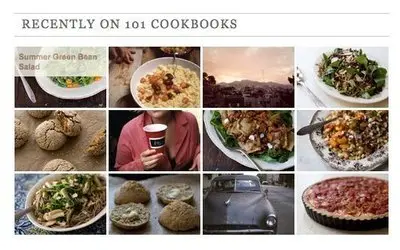
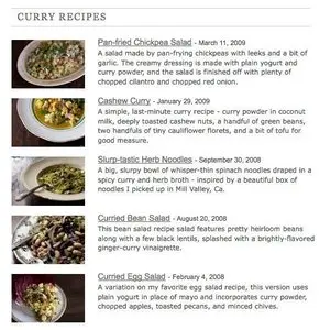
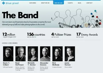
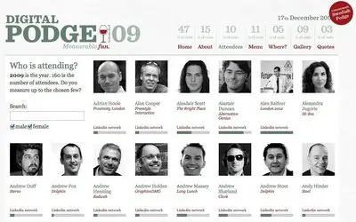
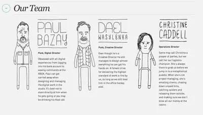
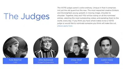
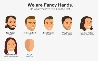
The recipe examples from 101 Cookbooks use food photography; the team and speaker lists use portraits; the wine-list example uses icons to describe characteristics. Each visual has a different job: recognition, identity, or an attribute.
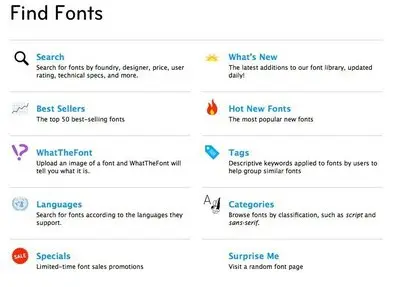
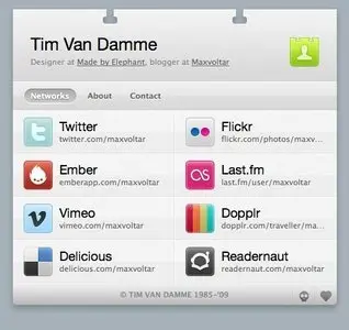
Use a thumbnail when the image helps people choose. Use a small icon when it communicates a meaningful category or status. Keep a text label for unfamiliar symbols and for distinctions that matter. Repeating the same decorative icon beside every item may add visual weight without helping anyone scan.
Keep image dimensions consistent so titles line up. For implementation, give informative images appropriate alternative text and decorative images an empty alt attribute. If a linked image and adjacent title lead to the same destination, avoid making someone tab through redundant controls just to reach the next item.
4. Choose numbers, bullets, and order deliberately
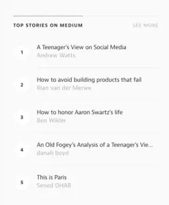
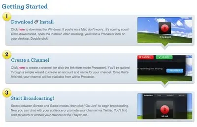
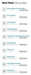
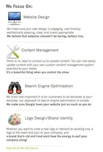
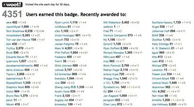
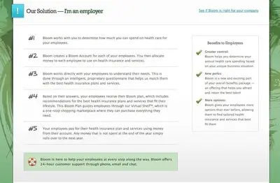
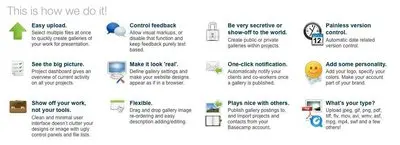
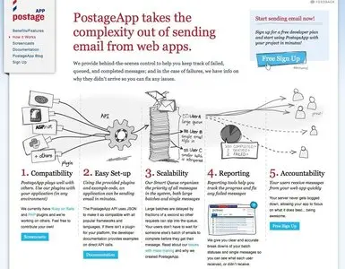
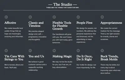
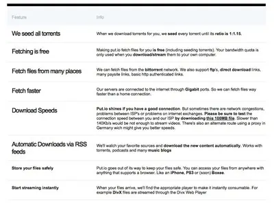
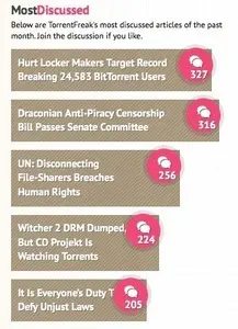
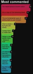
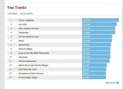
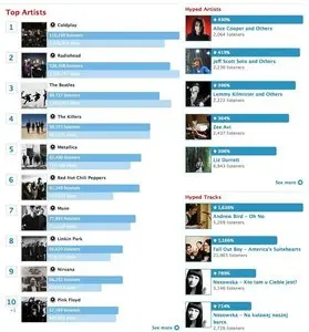
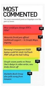
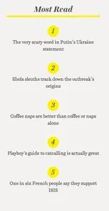
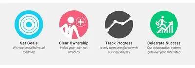
The collection contains handwritten numbers, numbered feature lists, and a Wikipedia most-read list with sparklines. Numbers can communicate sequence, rank, a reference to another image, or simply an item count. Those meanings are different.
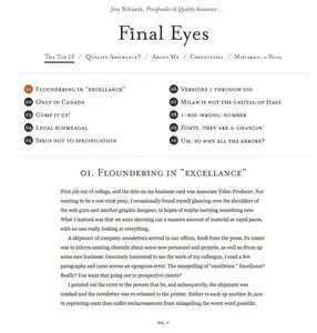
Use an ordered list when changing the order changes the meaning, such as instructions or a ranking. Use an unordered list when entries are peers. If the list is ranked, explain the basis: “Most read this week” is more useful than an unexplained “Top 10.” Dates, popularity, relevance, and alphabetical order each create different expectations.
The outfit example connects numbered garments in an image with a numbered list beside it. That is a useful reference pattern when someone needs to match a label to a specific part of a visual. Keep those connections understandable without depending on color alone.
5. Group long lists before adding decoration
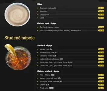
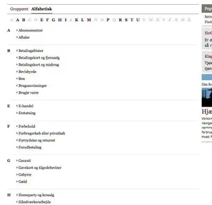
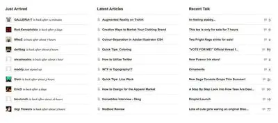
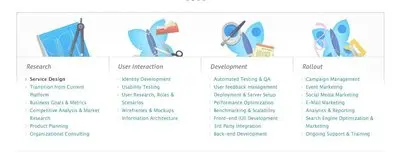
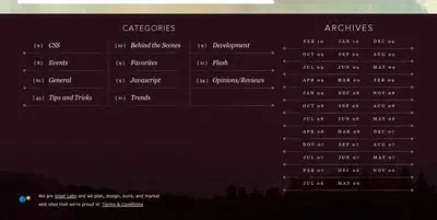
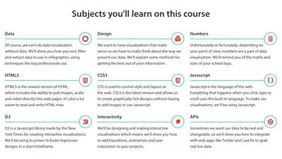
The alphabetical listing from forbrug.dk, the archive links from Jason Santa Maria, and the course-subject list from steer.me point to different ways of making a collection navigable. Useful grouping comes from the content: letters for known names, dates for archives, topics for learning material.
Choose headings that people can predict. Avoid splitting a short list into so many sections that users must interpret a new structure for every two items. For a long list, offer search when people know what they want, filters when they need to narrow a category, and sorting when order helps them decide.
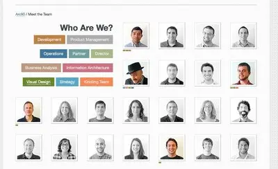
The employee-list reference from arc90 is described as filtering by job position. For a current implementation, show which filter is active, provide a clear reset, and explain an empty result. “No designers in Copenhagen” is actionable when it comes with a way to remove a filter.
6. Distinguish opening an item from acting on it
A list may let someone open a record, select it, download it, or change it. Make those actions distinguishable. A row that looks like one large link becomes confusing if a small control inside it performs a destructive action.
Use links for navigation and buttons for actions. Give each control a meaningful accessible name, especially repeated controls such as “Remove.” Keep secondary actions available to keyboard and touch users; a hover-only reveal cannot be the only way to discover them. Show visible focus and a clear selected state, and preserve that distinction when a row is also clickable.
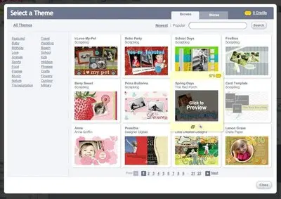
Screenshots show appearance, not working behavior. The collection’s expanding hover example from Scrapblog is a prompt to investigate what happens on focus and touch, not a reason to reproduce the effect without testing it.
7. Preserve the list’s logic on small screens
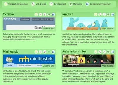
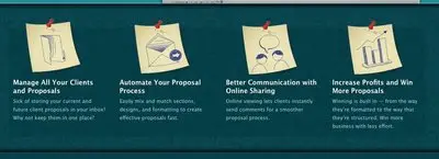
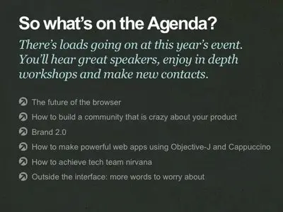
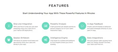
Multi-column feature lists, horizontal lists, and image grids all appear in the collection. When adapting those structures, preserve reading order and the relationship between a label and its details.
Let long titles wrap. Move secondary metadata below the title when columns become cramped. Avoid hiding an attribute that people need to compare. For a genuine comparison table, horizontal scrolling may preserve the relationships better than turning every row into a tall card.
If results continue over several pages, help people return to their place after opening an item. Pagination makes a bounded collection easier to revisit; a “Load more” control can support browsing. Infinite scrolling needs particular care with focus, history, loading feedback, and access to content after the list.
A practical review checklist
Pick a list in your product and use the gallery to explore alternatives. Then check the result with real content:
- Can someone identify the main label and distinguish neighboring items quickly?
- Are the attributes needed for the task visible and consistently positioned?
- Does the default order make sense, and is its meaning clear?
- Do images, icons, numbering, and separators each communicate something useful?
- Can someone complete the task with a keyboard and at a narrow viewport?
- Are loading, empty, error, selected, and filtered states understandable?
- Can someone open an item and return without losing their position or filters?
For accessibility details, consult WCAG 2.2, particularly information and relationships, keyboard access, focus visibility, and target size. A screenshot can inspire a layout; observing someone find, compare, or act on real items tells you whether that layout works.
Explore the 100 list-design examples
Compare references with the same task first: contacts with contacts, recipes with recipes, and rankings with rankings. Then borrow useful structures across categories. A consistent metadata column from a song list may help a document list; a portrait-based directory may suggest a clearer way to browse speakers.
The gallery below preserves the original examples and their captions. Look for the repeated decisions behind the styling: what is emphasized, what is grouped, what stays aligned, and what makes the next action clear.