I frequently find myself fully occupied watching conference talks on youtube.com and vimeo. It is often when I’m researching for a new blog post, adding an addition to my online course, or trying to figure out a solution to that annoying problem at work.
The best talks are often more than 5 years old. That annoys me. Why didn’t I find this talk earlier? I didn’t, because it didn’t occur to me to research that specific topic earlier. There are so many brilliant, inspiring, and jaw-dropping conference talks recorded and presented online in abundant numbers.
My problem: They are hard to find if you don’t know what to search for.
Presenting Talks by UI Patterns
That is why I created UI Talks. To collect the best recorded conference talks on UX in one place. To find all the hidden gems of the internet and present it in a much more accessible manner.
UI Talks is a collection of the best talks online on User Experience curated by yours truly. I am constantly adding new conference talks as I find them. All talks have been grouped into three categories:
- Topics. Browse topics like User Experience, Emotional Engagement, User Research, Data visualization, Design Patterns, and Mobile.
- Events. Wondering what conference to go to? Then browse the best talks of An Event Apart, Web Stock, or The Next Web.
- Experts. Find the best talks from speakers like Andy Budd, Jared Spool, Luke Wroblewski, Nathalie Nahai, or Josh Clark.
In this article, you are going to get an insight in all aspects of the project:
Design considerations
It was important for me to keep the concept simple and launch as early as possible in order to see if the idea was useful for other people than me.
I quickly settled on three simple views:
- Video page
- Topic pages
- The frontpage
My strategy was to first quickly iterate through paper sketches, code a simple data model consisting of videos and tags (which would double as topic, expert, and event data) and accompanying pages, and then launch it as soon as possible.
When watching videos, I had three important goals: give a great introduction, give a great watching experience, and help users discover similar and relevant videos. The introduction help make the page a good landing page. Even though all videos are of conference talks, it still makes sense to highlight for all external traffic. To give a quick loading experience, I first show the thumbnail provided by the youtube and vimeo APIs. Once you click it, the actual video will show and autoplay. Related videos are shown next to the video embed, and is based on shared tags.
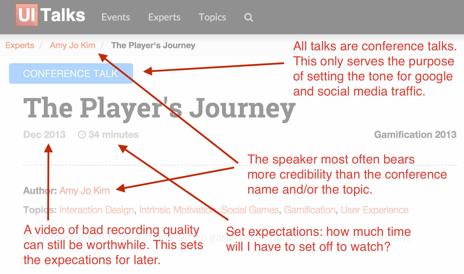
Initial design considerations for the video watching page.
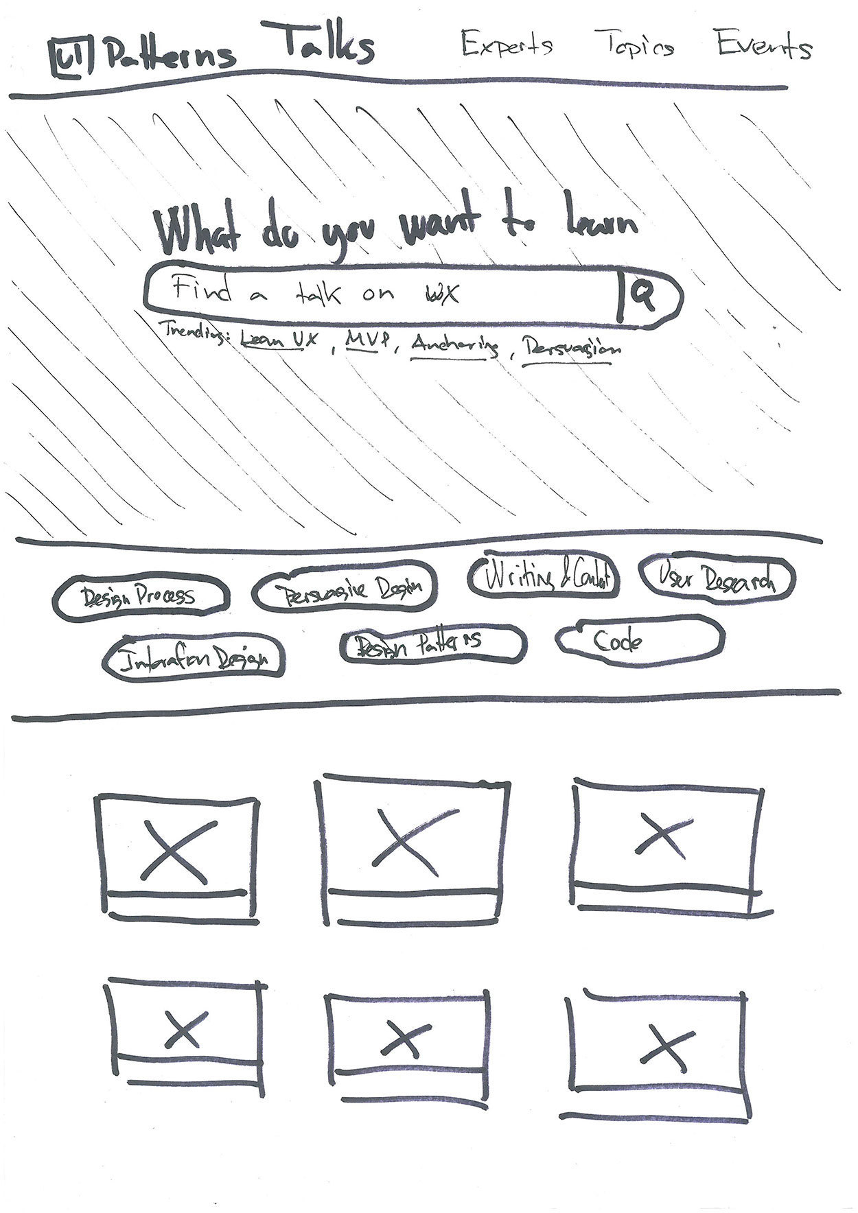
The very first paper sketch of the front page of UI Talks.
Topic pages are used for presenting, experts, topics, and events. I had two goals for this page: give a good and short introduction of the topic and list the videos associated with it. The two should be easily distinguished, why the first is put on a colorful background and the other on plain white. For the next design iterations, I hope to link to additional resources like books, websites, social media profiles, and the likes to provide a more full picture of the person, topic, or event in question.
For the front page, I wanted to show the value proposition up front: learn everything about user experience through watching great conference talks. I picked an active call to action based to a verb: “What do you want to learn”. Below it, I wanted to give a few hints as to which queries would yield a good response. This turned out both good and bad. I’ll get back to why, later.
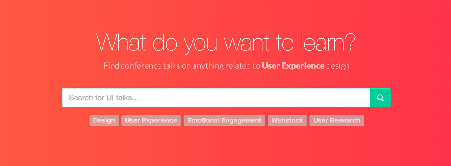
The big and bold call to action that serves as the value proposition of the site: What do you want to learn?
Go live and adjust
Before going live, I installed a user recording service to be able to peek into how users where actually using the site. That turned out to be a wise choice. For this case, I used mouseflow, which helped me discover a few usability defects over the first few weeks:
- First I had two newsletter sign up forms: one at the top and one at the bottom. Especially when enjoying the site on a mobile device, the search form and newsletter sign up form were hard to tell apart, why users would type in their search string in the email field. I also found out that nobody had successfully signed up using the top form – only the bottom form. Removing the top newsletter form all together seemed obvious.
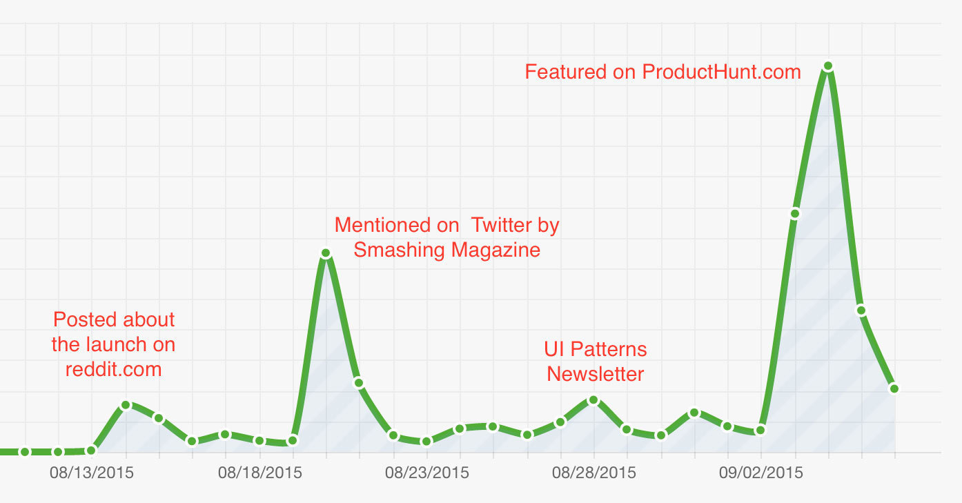
- Within the first 25 days UI Talks got picked up on Twitter by Smashing Magazine and was featured on ProductHunt. Both events drove in quite a lot of traffic. Here, I found out that the “What do you want to learn” phrase on the frontpage didn’t quite work as intended. Users would type on “speak japanese” or “physics” – topics that are clearly not relevant to User Experience. Putting emphasis on User Experience helped.
- Through scroll heat maps and playback of user recordings, I quickly found that users would quickly scroll down to the bottom part of the front page, where the most recently added videos can be found. After adding more videos to the list, people would scroll even more. If it wasn’t because I had an important call out for signing up for the newsletter in the bottom (and having deleted the top one), I had converted it to infinite scroll.
Topics over events and experts
The click heat map of the frontpage reveals a great deal. The most revealing fact that in all of the categorization, topics are the most interesting pull-behavior to browse for. Users come to get input inspired on the topic they are interested in, rather than to stalk their favorite expert. The heat map was created with mouseflow.
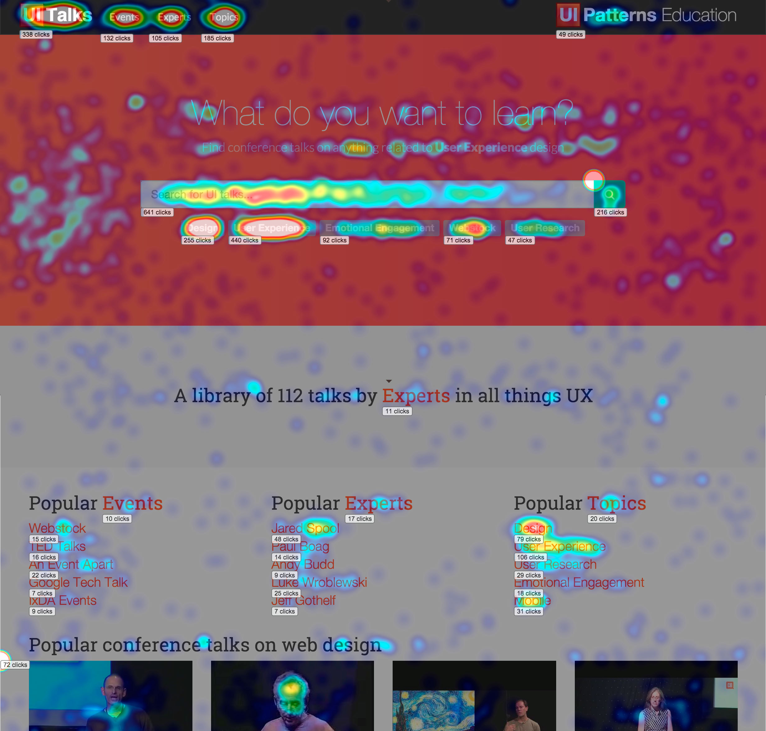
Click heatmap of the frontpage of UI Talks. Created with Mouseflow.com.
Still unsolved
I still have to figure out how to solve a few design challenges (recommendations are welcome):
- The search functionality is problematic. The search engine logic is flawed and too many searches return zero results. I am not sure whether it is due to the search functionality or whether there is never going to be enough content to provide decent search. Should I support push more than pull in my communication?
- Common for all talks on the site is that they deal with User Experience rather than technical details. Still, most users are searching for technical terms like javascript, python, php, and node.js. If talks on those subjects are truly groundbreaking and introduce thoughts that are also applicable for other technologies, then I will add them – but if it’s only for the technical aspects, then they don’t fit on the site. I guess my “What do you want to learn?” phrase, is biting me in my tail. How do I set the tone, so that people expect (and enjoy) great user experience talks (rather than technical talks)?
Marketing and traffic
Silent launch
I launched the site silently while still adding content, only presenting it to my friends and co-workers. It had the effect that some of the most talented designers, developers, and business developers I know started sending me their best tips on great talks. It was fun! I soon opened my eyes to a few new perspectives I would never have considered myself.
