Small tweaks can lead to crucial changes in your conversion. In this article, I’ll examine how design patterns, psychological principles, and practices can help you increase your conversion.
1. Add inline form validation
Adding inline form validation can help decrease abandonment in your onboarding, checkout, or lead sign up process. Without inline form validation, users are forced to spend extra time and another attempt if a form isn’t filled out correctly. Instead, consider alerting visitors of any errors as and when they’re filling out a form.
The Input Feedback design pattern is another name for inline form validation.
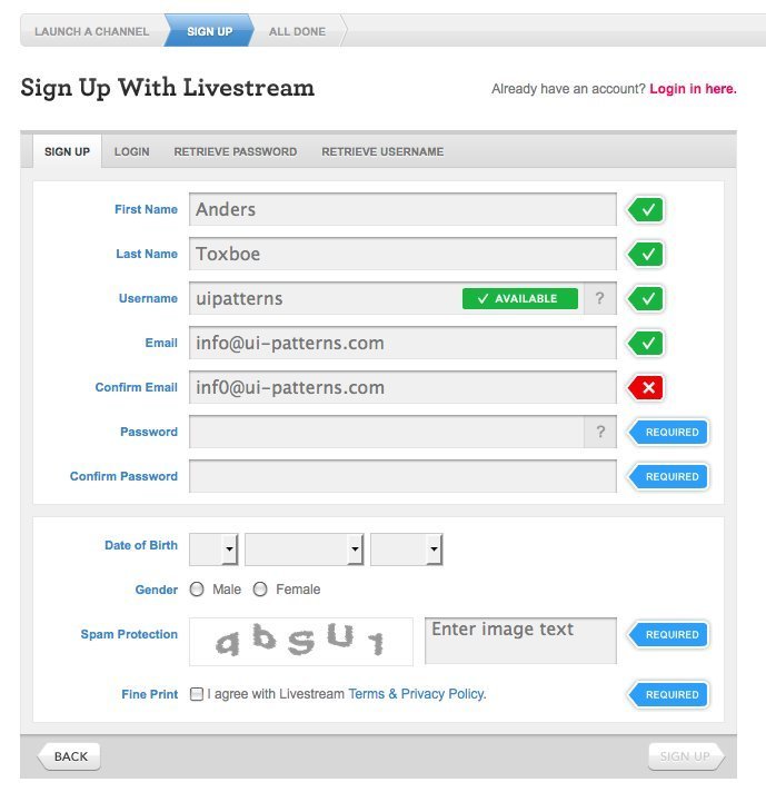
Inline form validation will help your users get your forms correct the first time around.
2. Design for trust: Use logos and seals
More than 50% of Internet users avoid buying online because they are afraid their financial information might be stolen. The fear of credit card information being stolen is a real concern. The same is true with your personal information.
Display logos of industry organizations, seals of security, or any other third party stamp of approval, which will eliminate the fears of your customers. Let users know how they can get in touch with you: provide phone numbers to your helpline over just displaying an email address. Focus on increasing your users’ trust in your website, brand, and security.

Buysellads displays a series of badges and icons that each communicate security and trust.
3. Add customer ratings, reviews, and feedback
Add customer ratings of your product or content within listings and on category pages. Visitors and shoppers love seeing what and why other people have bought the products they’re interested in. Displaying ratings and reviews to users will increase the likelihood of them progressing to a product page or reading the full length of an article.
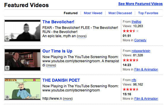
When listing videos, youtube.com displays the rating of each video to give the user an indication of whether the video is worthwhile or not.
4. Add testimonials
Do your customers love you? Great. Show that to everybody else. Testimonials can be very powerful for helping to establish trust and encouraging visitors to buy, sign up, fill out a form, or take whatever action you are after. They play on the persuasive power of Social Proof and also draws on the related persuasive principle of Authority.
The more users can relate to the testimonial, the more powerful they are. Due to the power of Liking, we respond more to testimonials of people we deem similar to us. We respond more to people from the same city than from the same country. The more imaginable people behind the testimonials are, the more we trust them, so accompany testimonials with real-face pictures of their authors.
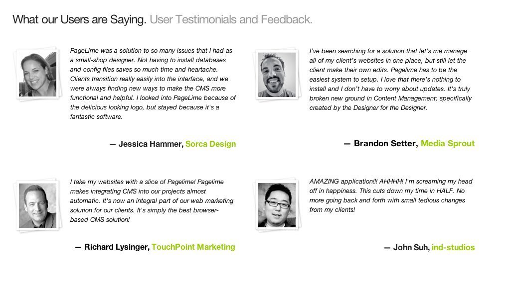
Testimonials help increase the Social Proof of your offering and will in turn help grow your credibility.
5. Play with Call To Action texts
In the last crucial moment of making a decision, a good Call To Action (CTA) text is what makes a user click. The more value and relevance the text conveys, the more clicks you will get. Focus on what the user is going to get by clicking on the CTA, rather than what they have to part with (eg. time, money etc).
Think about: “What’s in it for your users?”. How do you provide value? In a test by VWO, changing the CTA from ‘Book a free survey’ to ‘Get a free quote’, lead conversion increased by 60%.
Addressing anxiety concerns to your call outs by adding things like “Spam free”, or “Free forever” has also shown to increase conversions as well as adding a cue of urgency: “Try it now, free” works better than “Sign up for a free trial”.

UX Pin are masters of converting visitors to newsletter recipients. To get their free e-books, you need to give them permission to send their newsletter to you. Notice how the call to action is clearly focused on the value you receive.
6. Experiment with form lengths
Forms have the function of collecting information. Most marketeers wants as much information as possible about their potential leads and as a consequence creates mile-long forms. However, if visitors deem a form field unnecessary or think “Why do you need that?”, they’re very likely to abandon your form.
Reducing form length to the bare minimum has repeatedly shown to improve conversions. If that sounds too scary, then consider how you can either:
- Break up the form into more manageable pieces. If you are signing users up, then you might consider creating the actual account after step 1 (out of many), instead of waiting until the very end to close the deal. The information you gather in the rest of the steps will be an added bonus. This solution ensures that you will both receive sign ups from the people who tolerate long forms, as well as those who are only willing to play along for a short while.
- Collect the information you need from multiple touch-points. There are many ways of collecting data about users. All data doesn’t have to stem from the same sign up form. Collect phone numbers from password reminder services, preferences from their browsing behavior, and full names from ordering information.
7. Remove distractions
Your goal is to focus users attention on a single action at a time and keep them from being distracted. Go through your web design and examine whether anything could possibly divert visitors away the from the goal. The more visual inputs and action options your visitors has to process, the less likely they are to make a converting decision. Minimizing distractions like unnecessary product options, links, menus, and extra information will increase the conversion rate.
Consider the persuasive design principle of Reduction and try to reduce complex behavior to simple tasks, increasing the benefit/cost ratio of the behavior to influence users to perform the behavior. Consider the persuasive design principle of Tunneling and guide users through a process eliminating distractions that will divert users away from your objective.
8. Limit the number of options
When faced with too many choices, the result is often that we make no choice at all. As humans, we hate to make decisions – or in general spend precious brain energy on evaluating choices. We easily become paralyzed and as a result completely avoid particular tasks or decisions.
We tend to stick with the Status quo and accept the default option instead of comparing the actual benefit to the actual cost. This makes it possible to frame the option you would like your user to choose as the default option, and make the cognitive load to understand alternative options too big to comprehend at a glance.
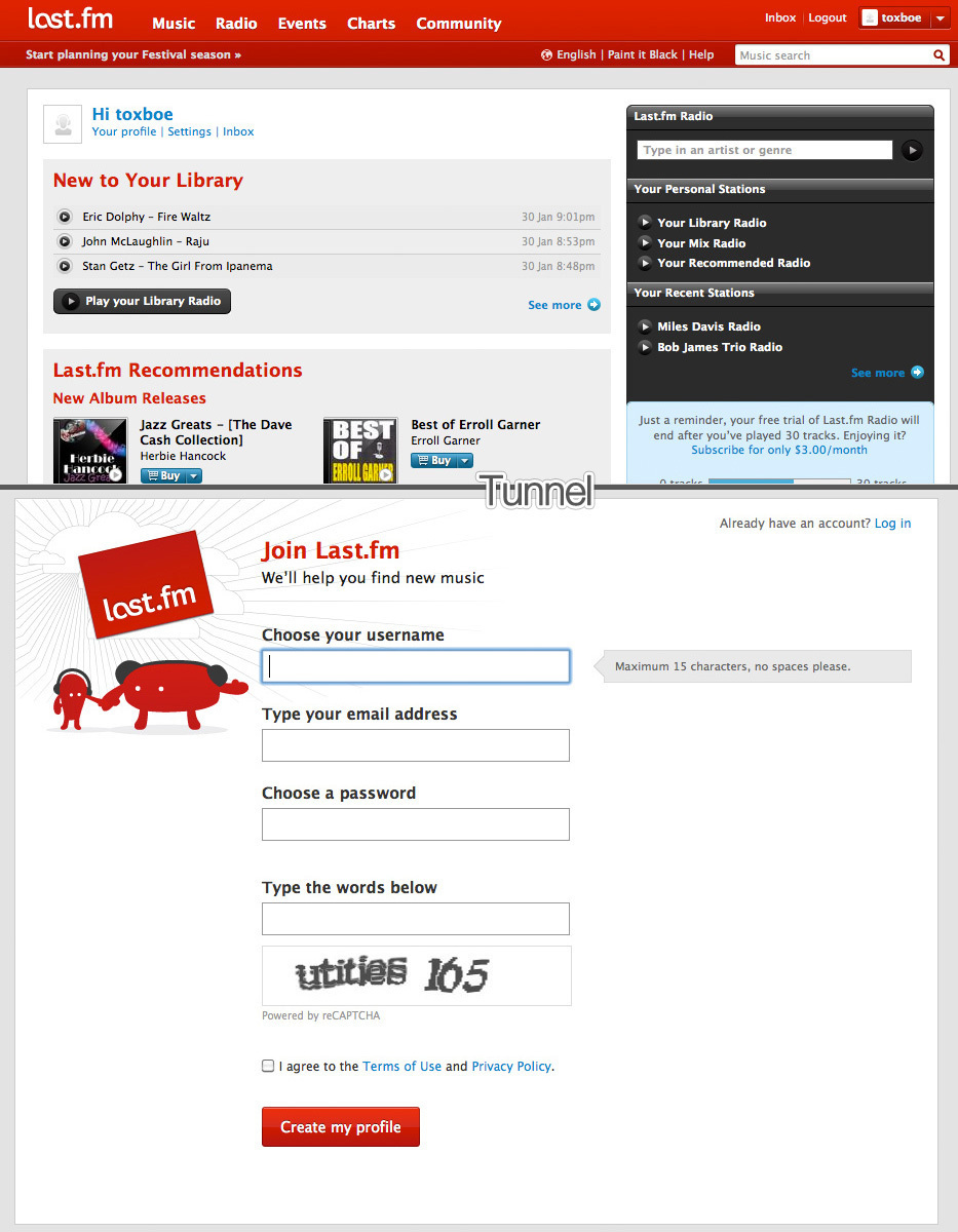
Last.fm uses the principle of Tunneling: as soon as you click their Sign Up button, all distractions disappear.
9. Add scarcity incentives
If you give people all the time in the world to make a decision, they will either take up every minute of that time, or never make a decision at all. By implementing scarcity techniques, you are essentially forcing users to take action.
It’s not enough simply to tell people about the benefits they will gain, if they choose your product or services, you will also need to point out what’s unique about your proposition, and what they stand to loose, if they fail to consider your proposal.
Common arguments for applying scarcity principles to digital products are:
- Information is too valuable. If everybody had the same information you are selling, then it wouldn’t be valueable.
- Quotas. Items left in stock, or simply an artificial limit.
- Limited time offers. Offers only valid for a certain period of time.
10. Add guarantees
Use guarantees to stir confidence in your offering, and in turn to increase conversion rates. For users, knowing there is a way out if the product is not satisfactory, makes it easier to commit in the first place.
As marketeers and designers, we’re helped by the power of the Commitment and Consistency principle. It ensures that once the commitment of buying a product or signing up has been made, we are more inclined to stick with that commitment. As humans, we feel an urge to be consistent to the voluntary and public commitments we make.
11. Test, test, test
No matter how you are trying to tweak your lead conversion, one important thing you should always keep in mind is testing. Your goal should be to have at least one, and preferably several A/B tests running at any given time on your site. There’s no “perfect” when it comes to conversion. The only way you learn about what works and doesn’t work is to continuously test.
