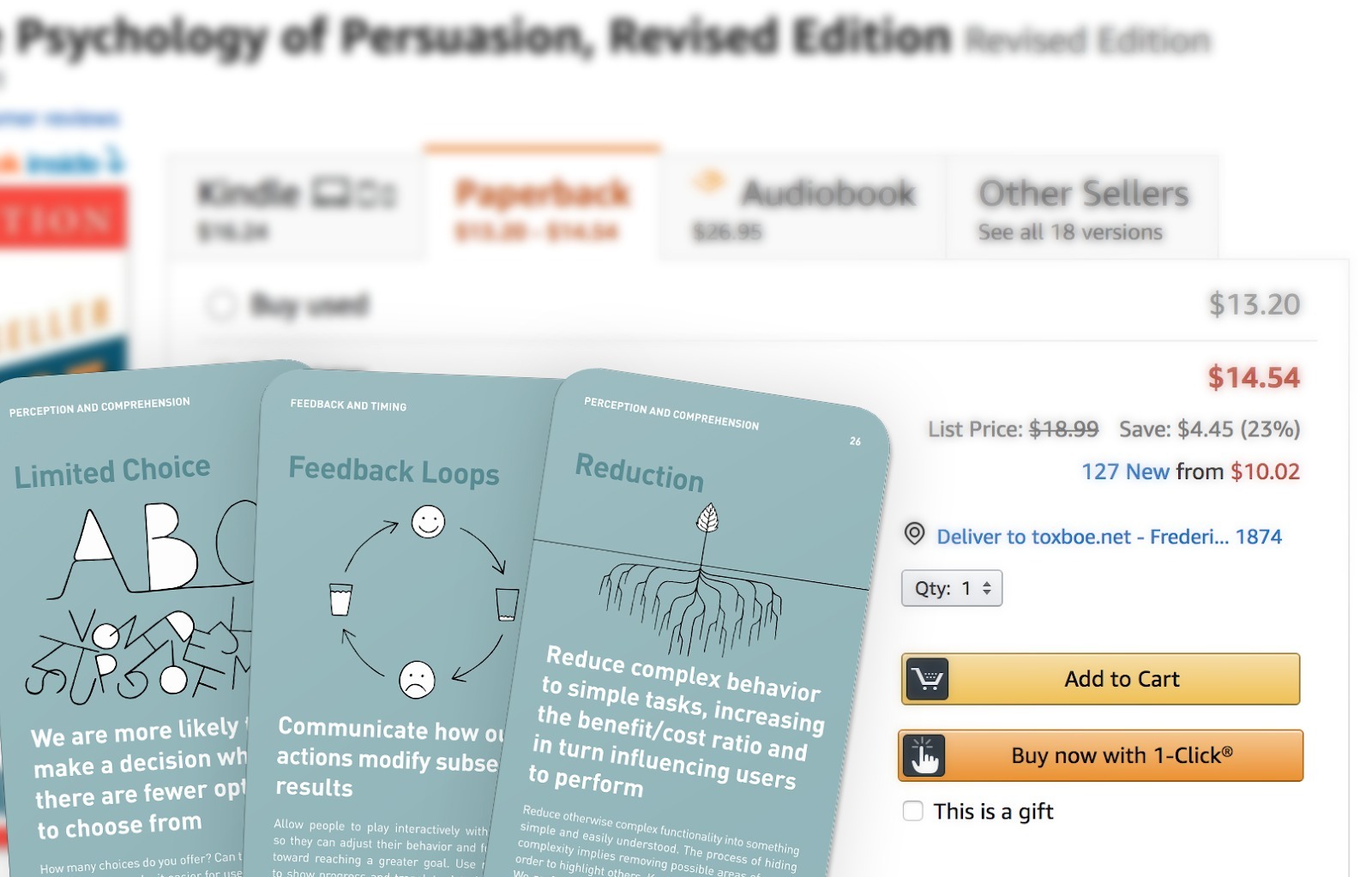
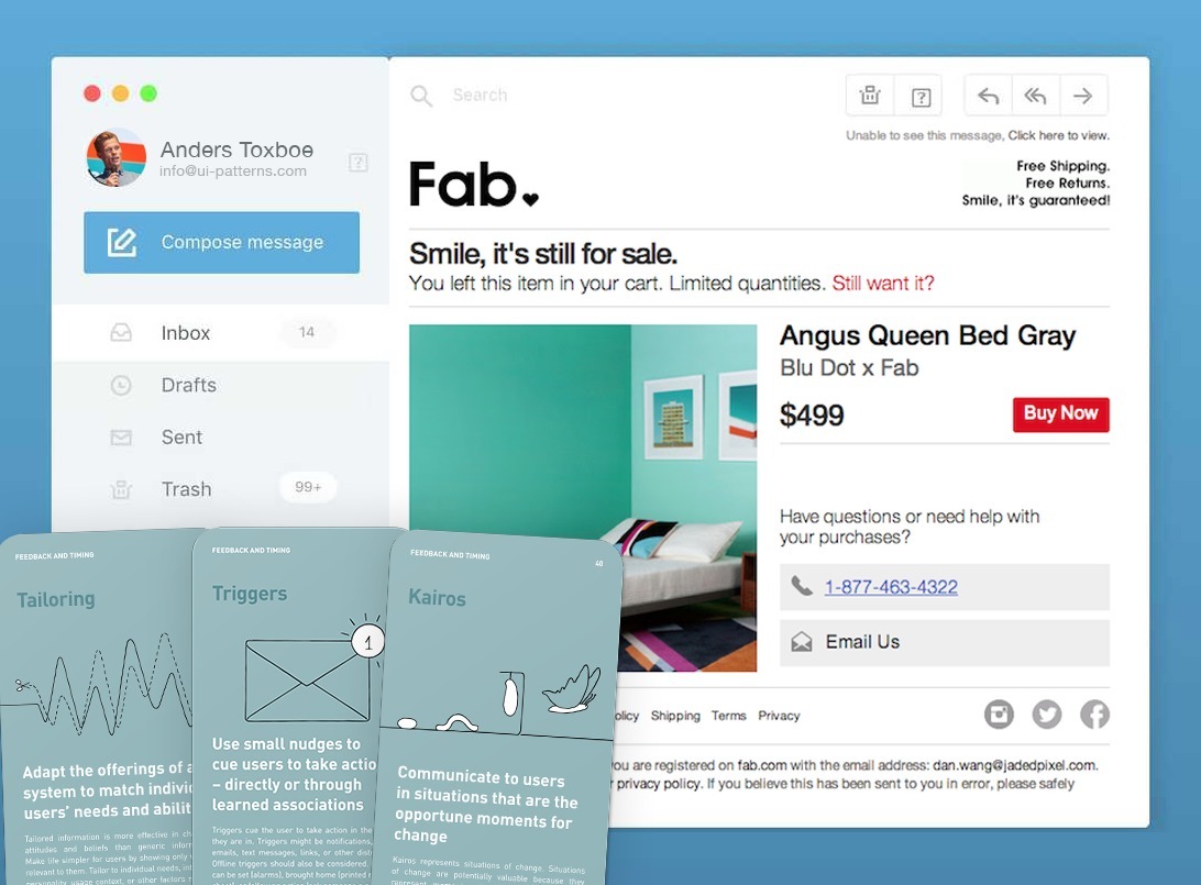
Persuasive Design has helped team members apply psychology to the design process, effectively establishing a more nuanced understanding and discussion of of the human mind. It has done so by digesting key psychological concepts into a simple and shared design vocabulary for team members to use in their daily work, called Persuasive Patterns. With a shared vocabulary about psychological concepts in hand, designers can start communicating more precisely about complex psychological concepts.

With the help of Persuasive Design, we can…

  • Aid users in making better decisions.
  • Nudge them toward completion of their goals
  • Assist them in developing new skills
  • Help them end- and begin new habits.

Although all noble goals, pushing too hard can become too much for users and backfire. When pushed too hard to commit to a decision, users end up feeling manipulated. Ultimately, they’ll end up abandoning the experience you designed for them.

Being nudged more than necessary toward a goal can be experienced as annoying – and as if completion of a goal is more important to the business than it is to the user. Being pushed too hard to learn something new will bring users stress and anxiety – and being reminded one time too many that we should have started or ended a habit (but that we failed), doesn’t exactly keep users motivated.

When pushed too hard to commit to a decision, users feel manipulated.

Design either enables or disables users

Instead of being concerned about being too pushy, too manipulative, or just too much, I suggest another way to think about persuasion. Generally, your persuasive efforts can be parted into two:

  • Things that enable users achieving their goal
  • Things that disable users (or hold them back) from achieving their goal

Some design structures can be classified as enablers and others as disablers. The right structures enable users and the wrong structures disable users. To design an effective user experience over time, focus on enforcing the enablers and reducing the disablers.

Enabling design structures are generally those that help users avoid thinking too hard while still providing a sense of autonomy and control. Enabling structures help users feel in control over a world that seems manageable and thus providing a sense of high autonomy and power to influence.

Disabling structures are generally those that make users feel manipulated, without control, and overwhelmed of too many options to consider. Disabling structures makes the world seem complex and hard to influence with its thought-consuming decisions and forced workflows that doesn’t necessarily cater to the best interest of the user.

Adding too many persuasive ingredients, even though they are all enabling to begin with, will add to the complexity of the experience. Since complexity itself is a disabling factor, adding too many persuasive ingredients, can end up keeping users from completing their goal.

Enabling a feeling of high autonomy

We strive to feel in control. A perception of greater autonomy increases the feeling of certainty and reduces stress. To increase the perception of freedom to make our own choices, always allow escape, speed up interactions, split up tasks and attention, and reduce complexity. To further add to the feeling of autonomy, focus on meaning, competence, power to influence, and emotional engagement.

Let’s examine concrete examples of how this is done in practice

Allow users to escape forced workflows

When signing up for Canva.com, users are led through an onboarding Wizard aiming to not overwhelm users by limiting choices to something users can recognize from memory rather than having to recall it.

The front page of Canva.com

The front page of Canva.com

While these are all well intentioned design patterns meant to aid users in getting a great start, they can equally be a pain and a hassle for many others.

However, it depends on the context. Some users like to be taken on a guided tour, but more like to learn through trial and error. The latter and larger part of users expect to be able to jump right in the product experience and get started. For these users, introductory slideshows, videos, and wizards are anti-patterns as they keep those users away from direct interaction.

This is why it is vital to allow users to escape forced linear flows like guided tours and introductory screens or videos. Canva allows for escape with a link at the very bottom of the screen, prompting users to “Play with Canva”.

Speed up interactions

As forced workflows grow complex, the longer and more cumbersome the user experience feels to the user. The feeling of operating in a complex user interface is a disabling factor for the user to reach his or her goal.

Speeding up or limiting the number of necessary interactions to fulfil a goal will help enable the feeling of autonomy and being in control. The shorter the distance from a user action to the responding reaction, the more autonomy and in control a user feels and the less likely he or she is to take a detour and visit the competition in the meantime.

One-click shopping at Amazon

One-click shopping at Amazon

Amazon has recognized this by reducing a complex shopping experience into a single click. Furthermore, they have capitalized on our quest for simplicity, speed, and feeling of autonomy by providing favorable shipping and return policies with their Amazon Prime membership program, which reduces complex barriers of purchase and speeds up the feedback loop considerably from purchasing to receiving your order.

Provide relevant just-in-time learning rather than unnecessarily interrupting

When you are new to Quora and start engaging with content, tooltips especially targeted novel users pop up to give provide an in-context and just-in-time guided tour. The same tooltip would be out of context for highly engaged users, well-versed in upvoting. Furthermore, the tooltip focuses on teaching the benefits and meaning (the why) of the functionality rather than explaining what it does (the how and what), which is well evident in the copy of the button.

Just-in-time learning at Quroa

Just-in-time learning at Quroa

Users will take the path that are relevant to them

What is interesting about the Guided Tour UI Pattern is that hints are only displayed when they’re relevant to the user’s current intent, why hints may appear in different orders for different users. This is a great way to set the user free from forced paths, as hints only appear when they are needed and relevant.

Users will take the path that are relevant to them. If you push your own agenda untimely and Interruptive, users will feel stressed and annoyed and might abandon your product experience before they even started.

Support practice rather than restricting play

Force-shaping behavior comes with a high risk of users ending up feeling manipulated. Avoid the risk by focusing on creating engagement toward a goal – and then facilitating the way. Communicate clearly to users how to reach an end goal, and nudge them toward the goal using small cues – or even spelling out the path.

Supporting practice rather than restricting play at Quora

Supporting practice rather than restricting play at Quora

After setting up an account at Quora, a clear path to completing account setup is paved for users highlighting the way to goal completion. A complex task has been broken down and sequenced into small and manageable bits. But notice how none of the tasks are interconnected, allowing users to jump in and out of the experience in the way they see fit.

Acknowledge fragmented user journeys

Chances are that users will not take the exact path you had originally set out for them, but instead a much more fragmented user journey, jumping in and out of your experience in sometimes unimagined order.

Acknowledging this fact will force you to start focusing more on the overall end goal for both your user and your business. User behavior rarely happens in a direct cause-and-effect loop but is often full of delays and detours that makes it impossible to limit the experience into a short time span.

What you however can do, is to map out when users are most likely to jump back into your experience, and try to set up hooks to get them back in.

Tackling fragmented user journeys at Facebook

Tackling fragmented user journeys at Facebook

Facebook has set up an elaborate mapping scheme, trying to lure users back in the experience to either finish what they started or start a new journey.

Tackling fragmented user journeys at Fab when abandoning a shopping cart.

Tackling fragmented user journeys at Fab when abandoning a shopping cart.

As many others, fab.com sends out emails to potential customers, who skipped the very last step of making a purchase – they abandoned their cart. Fab.com have identified that, the hours and days after a purchase-attempt, represent an opportune moment (Kairos) to persuade users back on the original path. In this moment, users are exceptionally open and receptive to closing their purchase.

Similarly other moments can be mapped out, where users are more inclined to make a deal, change behavior, or finish the journey they started. Instead of only mapping the user journey where the business is in control (when they are on the fab.com website), fab.com has also mapped opportune moments of chance where the user is busy doing something totally different. Here it can be beneficial to reach out to trigger users to come back to the loop.

Common hooks are abandoned cart emails like the example above, retargeted advertisement, or tapping into periodic events such as holiday seasons, the beginning of a new year, or opportunities for fresh starts in general. The more personalized and tailored you can make an attempt to reaching out to users to get them back in the loop, the higher certainty of success you will have.

Conclusion

Instead of focusing solely on eliminating concrete usability flaws as disablers, let’s consider complexity our enemy.

It is not only bad usability and user interface bugs that create friction in the user’s experience. To eliminate friction, we need to consider complexity the enemy rather than just usability flaws. As more attention are paid to creating effective user interfaces that cater to the purpose and intent of the designer, so is the attention paid to the needs of the business rather than the needs of the user.

As designers focus more on business needs than of user needs, a new source of complexity emerges: one of forced workflows and interruptive and untimely learning trying to lead users down a path from A to B as determined from the business’ perspective.

Instead of focusing solely on eliminating concrete usability flaws as disablers, let’s consider complexity our enemy.

Stop forcing users through forced and tunnelled workflows with no room for escape. Allow them to escape forced flows by skipping a step or leaving the experience only to come back at another stage. Don’t force untimely education and introduction, but let users out on deep waters with just enough practice and guidance to survive. Support practice and let users learn through trial and error.

Don’t expect users to take the path you’ve intended for them. Make it easy to jump in and out of journey and skipping steps on the way. Acknowledge that users take the journey that feels right to their current state of mind, but don’t be shy to make an effort to get them back in your loop.

Stop trying to tame the user experience - set it free!

Sources

1 The Illusion of Control persuasive design pattern

2 Wizard UI design pattern

3 Recognition over Recall persuasive design pattern

4 Limited Choice persuasive design pattern

5 Canva social media image creation service

6 Guided tour UI design pattern

7 Completion persuasive design pattern

8 Sequencing persuasive design pattern

9 Kairos persuasive design pattern

10 Trigger persuasive design pattern

11 Tailoring persuasive design pattern

Anders Toxboe Author

Based out of Copenhagen, Denmark, Anders Toxboe is a Product Discovery coach and trainer, helping both small and big clients get their product right. He also founded UI-Patterns.com and a series of other projects. Follow Anders at @uipatternscom.