AI didn’t remove friction from product development. It moved it to the moment of use.
AI tools have made AI UX design wildly productive: you can prompt your way to screens, flows, even working prototypes in minutes. But the friction didn’t vanish. It moved downstream. From makers to users. From “hard to build” to “hard to understand”. When AI prototyping UX outputs start behaving like production, you get pattern drift, broken mental models, and rising cognitive load UX — the silent tax that turns “looks great” into “feels confusing”.
AI shifted the friction downstream
Vibe coding doesn’t feel like work – until it ships
“Vibe coding” is the mindset of giving the AI a goal, accepting what comes back, and iterating by feel. Great for exploration. Dangerous as a delivery strategy.
Because what the AI gives you is often high-fidelity by default: nicely spaced UI, plausible copy, familiar components. It looks done, which changes the conversation. Stakeholders debate button colour while the underlying hierarchy and interaction logic are still half-baked. That’s not a tooling issue. That’s humans responding to fidelity.
Here’s the shift: classic product development had upfront friction (alignment, design rationale, pattern decisions). AI reduces that friction, but pushes the cost onto the *usage moment. Users pay it as hesitation, mistakes, and re-learning.
When something looks finished, teams treat it as finished — even when the structure isn’t.
Prototypes become production because they can
A prototype used to be obviously unfinished. Now it’s interactive, clickable, and styled. That makes it easy for teams, especially small teams, to quietly let “prototype” become “release candidate”. NN/g explicitly warns that AI prototypes can look final while lacking the underlying structure and usability work needed for real development.
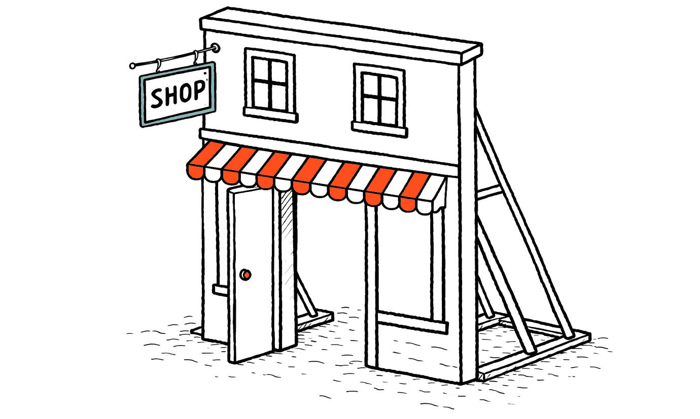
Real-world analogy: imagine a storefront facade built quickly for display. From the front, it looks complete — windows, signage, a door slightly open as if it’s ready for customers. From the side, it’s only a shallow frame held up by supports, with no real building behind it. It photographs well. It signals “finished.” People approach expecting a functioning place inside. The gap between appearance and structure becomes their problem.
That is vibe coding UX in production: polish applied to undecided structure.
UI pattern consistency is what makes products feel “easy”
Users don’t learn screens – they learn rules
People form mental models: beliefs about how your system works, used to predict what will happen next. When the interface communicates stable rules, users act with confidence. When it doesn’t, they guess.
Consistency isn’t aesthetic. It’s cognitive. Jakob Nielsen’s “consistency and standards” heuristic exists because inconsistency forces users to stop, interpret, and relearn — which increases cognitive load.
Inconsistency turns every click into a small decision.
Pattern drift is the new fragmentation
Large organisations have long created fragmented experiences through local optimisation: each area “works”, but the whole doesn’t. Navigation shifts, concepts get named differently, and similar problems are solved in multiple ways. LearningLoop frames this as a structural issue: local decisions accumulate into global incoherence.
AI recreates the same pattern inside a small team.
Every prompt is a local decision. Every generated flow is a new micro-standard. One screen uses “Save”, another auto-saves but still shows “Save”, a third uses “Done”. One area treats “Archive” as reversible; another treats it like delete. The UI is individually plausible. The product is collectively tiring.
NN/g found that AI tools often apply the wrong established pattern for a context (for example, interpreting “profile” as a social-media profile pattern, even when the real task is something else). The result “technically works” but is off by just enough to create friction.
High cognitive load is the hidden cost of fastly built interfaces
The three loads designers should care about
Cognitive load theory describes how limited working memory gets consumed during task performance, and it distinguishes between three kinds of load.
1. Intrinsic load: the complexity of the user’s actual task (e.g., reconciling an invoice, configuring permissions). You can’t remove it, but only clarify it.
2. Extraneous load: load created by how you present the task. This is where AI-driven pattern drift kills you: inconsistent labels, unpredictable navigation, shifting control behaviour. This is the waste.
3. Germane load: the effort users invest in building a useful schema (learning your product’s rules). You want this to pay off once, not restart every screen.
High cognitive load shows up in predictable symptoms: slower task completion, increased errors, more reliance on help text/support, and that familiar user quote: “I don’t trust what will happen if I click this.” NN/g ties cognitive load directly to burden on working memory and perceived difficulty.
So when you ship fastly built interfaces without UI patterns consistency, you don’t just create “UX debt”. You create working-memory debt.
Structure-first practices that keep AI honest
Put rules before pixels
If you want speed and coherence, stop letting the UI be the place where decisions get made.
Do structure-first work that AI can’t hallucinate for you:
- Flows: the user’s path, the forks, the exit points.
- Naming: one concept, one name (and a glossary if needed).
- States: empty, loading, error, success, partial completion, retry.
- Interaction rules: what’s consistent everywhere (save behaviour, navigation behaviour, undo/redo semantics, destructive-action patterns).
- Pattern ownership: who decides when a new pattern is allowed.
Design systems exist to encode these decisions into a shared language and standards that reduce redundancy and create consistency. That’s their job.
AI can generate UI. It cannot decide what your product should mean.
A short checklist for AI-assisted teams
Use this when you’re shipping with vibe coding UX energy:
- Write interaction rules before prompting UI (save/submit, navigation, destructive actions, defaults).
- Maintain a single naming source of truth (labels, object names, statuses) and enforce it in prompts.
- Define state requirements per component (empty/loading/error/success) before anything “looks done”.
- Run a “pattern drift review” weekly: find places where the same intent is implemented differently.
- Treat AI output as draft: no production merge without matching existing patterns or explicitly adding a new one.
Fast to build is fine.
Just don’t make users do the building in their heads.
