If you look at usability purely as a design concern, you miss its business impact.
From a business perspective, usability is risk management. Every unclear label, low contrast element, or ambiguous interaction increases the chance that a user hesitates, makes a mistake, or abandons a task. Those moments translate directly into lost revenue, higher support costs, lower data quality, and reduced trust.
Friction is not neutral. It is experienced as a loss.
Friction is not neutral. It is experienced as a loss.
Behavioral economics tells us that people are more sensitive to losses than gains. Loss aversion means that a negative experience carries more emotional weight than a positive one. A small frustration often outweighs a small delight. A confusing checkout step can erase the goodwill created by polished visuals or a thoughtful animation.
This has an important implication for product teams. Before investing in new features, visual refinements, or delight moments, you need to eliminate avoidable friction. Reducing losses has a stronger impact than adding minor gains.
Usability, viewed this way, is not just about making things easier. It is about protecting value.
Reducing friction is one of the most effective ways to reduce risk.
Friction Is a Risk Multiplier
Friction is often discussed in terms of conversion rates and drop offs. Those are outcomes. The deeper issue is unpredictability.
When an interface requires extra thinking or interpretation, results become less consistent. Some users succeed. Others hesitate, make mistakes, or abandon the task. The more cognitive effort required, the more variation you introduce into outcomes.
Unpredictability is risk.
Unpredictability is risk.
A slightly vague form label will be interpreted correctly by some and incorrectly by others. An unclear call to action will prompt confident clicks from some users and hesitation from others. Each small ambiguity increases the probability of error. Over time, those probabilities compound into support tickets, incorrect data, refunds, and loss of trust.
Friction is not just inconvenience. It is a multiplier of uncertainty.
Small Design Decisions Create Real Risk
Many usability risks look polished during design.
Thin, light grey text can feel refined and modern. The risk is that some users will struggle to read it. People with poor eyesight, aging vision, or low quality screens may find it difficult to distinguish. Reduced contrast increases cognitive effort and slows comprehension.
Icons without labels are another example. A row of simple icons can look clean and efficient. Yet users may not know what those icons represent. The risk is higher for people with cognitive impairments, lower computer literacy, or limited familiarity with digital conventions. When users must interpret instead of recognize, hesitation increases.
Even adding color to heading text can introduce confusion. If a heading appears blue, some users may assume it is a link. If it is not clickable, that small mismatch reduces predictability.
Individually, these choices seem minor. Together, they increase cognitive load and the likelihood of misunderstanding.
That increase in cognitive load directly affects error rates.
Cognitive Load and Errors
Users do not approach your product with full attention. They may be distracted, tired, stressed, or using a small screen. They may have limited experience with digital systems.
Every unclear label, inconsistent term, or hidden system state adds mental effort. As cognitive load rises, error rates rise with it.
Vague buttons force interpretation. Multi step flows without progress indicators create uncertainty. Ambiguous error messages leave users unsure how to recover. Inconsistent terminology makes people question whether two similar words mean different things.
When users are unsure, they guess. Some of those guesses are wrong.
When users are unsure, they guess. Some of those guesses are wrong.
Errors affect more than the individual user. Incorrect submissions damage data quality. Abandoned checkouts reduce revenue. Confusion generates support requests. In some industries, misunderstanding can even create compliance risk.
It would be unrealistic to remove all friction. Some friction is protective.
Intentional and Accidental Friction
The goal is not zero friction, but to remove unnecessary resistance while preserving safeguards where they matter.
Certain interactions benefit from deliberate pauses. Confirmations before deleting an account, reviewing an order before payment, or summarizing details before submission all reduce the chance of irreversible mistakes. This is intentional friction. It reduces risk.
Accidental friction is different. It comes from unclear language, weak contrast, inconsistent styling, or missing feedback. It offers no protection. It simply increases the chance of error.
The goal is not zero friction, but to remove unnecessary resistance while preserving safeguards where they matter. Recognizing accidental friction requires awareness, and usability testing helps. However, testing has limits.
The Limits of Usability Testing
Usability testing often reveals major problems. If participants consistently fail to complete a task, something is clearly wrong. Smaller risks, however, can go unnoticed.
Testing outcomes depend on who you recruit and how diverse they are. Many teams test with a narrow group. Subtle issues affecting people with reduced vision, lower digital literacy, or cognitive limitations may not appear.
You also rarely know the full range of future users. Because of this, it is safer to simplify early. If something feels slightly vague, clarify it. If a label could be misinterpreted, rewrite it. If contrast looks marginal, increase it. Reducing obvious risk before testing lowers the chance that important issues remain hidden.
Accessibility standards provide a structured way to do this.
Accessibility as Risk Reduction
Lower error rates reduce downstream costs.
Designing for a broad range of users means assuming variation. Consider people with poor eyesight, reduced dexterity, lower computer literacy, or temporary impairments such as fatigue.
The Web Content Accessibility Guidelines offer measurable benchmarks for contrast, focus states, and keyboard accessibility. Aiming for WCAG 2.1 Level AA is a practical baseline. It addresses many common barriers without being overly restrictive.
Following accessibility guidelines reduces the likelihood that someone struggles due to low contrast text or unclear focus indicators. It also reduces legal and reputational risk.
Accessibility is often framed as compliance. It is better understood as systematic risk management. When clarity improves, cognitive load decreases. When cognitive load decreases, error rates fall.
Lower error rates reduce downstream costs.
Workarounds and Operational Risk
When interfaces are difficult, users create workarounds. They skip steps, reuse passwords, share accounts, or avoid official processes. In some environments, they create shadow systems.
These behaviors increase security and compliance risk. They also increase operational costs.
Support tickets often trace back to small points of friction. An unclear empty state or confusing error message can generate repeated questions. Each ticket represents time and money.
Complex flows introduce more edge cases and failure points. Simpler, clearer systems are easier to test, maintain, and audit. Reducing friction lowers variability and limits avoidable cost.
With this mindset, it becomes useful to examine a concrete example.
Example: Buying a Bike
Imagine a product card for a road bike on an ecommerce site. In the original version, the bike image fills the top of the card. A thin, low contrast back arrow sits over the image. It blends into the background and is easy to miss.
Below the image, the bike name appears in light blue. It looks like a link, but it is not clickable. This creates uncertainty. The star rating and review count are also styled in blue, with no clear distinction between static text and links.
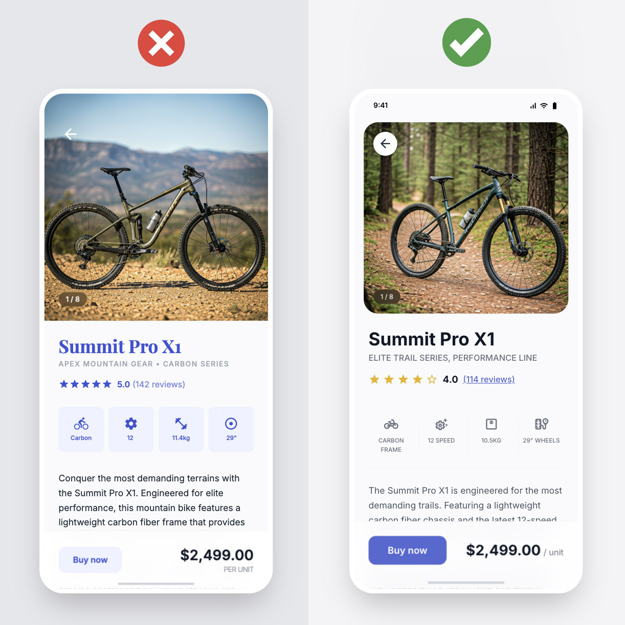
A row of feature icons follows. There is a gear icon, a frame icon, a suspension icon, and a wheel icon. None of them include labels. Users must guess whether the gear icon refers to the number of gears or the drivetrain type. The wheel icon could indicate size or brand. Interpretation replaces recognition.
The description text is small and low contrast. The primary “Buy now” button is pale and does not stand out from the background. The price draws more attention than the action.
Individually, these issues seem minor. Together, they increase cognitive load and hesitation. When buying a bike, users are comparing specifications and price. Any added uncertainty increases the risk of abandonment or misunderstanding.
In a revised version, the back arrow sits inside a clear button with sufficient contrast. The bike name is styled in a strong heading color and only appears as a link if it is clickable. The review count is clearly distinguishable as a link.
Each icon includes a short label such as “12 speed,” “Carbon frame,” and “29" wheels.” Users can scan without guessing. The description meets contrast guidelines. The primary button is visually dominant and clearly actionable.
The layout is similar. The difference is reduced ambiguity. The result is a lower risk interface.
Usability as Risk Control
Reducing friction is not simply about making an interface feel smooth. It is about reducing unpredictability. When outcomes are more predictable, error rates decline. When error rates decline, business risk decreases.
If you focus on eliminating friction before adding enhancements, you protect value first. Improvements then build on a stable foundation rather than masking underlying issues.
Good usability is not decoration. It is risk control built into the design.
