Rate Content
Design Pattern
Problem summary
The user wants to promote a specific piece of content in order to democratically help decide what content is of higher quality.
Example
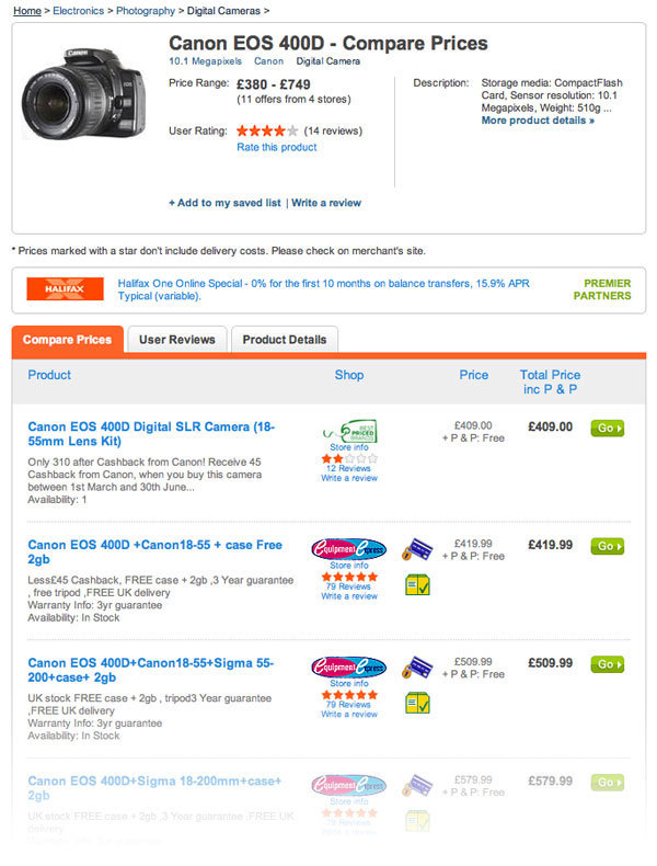
▲ At kelkoo, both products and sellers are reviewed. The rating of the sellers is presented next to their price for a given product and a textual description of each offer for each seller.
Usage
- Use when you want a mechanism to handle risk for your users: is an item of content worthwhile spending time and/or money on.
- Use when you want your users’ help to democratically decide what content is of higher quality.
- Use when you want to let the voice of your users guide other users in what is good and bad.
- Use when your website has a large user-base.
- Use when you feel that you can trust your users’ subjective opinion on which items are of higher quality than others.
- Do not use when your website has a small community. A large user base and a strong community is important for enough votes to be generated and in turn for comparison between items to render meaningful.
This card is part of the UI Patterns printed card deck
A collection of 60 User Interface design patterns, presented in a manner easily referenced and used as a brainstorming tool.
Get your deck!Solution
Let users rate content in order to democratically help decide what is of higher quality.
User ratings act as a mechanism to handle risk for your users: is something worthwhile to spend time or money on? Promote community participation by letting users democratically decide what is of higher quality. Consider accompanying quantitative ratings with qualitative comments or reviews.
This pattern is much like the Vote To Promote pattern. It differs from the Vote To Promote pattern by having different outcome. The outcome is to allow users to guide other users about what is good and bad rather than to promote what is interesting.
The pattern consists of a number of mechanisms that work together:
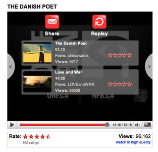
- Voting mechanism. Provide a mechanism for your users to rate an item on a numeric scale. The most popular scale is 1-5, where a rating of one is worse than a rating of 5. A user gets one vote and can possibly add an explanatory comment along with the rating. When a user rates an item, feedback should be given back to the user informing them that the rating has been recorded.
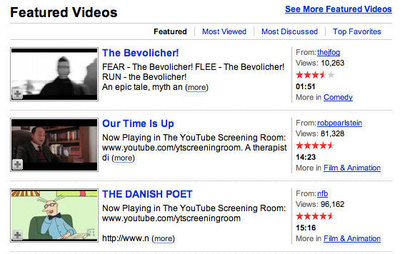
- Display the average rating an item has received. The average of all ratings an item has received shows the perceived quality of an item, and will guide new users in whether an item is worthwhile.
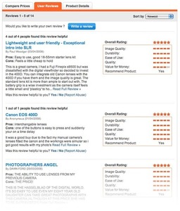
- Display explanatory comments from users rating an item. An item can often be rated either low or high for a number of different reasons all originating from different users’ subjective opinion. A perceived flaw by one user is not necessarily a perceived flaw of another. To add a more quality and depth to the given ratings, allow the users to review an item by letting them explain themselves in free text.
- Show the highest rated items. Sum up the highest rated items in lists on a main page.
- Favor quality items. Favor items rated high in search results, when browsing tags, and showing related information.
- Related items. When showing one item, display its rating. Additionally, use the people who also rated the item highly, to create a list of related items, by showing other similar items these people rated highly.
Rationale
The Rate Content pattern promotes community participation and can assist you in separating good quality content from bad quality content. This is especially useful when your website relies on user submitted content.
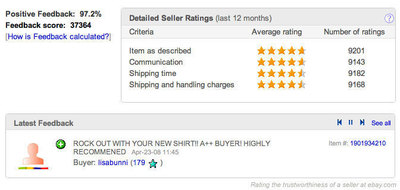
Rating content is about handling risk from the user’s point of view. Will a user on eBay cheat me or is a book on amazon worthwhile my time and money?
Discussion
The main reason to use the Rate Content pattern is assist the user in managing risk. Examples of such risk are spending money on buying a product or from investing time on another user.
When implementing a rating system, you need to consider a number of things in relation to what it should be used for and how it should be communicated:
- Who is doing the rating
- What is being rated
- What behavious are we trying to encourage or discourage?
Who is doing the rating
When reading reviews about an item and seeing how other users rate a given item a number of concerns are bound to be raised by the user: “Is the rating and review honest and authentic?”, “Are the users who rated a given item like me?”, and “Do the reviewers posses the relevant competence to review the product or service in question?”.
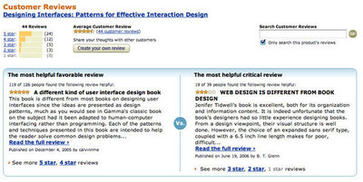
Amazon and Netflix have solved this problem by letting people rate the ratings: was this review helpful for you?
What is being rated
Be clear when communicating what is being rated and make sure that the user knows exactly what he or she is rating. If what is being rated seems ambiguous, the value of the review for other users in turn diminishes. For instance, if a website collects good computer deals that can be rated by the website’s users, is it the trustworthiness of the seller, the products, or the price that is being rated?
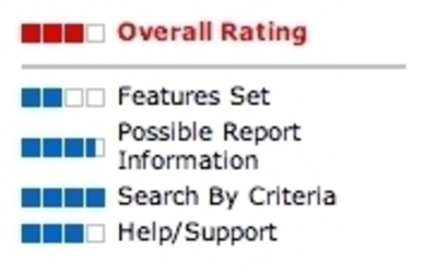
Consider making your rating system multi-dimensional, or simply be clear about what – exactly what – is being rated.
What behavious are we trying to encourage or discourage?
Like with the similar community driven patterns, several pitfalls can make or break the success of the Rate Content pattern. Are some users trying to promote or demote certain items? – perhaps their own or their competitors product – maybe their friends or foes. You might want to setup a number of measures to prevent users from misusing the system, such as limiting the maximum activity of a user, looking out for malicious activity, or promote trusted key users to count more than others
Design your rating system so that you encourage the behavior you want. Making your rating system multi-dimensional by breaking up the full rating into sub-parts that by their title explain exactly what you want measured (rated), is one way of solving this problem.
- On a scale from 1-5 at Boxes And Arrows by Alex Kirtland and Aaron Schiff.
- Vote To Promote design pattern at ui-patterns.com by Anders Toxboe.
More examples of the Rate Content pattern See all 33 example screenshots
User Interface Design Patterns
- Forms
- Explaining the process
- Community driven
- Tabs
- Jumping in hierarchy
- Menus
- Content
- Gestures
- Tables
- Formatting data
- Images
- Search
- Reputation
- Social interactions
- Shopping
- Increasing frequency
- Guidance
- Registration
Persuasive Design Patterns
- Loss Aversion
- Other cognitive biases
- Scarcity
- Gameplay design
- Fundamentals of rewards
- Gameplay rewards






3 comments
jbot on Oct 09, 2008
There is one caveat in this site’s own style of rating: internationalisation or i18n or short.
Basically, the use of thumbs-up and -down symbols might not necessarily mean the same in one culture as it does in another.
For instance, here in the West it derives from ancient Roman culture and has passed down through the ages to the present day whereupon it roughly means the same thing, i.e. suggestive of something that is favourable.
However, in Arabic countries it basically means, “up your’s, pal”. So when you see young Iraqi kids giving coalition troops the thumbs-up, they’re not welcoming their country’s new occupiers.
Hence it’s better to leave out potentially ambiguous imagery when being used to convey implicit messages, just in case. (I believe there’s more on this at the User Interface Hall of Shame website.)
Ben on Jul 01, 2009
There is a contradiction here.
“This pattern is much like the Vote To Promote pattern. It differs from the Vote To Promote pattern by having different end means. The end means is to allow users to guide other users about what is good and bad rather than to promote what is interesting.”
Not sure I agree with this, but let’s run with it.
This Web site uses vote-to-promote — the thumbs-up, thumbs-down which appears at the top right of the screen on this page. On hover I see that these icons indicate “This pattern was helpful” or “This pattern was useless”. That doesn’t sound like interestingness. That sounds like a decision about the goodness or badness of the pattern.
So according to what’s written in the Solution here, Rate Content would have been a more appropriate pattern than the thumbs-up, thumbs-down. Hmmm…
Anders Toxboe on Jul 01, 2009
@Ben: I totally agree. The wrong pattern is used for this site. It is only due to lack of time that it hasn’t been changed.
And I do concur – a site like ui-patterns.com should definitely be the first to take its self-prescribed medicine!
Comments have been closed