Input Feedback
Design Pattern
Alternate titles: Confirmation notice, Error notice, Alert, Inline Form Validation.
Problem summary
The user has entered data into the system and expects to receive feedback on the result of that submission.
Example
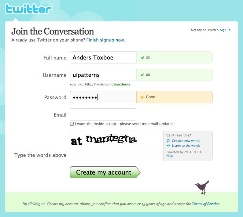
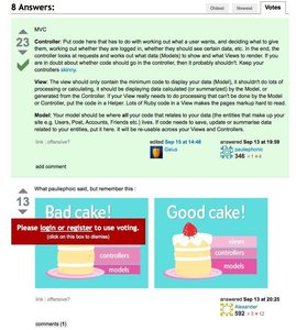
▲ When signing up at twitter, you instantly, as you type, receive feedback to what you have typed.
Usage
- Use when you want to provide feedback to the user upon submitting content to your site.
- Use when you want to notify your users about errors that happened during form submission.
- Use when you want to let your users know that everything went as planned upon content submission.
More examples


Solution
When users submit content to your site via forms, errors in the are bound to happen from time to time. The goal of this pattern is to improve the user experience by minimizing input errors.
A paradigm called data validation is well suited for catching errors at the time of submitting a form. A common way to tell if data validates is to set up rules for each input field in the form. The data entered must pass these rules to be considered valid. Such validation rules can be:
- Validate presence of content – at least some content must be entered
- Validate exclusion of content – prohibited values – for instance inserting ‘admin’ as username
- Validate inclusion of content – data must contain certain data or must be within a certain range
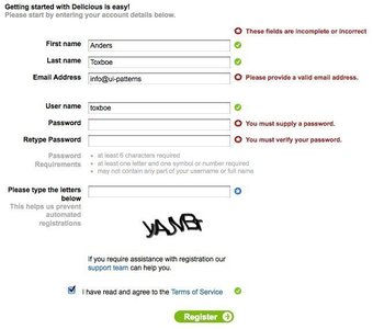
- Validate acceptance (of for instance terms of service) – often with a checkbox
- Validate confirmation – two input fields needs to match – seen with for instance passwords
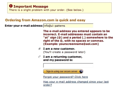
- Validate format – an email for instance needs an ‘@’ sign and a number of dots
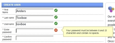
- for instance that the user must be above 18 year of age. - Validate length – A password must in many cases be at least 6 characters long.
- Validate uniqueness – Many systems only allow one user with a given username
If the data submitted by the user validates, it is good practice to let the user know that everything went as planned. Even better, redirect the user to a page, where he or she can see the newly submitted content in a context.
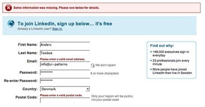
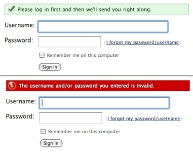
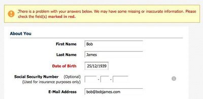
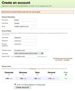
However, if the data submitted by the user does not validate, an error message should be presented to the user explaining how to correct the data and request for a re-submit. Such an error message should explain that:
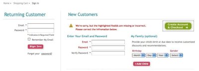
- An error has occurred. Display box at the top of the page (so that the user does not need to scroll the page to find out that an error occurred), preferably colored red to signal an error.
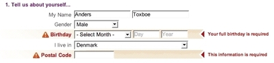
- Where the error occurred. This can be done by listing the fields that caused the error in the error message, as well as highlighting the fields (by changing their colors) that caused the error.
- How the error can be repaired. Provide information on what needs to be different in order for the field to validate. This can either be listed in the top error box or directly next to the field causing the error.
The visual representation of the input feedback should correspond with the message you want to give. If the submission went successfully, consider letting the user know in a green box. If the message is neutral, a color often used is yellow. If something went wrong, red is often used. But beware – red means danger – is the user experiencing a dangerous situation?
Rationale
As the user fills out a form on a web page, he or she is conducting the process of converting mental data structured in one way to a written form structured in another way. As all humans do not think alike, we are bound to enter the data in different ways as we try to convert our individually structured data to a shared structure defined by the system.
Data entered in web forms is prone to contain errors, which we must be prepared for in our design. The user must be made aware of the fact that the data entered did not match the structure that we designed for. Using visually distinct feedback notices, the user will be made aware of such errors and how to correct them.
Discussion
It can be argued that you should focus more on preventing errors before the user submits his or her data than on providing a good error message after data has been submitted. Consider constraining input with select boxes.
Consider the language of your error messages, as these may have an emotional impact on your users. What tone of voice is appropriate for your users?
Provide clear feedback after every action
Users will feel more confident and informed when they receive feedback from the system. Feedback includes notifications, dialog message boxes, colored or disabled buttons, loading animations, inline alerts, tooltips, hover effects and so on. Bridge the gap created between performing an action and evaluation of the system after an action.
More examples of the Input Feedback pattern See all 19 example screenshots
User Interface Design Patterns
- Forms
- Explaining the process
- Community driven
- Tabs
- Jumping in hierarchy
- Menus
- Content
- Gestures
- Tables
- Formatting data
- Images
- Search
- Reputation
- Social interactions
- Shopping
- Increasing frequency
- Guidance
- Registration
Persuasive Design Patterns
- Loss Aversion
- Other cognitive biases
- Scarcity
- Gameplay design
- Fundamentals of rewards
- Gameplay rewards
5 comments
Jasper Kennis on Mar 20, 2008
A great method, witch I think works best if you use both a warning at the top of the form, and one at the “breaking point” location, so that the user is quickly attended somethings wrong, and can then easily find where he’s made his mistake.
satyashish on May 22, 2008
I always come across this dilemma: Inline vs modal pop-up message box. In which context we should use each of them.
Pls provide a Pattern for the modal window message/ error message.
Mohammed Alaa on Jun 20, 2008
i like the idea of linked in and i love the inline validation method
thanks for sharing your information,
Mohammed
Michael Parenteau on Sep 03, 2009
Sorry…
I just re-read the article and use cases… because I would think that LinkedIn is hip to the as input fields are entered & out-of-focus validation. It says:
“Use when you want to notice your users about errors that happened during form submission.”
However, it then also says, “Upon Submission”…
What is being covered here? I guess I am not clear as to what is being said.
web design egypt on Nov 09, 2009
yeah Michael .. I am tottaly agree with you
Comments have been closed