Success State
Design Pattern
Alternate titles: Completion Screen, Celebration Moment, Confirmation Screen.
Problem summary
The first meaningful success often passes without the user noticing it, and without leading anywhere.
Example
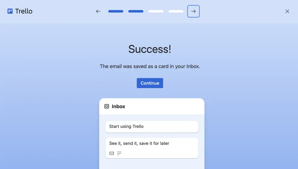
▲ In Trello’s tour, sending the example email is followed by a plain confirmation: “Success! The email was saved as a card in your Inbox.” The new card is visible in the Inbox beside the message, with one “Continue” button.
Usage
- Use when the user has just completed a meaningful first action.
- Use when the result is not obvious from the interface alone.
- Do not use when the action was trivial. Celebrating it would feel patronizing.
The card deck
Find more patterns like Success State in the UI Patterns card deck
A collection of 60 User Interface design patterns, presented in a manner easily referenced and used as a brainstorming tool.
Solution
Mark the moment the user succeeds, say what they achieved in their own terms, and show what to do next.
Name the achievement
Say what happened, in the user’s words and not the system’s: “The email was saved as a card in your Inbox”, or “Your first update is on its way to six people”. A generic “Success!” confirms that something happened. A named result tells the user what it was.
Show the result
Show the outcome next to the message: the new card, the sent update, the published page. Trello’s confirmation shows the email it just turned into a card, sitting in the Inbox beside the message.
Offer the next step
Give one clear way forward, such as “Continue” or “Plan the next one”. The success is the best moment to suggest what to do next, because the user has just seen that the product works. See Suggested Action.
Keep the celebration in proportion
A small animation or a friendly illustration fits a real milestone. Confetti on every click loses its meaning quickly. Save the larger moments for the ones the user will remember: the first sent update, the first published page, the first completed checklist.
Make it easy to move on
A success state should not block the next action. Let the user dismiss it, or continue, with one click, and don’t bring it back for the same achievement.
Rationale
People remember the end of an experience, and a clear success makes the experience a positive one. A visible confirmation tells users that they did it right, which builds their belief that they can use the product (self-efficacy). It also links the first success to the next action, so value becomes a path to follow instead of an endpoint.
Without a success state, users who just did something important can miss that they did. A message that appears and vanishes, or a change somewhere on the screen that they don’t see, leaves them unsure, which is the problem Input Feedback addresses for forms.
Discussion
Praise that overstates
Praise that is out of proportion to the achievement is noticed and discounted. A celebration for marking a to-do in a tutorial is a demonstration, and users know it. The same celebration for a real first task, done on their own data, carries weight.
Success is not the end
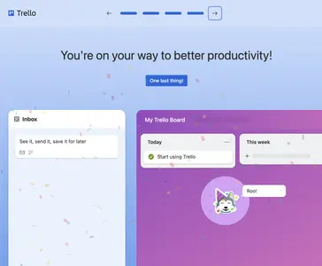
A success screen that only congratulates leaves the user at a dead end. Attach the next step to it, and let the product continue from there. In Trello’s tour the message that the first to-do is complete is followed by “One last thing!”, which leads to the next step.
Honest confirmation
Only show a success state when the thing actually happened. A confirmation that appears before an email is sent or a payment is processed causes confusion when the result fails. When something can take time, say so, and show the result when it arrives.
Success state and suggested action
A Suggested Action points the way forward from any moment. A success state is the moment right after an achievement, and it is where a suggested action works best.
Measuring it
Track click-through to the next step, and the second-session return of users who saw the success state compared with those who did not.
More examples of the Success State pattern