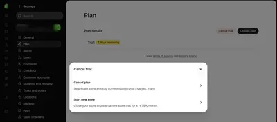
Trial Countdown
Design Pattern

Alternate titles: Trial Banner, Trial Status, Days Left.
Problem summary
Users lose track of when their trial ends, and the end comes as a surprise, either an unexpected charge or a sudden loss of access.
Example
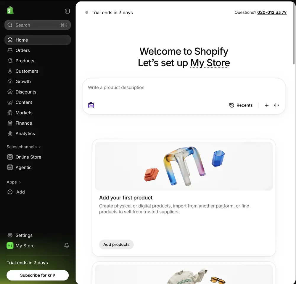
▲ Shopify’s home page shows “Trial ends in 3 days” twice, at the top and at the bottom of the navigation, with a “Subscribe” button next to the second. Both state a fact and stay out of the way.
Usage
- Use when the product offers a time-limited trial.
- Use when a charge or a loss of access follows the end of the trial.
- Use when you want users to decide on evidence of what they have done in the product.
- Do not use when there is no trial or deadline.
The card deck
Find more patterns like Trial Countdown in the UI Patterns card deck
A collection of 60 User Interface design patterns, presented in a manner easily referenced and used as a brainstorming tool.
Solution
Keep the trial’s status and end date visible in a small, persistent element, with a clear way forward.
Keep it small and always there
Show the days remaining in a compact element that is visible on every screen, such as a line at the top and a block in the navigation. It should state a fact (“Trial ends in 3 days”), not exert pressure.
Link to what happens next
Link the element to a page that explains what happens at the end and what the user can do: choose a plan, continue on a free plan, cancel, or export their work. Put “Choose plan” and “Cancel trial” side by side on that page, with equal prominence.
Warn before anything is charged
Send a reminder a few days before the trial ends, especially before any charge, and say what the charge will be.
Show progress toward value
Combine the countdown with what the user has done so far, so they can judge whether to continue on evidence and not on a feeling of deadline.
Rationale
Transparency about time gives the user control over the decision. A user who knows when the trial ends can use the remaining days well, and a reminder before charging builds trust that outlasts the trial.
Discussion
Information, not urgency
A countdown informs, while fake urgency pressures. Invented deadlines, countdowns that reset, and “last chance” offers fail the ethics test, and in many jurisdictions consumer-protection rules. The deadline should be the real one.
Trial length
A short trial puts the countdown in front of the user at the very start. Shopify’s trial is three days, so the element shows up on the first screen. Short trials need a path to value that fits in the time, or a way to extend or continue at a low price.
Charging without notice
Charging at the end of a trial without a clear warning is the most common source of complaints and chargebacks. Say what will be charged, when, and how to stop it.
Measuring it
Track trial-to-paid conversion, refund and chargeback rates, and complaints at trial end.
More examples of the Trial Countdown pattern