Feature Gate
Design Pattern
Alternate titles: Locked Feature, Upgrade Prompt, Premium Preview.
Problem summary
Paid features are either hidden, so users never learn they exist, or locked without explanation, which frustrates users who try them.
Example
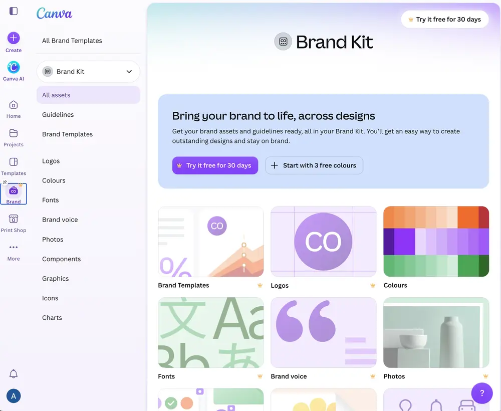
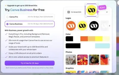
▲ Canva’s Brand Kit page is open to free users, but its sections carry crown icons and the page offers “Try it free for 30 days” next to “Start with 3 free colours”. The Brand item in the sidebar carries a crown too.
Usage
- Use when a paid feature would clearly help with the user’s current task.
- Use when the product has a free tier and the paid features are discoverable in the interface.
- Do not use when the gate would interrupt the user’s first experience of value.
- Do not use when the free product would feel incomplete without the gated feature.
The card deck
Find more patterns like Feature Gate in the UI Patterns card deck
A collection of 60 User Interface design patterns, presented in a manner easily referenced and used as a brainstorming tool.
Solution
Show the feature where it would be used, marked with a small label, and explain it when the user tries it.
Mark locked features in place
Keep the feature visible, with a small, consistent mark such as a crown, a “Pro” label, or a lock. Users learn what the paid plan includes by seeing it in context, not by reading a pricing page.
Preview what the feature would do
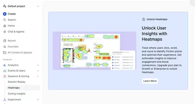
When the user tries a gated feature, show what it would do with their own work, or with a convincing sample: a preview, a sample result, or a short trial. A dialog that lists benefits next to a picture of the feature in use is stronger than a list alone. Amplitude’s locked Heatmaps page shows what a heatmap looks like, explains what it tracks, and names the plans that unlock it. Canva previews its Brand Kit in the upgrade dialog and offers a free trial.
Say which plan includes it and what it costs
Name the plan that unlocks the feature, the price after any trial, and when the trial ends. If the user chooses a trial, promise a reminder before it ends.
Offer a way to continue without it
Make closing the dialog easy, and let the user continue with what the free plan offers. The user should return to the task they were on.
Rationale
A gate in context shows the value of a paid feature at the moment the user wants it, which is more persuasive than asking them to imagine it from a pricing page. It connects the upgrade to the user’s current goal, so the offer feels like help with the task rather than a sales pitch.
Discussion
Gates everywhere
Gates scattered across the interface until the free product feels like an advertisement. Keep the core free experience complete, and gate only the features that add clear value for the users who need them.
Feature Gate and Paywall
A Paywall stops the user at a fixed point until they pay or register. A Feature Gate leaves the rest of the product open and only asks at the moment the user reaches for a specific paid feature. The gate is lighter, and works well in freemium products.
Trials make gates stronger
A gate that offers a short trial lets the user feel the feature before paying, and people value what they have started to use, the Endowment Effect. Pair the trial with a Trial Countdown and a Pricing Table that shows which plan unlocks what.
Measuring it
Track the upgrade rate from each gate, and complaints or drop-off after gate encounters.
More examples of the Feature Gate pattern