Usage Meter
Design Pattern

Alternate titles: Usage Limit Indicator, Quota Meter, Plan Usage.
Problem summary
Users hit a plan limit without warning, at a moment when they are in the middle of their work.
Example
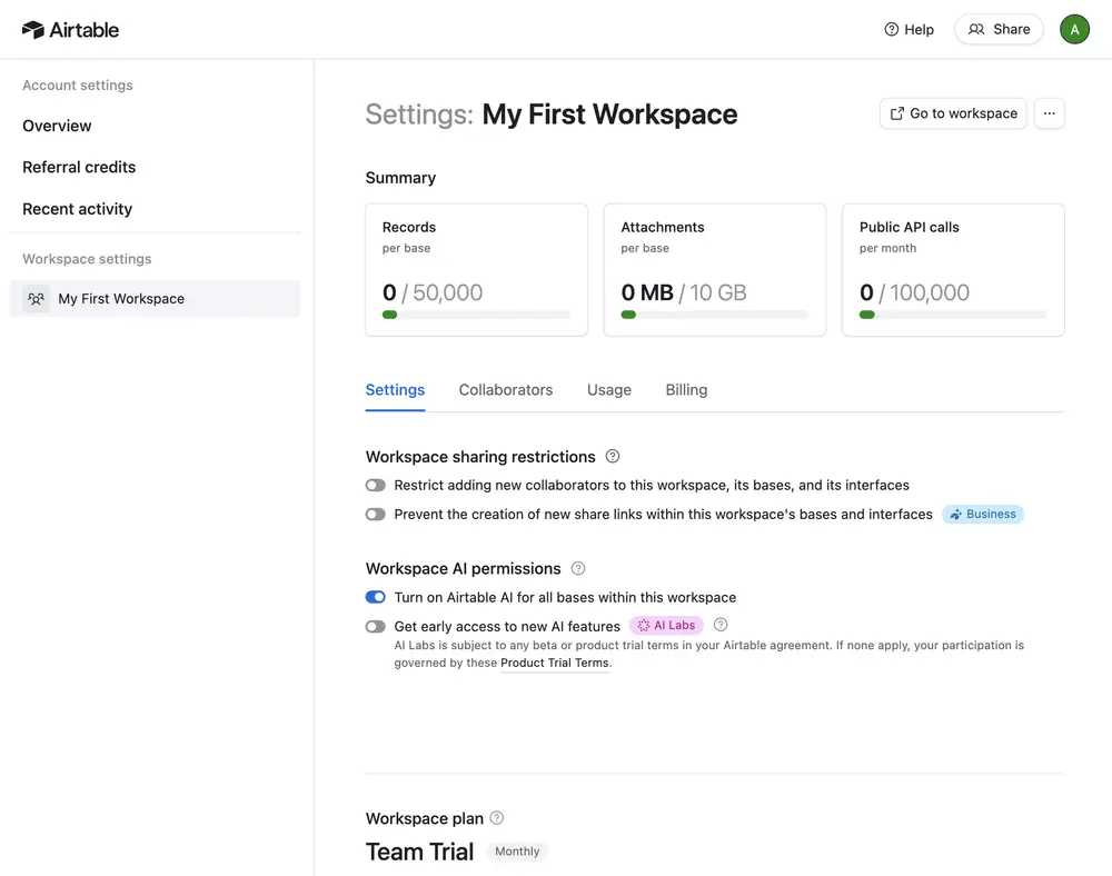
▲ Airtable’s workspace summary shows usage against each limit of the plan: records per base (0 / 50,000), attachments (0 MB / 10 GB), and public API calls per month (0 / 100,000), each with a small bar. The Usage and Billing tabs sit directly beneath.
Usage
- Use when the plan limits seats, projects, storage, credits, or actions.
- Use when users can reach the limit through normal use.
- Do not use when the limit is so high that few users ever approach it.
The card deck
Find more patterns like Usage Meter in the UI Patterns card deck
A collection of 60 User Interface design patterns, presented in a manner easily referenced and used as a brainstorming tool.
Solution
Show current usage against the limit in a calm, persistent place, and warn in plain language before the limit is reached.
Show used and total
Show the amount used next to the limit and fill a small bar to match: “0 MB / 10 GB”. A number with its limit tells the user how much room is left. A bar alone does not. Airtable’s workspace summary lists records per base, attachment storage, and API calls this way, each with its own bar.
Put it where users look for it
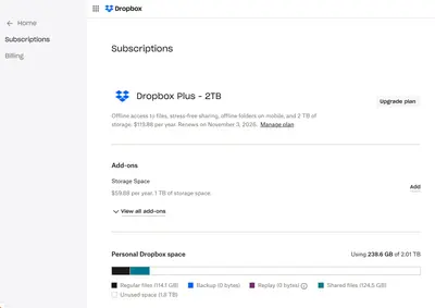
Settings or a sidebar are the usual homes: a place that is easy to find and does not interrupt work. Link the meter to the plan page, so the way to more room is one click away. Dropbox places its storage meter on the same page as the plan, with the price of more space beside it, and splits the bar by kind of content so users can see what fills their space.
Warn before the limit
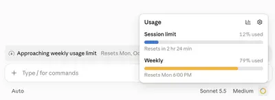
Tell users when they approach the limit, at around 80 percent, for example. Claude’s weekly bar turns amber as it fills, and a banner above the input says “Approaching weekly usage limit” with the reset date, which is calm, factual, and arrives while there is still room. Say what is about to happen, and give the options: upgrade, free up space, or wait for the reset. A warning that arrives while there is still room gives the user time to choose.
Be kind at the limit
When the limit is reached, let the user finish what they were doing where possible. Block the next action, not the whole product, and show what they can do now.
Say what counts
Name each limit by what it counts, and give reset times for limits that renew: “Public API calls per month”. Claude shows two limits side by side, a session limit that resets in a few hours and a weekly limit that resets on a set day and time, each with its percentage used. A limit users can’t predict is one they can’t manage.
Rationale
Predictable limits give users real control over the decision. A user who can see how close they are to a limit can decide when to upgrade, rather than being forced to by a sudden block. This turns an interruption into a planned choice, and an upgrade that follows is more likely to feel like the user’s own decision.
A meter also makes the plan concrete. “50,000 records” means little. A bar that is 80 percent full shows what the limit looks like in the user’s own use, which is the kind of loss that people take seriously (Loss Aversion).
Discussion
Meters that pressure
Alarming colors, flashing indicators, and countdowns that are designed to rush users into upgrading cross the line from information to pressure. A meter should state a fact. Use calm colors, and reserve red for limits that have been reached.
Meter, paywall, and gate
A meter warns about a limit that is coming. A Paywall is the wall itself, and a Feature Gate marks a feature that a plan does not include. The three work together: the meter makes the wall predictable, and the gate shows what is on the other side.
Free plan limits at the start
At the beginning, a meter at zero shows the limits before they matter. That helps users who are choosing a plan, and can look like a warning to the ones who are not. Show it in settings first, and move it to a more visible place when usage grows.
Measuring it
Compare the number of upgrades after a warning with upgrades after a hard stop, and track churn after limit events.
More examples of the Usage Meter pattern