Cancellation Flow
Design Pattern

Alternate titles: Cancel Flow, Offboarding, Exit Flow.
Problem summary
Users who want to leave face either a generic retention offer or deliberate obstacles, and neither addresses why they are leaving.
Example
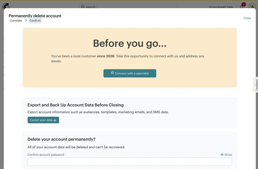
▲ Mailchimp’s “Permanently delete account” screen has a “Consider” and a “Confirm” step. “Before you go…” offers to connect with a specialist, then offers to export and back up the data. Deleting needs the account password, and the screen says the data can’t be recovered.
Usage
- Use when users can end a subscription or close an account.
- Use when you want to learn why people leave, and to offer something that fits.
- Do not skip it when there is nothing to retain. Every product with subscriptions or accounts needs a clear way out.
The card deck
Find more patterns like Cancellation Flow in the UI Patterns card deck
A collection of 60 User Interface design patterns, presented in a manner easily referenced and used as a brainstorming tool.
Solution
Make leaving easy to find and complete in a few steps, and respond to the user’s situation without blocking the exit.
Make it easy to find
Put the option where users look for it, in account or billing settings, and name it plainly. Several jurisdictions now require cancelling to be about as easy as signing up.
Offer something that fits, once
Ask one optional question about the reason. Respond with something that fits the answer: a pause for low usage, a cheaper plan for price, a route to support for a technical problem, and a clean exit for everyone else. Present the offer as an option beside the exit, never in front of it.
Say what happens to the data
Explain what will be deleted and whether it can be recovered, and let users export their data before they go.
Confirm and close the loop
Ask for a deliberate confirmation (such as the account password), then show a clear confirmation of what happened. Invite feedback after the exit instead of before it, and make it optional.
Rationale
Responding to the actual reason for leaving helps the users who would stay for the right offer, and respects the ones who wouldn’t. A clean exit builds trust and leaves the door open to return.
Discussion
Obstacles and guilt
Hidden cancel links, repeated confirmation screens, guilt-inducing copy, and offers that block the exit damage trust and can break the law. A good flow lets the user leave in as few steps as they would take to join.
Account closing versus cancelling a plan
Closing an account is more final than cancelling a paid plan. The first deserves a stronger confirmation and a data export. The second can often be softened with a pause or a downgrade.
What the example does
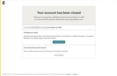
Mailchimp’s flow starts with “Before you go…”, offers a conversation with a specialist, and offers to export the account data. It then asks for the password, closes the account, and invites optional feedback. It does not ask why the user is leaving before it offers help, so the offer can’t be tailored to the reason.
Measuring it
Track the save rate by stated reason, the return rate of former customers, and complaints about cancelling.
More examples of the Cancellation Flow pattern