Telling good from bad
Conference talk at beyond tellerrand
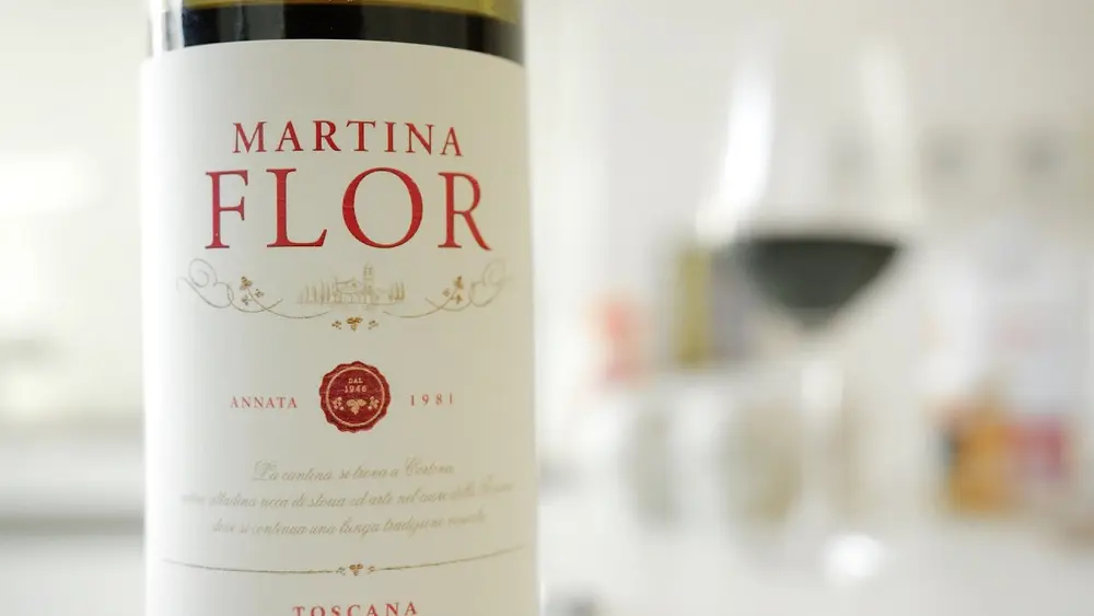
Lettering is everywhere, and social media has driven a boom that shapes how many people practise it professionally. In this keynote from beyond tellerrand 2015, designer and illustrator Martina Flor asks a simple question: how do you tell good lettering from bad?
She sets out several criteria designers can use to identify and filter good quality lettering from the constant stream of typographic work online. Along the way she gives a broad overview of the craft: what lettering is and what it is not, and how it differs from type design.
The talk also walks through the working process of a lettering artist, covering both the analog and digital tools involved. It is a useful watch for anyone who commissions, judges or produces typographic work and wants a clearer vocabulary for quality.
What you'll learn
- Criteria for spotting good quality lettering among the flood of examples
- What counts as lettering and what does not
- How lettering differs from type design
- The working process of a lettering artist, from analog to digital tools

Watch next
-
Jonathan HoeflerPutting the Fonts into Webfonts
-
Karen McGraneContent in a Zombie Apocalypse
-
Jason Santa MariaOn Web Typography
-
Jeff VeenMomentum: Crafting a Creative Culture
Free weekly newsletter
Real UI patterns and design psychology in your inbox
Learn how successful products use UI patterns and behavioral design. One email a week from UI-Patterns.com and Learning Loop.
Subscribe