Hotspot
Design Pattern
Alternate titles: Beacon, Pulsing Hotspot, Discovery Dot.
Problem summary
Some features are useful but not urgent, and explaining them with tours or modals interrupts users who are busy with something else.
Example
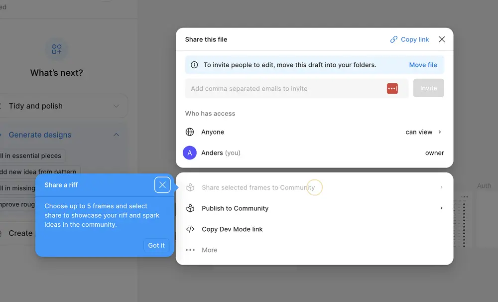
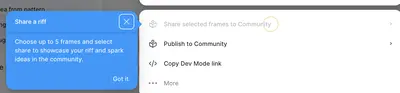
▲ In Figma’s share menu, a small animated circle sits next to a new option, “Share selected frames to Community”. A blue tip points to it and explains it in two sentences, with a “Got it” button.
Usage
- Use when the feature is optional or secondary.
- Use when users should discover it at their own pace.
- Use when you want to point at a specific element in context without interrupting the task.
- Do not use when the user must act on the information.
- Do not use when several hotspots would compete on the same screen.
The card deck
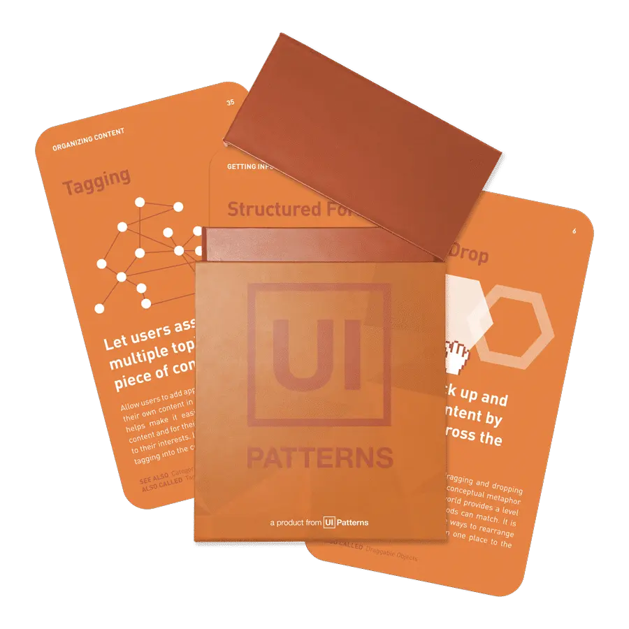
Find more patterns like Hotspot in the UI Patterns card deck
A collection of 60 User Interface design patterns, presented in a manner easily referenced and used as a brainstorming tool.
Solution
Place a small, softly animated dot next to the feature, and let the user open it when they are curious.
Keep the dot small and calm
A slow pulse draws the eye without demanding attention. A fast or large animation turns a hint into an alarm, and users learn to ignore it.
Explain in one sentence
When the user clicks or hovers, show a short tip: one sentence about what the feature does and why it is useful, and optionally an action. Longer explanations belong in a tour or a help page.
Let the user dismiss it
Remove the hotspot once it has been opened, or once the user has used the feature. A tip with an obvious close or “Got it” button gives the user control over when to learn.
Use few
Show one or two hotspots per screen, and only for features that are relevant to this user right now.
Rationale
A hotspot invites instead of interrupting. The animation draws attention through salience, and curiosity does the rest, leaving the user in control of when to learn. It points at the exact place the feature lives, so the user does not have to find it after reading an explanation elsewhere.
Discussion
Hotspots that never go away
A dot that stays after the user has seen it turns into visual noise. Retire it once it has been opened, or after a fixed number of sessions.
Too many dots
Several pulsing dots on the same screen compete with each other and make the interface look broken. If more than two features need attention, use a guided tour or a feature spotlight instead.
Hotspot, coachmark, or tour
A hotspot is a single, optional pointer that the user opens. A coachmark explains an element and is often shown automatically. A tour walks the user through several elements in a fixed order. Use the lightest form that does the job.
Accessibility
A pulsing dot is easy to miss for users who navigate with a keyboard or a screen reader, and animation can be a problem for users who prefer reduced motion. Make hotspots reachable and readable without a mouse, and respect the reduced-motion setting.
Measuring it
Track the open rate, and the use of the feature after the hotspot was opened.
More examples of the Hotspot pattern