Resource Center
Design Pattern
Alternate titles: Help Center Widget, Help Hub, In-app Help Menu, Help Launcher.
Problem summary
New users get stuck at different moments and on different questions, and leaving the product to search a help site breaks the task they were in the middle of.
Example
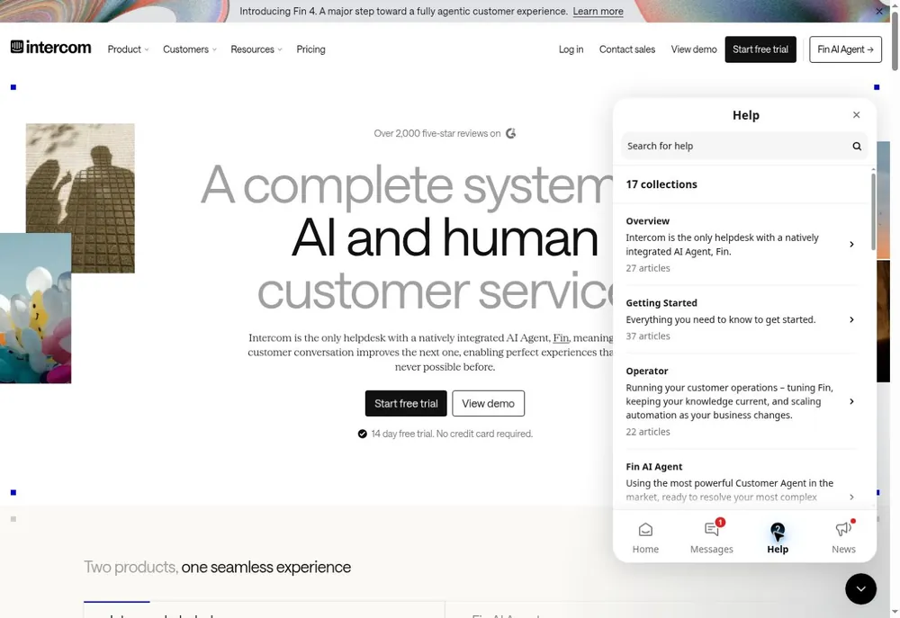
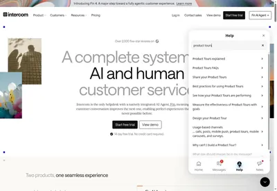
▲ Intercom’s Messenger opens a Help tab over the page: a search field and 17 collections of articles, each with a one-line description and an article count, without leaving the page.
Usage
- Use when the product is rich enough that users will have questions you can’t predict or place in advance.
- Use when help content already exists (articles, short videos, tours, release notes) but is scattered across a separate site.
- Use when users come back to the same questions after the first session, for example when they reach a feature for the first time.
- Do not use when the product has a handful of screens that can explain themselves with good labels and an occasional inline hint.
- Do not use as a place to hide explanations that the interface itself should give.
The card deck
Find more patterns like Resource Center in the UI Patterns card deck
A collection of 60 User Interface design patterns, presented in a manner easily referenced and used as a brainstorming tool.
Solution
Put one persistent, clearly labelled entry point to help in the product, usually a “?” or “Help” button in a corner or the main menu. It opens a panel over the current screen, so the user can look something up and carry on where they were.
Start with search
Put a search field at the top. Users who open help usually have a specific question, so let them type it in their own words. Match common synonyms, and show the answer, or the first lines of it, inside the panel.
Show what fits the current screen
Below the search field, suggest a few articles or short videos for the page the user is on, and for where they are in onboarding. A user in the billing settings needs different help from a user on an empty project.
Bring the guidance into one place
Collect the other ways the product teaches: the tours the user can replay, the onboarding checklist, keyboard shortcuts, and what is new. A user who dismissed a tour on day one can find it again when they need it.
Always offer a way to a person
End the panel with a way to contact support or the community, and say how quickly people usually reply. A help panel without a way out turns a question into a dead end.
Keep the user in place
Open articles inside the panel instead of in a new tab, and keep the panel open while the user tries what it describes.
Rationale
People seldom read documentation before they start. In interviews about help seeking, users said they avoid both printed and online help, and are as likely to ask a colleague or experiment on their own. Those who did use help complained that it was hard to navigate and that they struggled to find the right search terms (Novick & Ward, 2006). A resource center answers that by being there when the user is stuck, searchable in plain words, and in context, so finding help costs seconds instead of a detour. Because the entry point is always visible, users recognize where to go instead of having to remember it, an example of Recognition over Recall.
Discussion
Resource center or inline help
An Inline Help Box puts one explanation on the screen where it is needed, without being asked. A resource center waits until the user asks, and holds answers to many questions. Use inline help for the few things every new user must understand on a given screen, and a resource center for the long tail of questions that only some users have. If the same question keeps arriving through the resource center from one screen, that screen needs inline help or a better label.
Resource center or onboarding checklist
An Onboarding Checklist is a short, finite list of the tasks that lead to value, and it is meant to be finished. A resource center is a reference with no end, which the user opens when they have a question. Many products put the checklist inside the resource center so users can find it again after closing it. Keep the two roles distinct: the checklist says what to do next, and the resource center explains how.
A help panel is not a substitute for clarity
A resource center makes it easy to move explanations out of the interface. Each article about a basic task is a sign that the screen itself could be clearer.
Measuring it
Track the share of users who open help, the searches that return nothing, and the share of help sessions that end in a support request. Searches without results show what to write next, and frequent searches from one screen show where the interface is unclear.
- Novick, D. G., & Ward, K. (2006). Why don’t people read the manual? Proceedings of the 24th Annual ACM International Conference on Design of Communication, 11–18. https://doi.org/10.1145/1166324.1166329
More examples of the Resource Center pattern