Inline Help Box
Design Pattern
Alternate titles: Inline hints, Walkthrough.
Problem summary
The user needs assistive information located close to the interaction they are about to perform.
Example
Usage
- Use when an interaction with your website is not necessarily intuitive and self-explanatory in itself.
- Use inline tips to document your interface
- Use when you want to motivate the user to start using the system.
- Use when you want to aid the user in getting started with your web application.
- Use when you want to guide the user to get a good start with your web application.
- Use to gently introduce functionality to the new and untrained user.
- Use the ‘hide’ functionality to avoid frustration of the experienced and trained user.
Solution
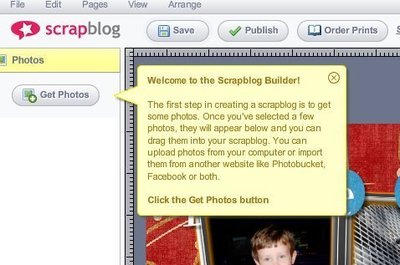
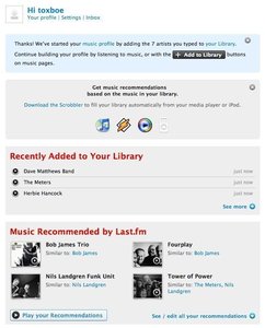
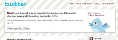
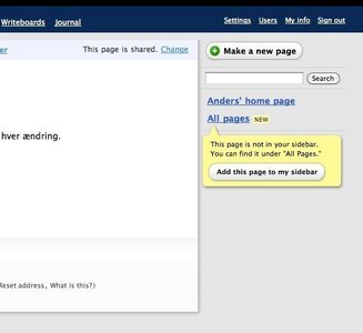
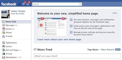
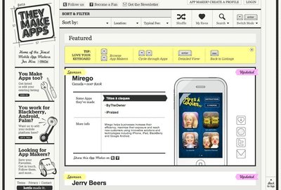
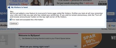
Document your interface in-line with descriptive help blocks. If important information needs to be communicated to the user, it can be easily explained with an inline help box located above or below the main content of a screen.
The inline help box needs to be differentiated from normal content. As the help box itself is not part of the main functionality, it is a good idea to add a style to it that visually separates the help box from that functionality. An easy way to do this is by applying another background and font color to the help box.
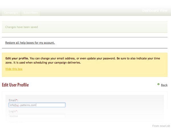
Additionally, to avoid the user’s discontent with the help box, a great feature of the in-line help box is to have a “hide this box” functionality. Once the user has clicked this link, the help box will never be shown to the user again.
However, you might want to provide an option for the user to re-enable all help boxes, to allow the user to get that first-hand help that he or she started out getting.
Rationale
Providing your users with assistive information, located close to an interaction, makes accessing and consuming instructional info simple and easy. In Line help boxes are far more engaging than reading disconnected FAQ’s or help sections.
By allowing the user to easily close/hide each help box, the user is not bothered with unnecessary information once it has been understood.
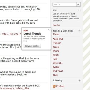
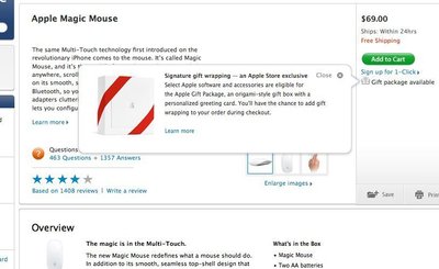
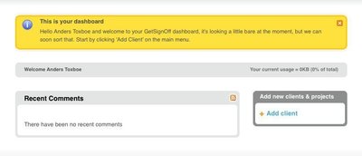
More examples of the Inline Help Box pattern See all 29 example screenshots
User Interface Design Patterns
- Forms
- Explaining the process
- Community driven
- Tabs
- Jumping in hierarchy
- Menus
- Content
- Gestures
- Tables
- Formatting data
- Images
- Search
- Reputation
- Social interactions
- Shopping
- Increasing frequency
- Guidance
- Registration
Persuasive Design Patterns
- Loss Aversion
- Other cognitive biases
- Scarcity
- Gameplay design
- Fundamentals of rewards
- Gameplay rewards


4 comments
Moses Ting on Feb 02, 2008
I’m a fan of this UI pattern and I’ve been seeing it used alot recently.
Janko on Mar 25, 2008
I use this pattern frequently. In some cases I extend the message with an icon or some helpful links. Absolutely positive.
naresh on Aug 09, 2008
i like your website. VERY useful or web/UI designers.
great work. expecting more examples.
cheers!
Walter on Jul 20, 2010
It is interesting, but could you give examples on how to re-enable the help?
Comments have been closed