Social Login
Design Pattern

Alternate titles: Social Sign-in, Single Sign-On (SSO), Sign in with Google, Sign in with Apple.
Problem summary
The user wants to start using the product without creating and remembering yet another username and password.
Example
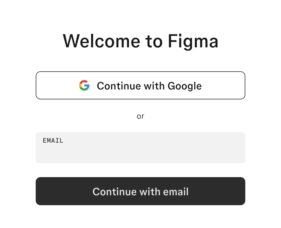
▲ Figma’s signup page leads with “Continue with Google” and keeps email signup as a clear second option.
Usage
- Use when your audience already has accounts with a widely trusted provider, such as Google, Apple, or Microsoft.
- Use when signup happens on mobile, where typing an email address and a password is slow and error-prone.
- Use when business users expect to sign in with their company’s identity provider.
- Use when you want to prefill parts of setup, such as name, photo, or company, from information the user has already given elsewhere.
- Do not use when the provider’s data access would worry your audience, for example in privacy-sensitive products.
- Do not use when your users are unlikely to have, or want to use, the accounts you offer.
The card deck
Find more patterns like Social Login in the UI Patterns card deck
A collection of 60 User Interface design patterns, presented in a manner easily referenced and used as a brainstorming tool.
Solution
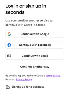
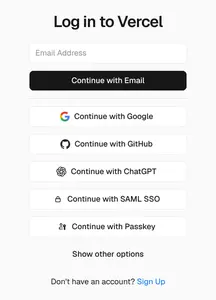
Let users create an account and sign in with an identity they already have. Place one to three sign-in buttons above the email form, and keep signing up with email available for users who prefer it.
Choose providers for your audience
Offer the providers your users actually use: Google and Apple for consumer products, and Google, Microsoft, and SAML-based single sign-on for business tools. Every extra button is one more decision. Three well-chosen options convert better than a wall of logos.
Ask only for what you need
Request the minimum permissions, usually name and email address. If you need more, such as access to contacts or a calendar, ask later in context and explain why. A permission screen that asks for more than the product obviously needs makes users stop and reconsider.
Use what you get
After sign-in, use what the provider shares to shorten setup. Prefill the user’s name and photo, and suggest joining an existing workspace when the company email domain matches one. The user should not be asked again for information they just gave you.
Make the button text and the outcome predictable
Use the provider’s standard button and a clear label such as “Continue with Google”. “Continue” works for both new and returning users, so people don’t have to remember whether they already have an account.
Rationale
Social login replaces several fields and decisions (email, password, password rules, confirmation) with one recognizable action. It removes the need to invent and later remember a password, which is one of the most common reasons people abandon signup and fail to sign in again later.
Familiar provider buttons also lend credibility at a moment of uncertainty. The user recognizes the button from many other products and knows what will happen when they press it.
Discussion
Too many choices
A row of six or seven provider logos recreates the problem social login was meant to solve: the user has to stop and choose. Look at which providers your users sign in with, and remove the ones few people use.
Duplicate accounts
Users often forget which method they used last time. Someone who signed up with Google may later try “Sign in with Apple” or type their email and create a second, empty account. Detect matching email addresses and offer to link the accounts, and show which method was used before when someone returns.
Trust and privacy
Some users are wary of connecting a social account to a new product, especially when they don’t know what will be shared. State what the product receives, and never post on the user’s behalf without asking.
Measuring it
Compare signup completion by method, and follow each method through to activation. A method that is quick at signup but leads to fewer active users may be attracting the wrong expectations.
More examples of the Social Login pattern