Onboarding Carousel
Design Pattern

Alternate titles: Intro Screens, Welcome Carousel, Feature Carousel.
Problem summary
Many products open with a sequence of screens explaining what they do, which users click or swipe through without reading.
Example
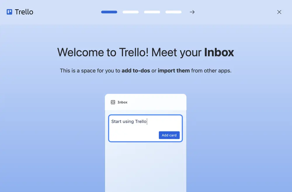
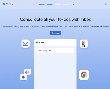
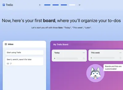
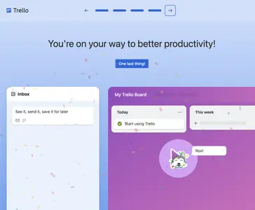
▲ Trello’s first-run introduction is a sequence of screens with a row of segments at the top, a forward arrow, and a close icon. The first, “Welcome to Trello! Meet your Inbox”, shows the Inbox with a first to-do being typed.
Usage
- Use when the product needs to explain one key concept before its first screen makes sense.
- Use when permissions or setup need a brief explanation of their benefit first.
- Do not use when the screens only list features.
- Do not use when the product could simply start with its first useful action.
The card deck
Find more patterns like Onboarding Carousel in the UI Patterns card deck
A collection of 60 User Interface design patterns, presented in a manner easily referenced and used as a brainstorming tool.
Solution
Introduce the product in a short sequence of screens that the user steps through before starting.
Keep it short
Three screens or fewer is a good limit. Every extra screen delays the first action, and people remember little of what they pass through before they have a reason to care. Trello’s runs to four, and shows that in a row of segments at the top, so users know where the end is.
One idea per screen
Give each screen one benefit the user cares about, with a headline that says it and a line of text that explains it. “Consolidate all your to-dos with Inbox” is a benefit. “Features” is not.
Show the real product
Use a picture of the product in action, and not a stock illustration. Trello’s screens show its own Inbox and board, so what the user sees in the carousel is what they will see next.
Let users move at their own pace
Offer clear forward and back controls, and show progress. Trello puts both arrows at the top, beside the segments, and highlights the next arrow when it is the expected action. Let users close the carousel at any point: an “X” in the corner, or a “Skip” link on every screen.
End on a way to start
The last screen should lead into the product with one clear action, not just close. Trello’s final screen says “One last thing!” and moves on to the next step.
Consider replacing it
A carousel explains. A first action lets the user do it. Where possible, turn the screens into a short Playthrough, or move the explanations to where they matter, as Inline Hints or a Hotspot.
Rationale
A carousel sets expectations and makes the value easy to picture, at the moment the user is most open to it. A few screens with a picture each are quick to take in, and a visible end keeps the effort small (Steps Left).
The risk is the opposite. People tend to click through introductions to reach the product, and what they skip they do not remember. A carousel works when each screen is short, concrete, and ends in the user doing something.
Discussion
Carousels that nobody reads
Users learn quickly that the screens before the product are skippable, and treat them that way. Count how many users skip, and how many of those who stay do better afterward. If skipping makes no difference, the carousel is not needed.
Carousel or playthrough
A Playthrough lets the user do the thing it explains. Trello’s sequence is both: it has the structure of a carousel, with segments and arrows at the top, but most of its screens ask the user to try something, such as sending an email to the Inbox or dragging a card to a list. This makes it more likely that the user remembers it, and it is a good model for a longer introduction.
Walkthrough, tour, or carousel
A Walkthrough or a Guided Tour explains the interface in place. A carousel comes before the interface, and so it has to explain without pointing at anything. That is why it needs a picture of the product on every screen.
Permission requests
A carousel is not the place to ask for permissions without context. If the product needs a permission, explain its benefit on the screen where it matters, before the system asks.
Measuring it
Track the skip rate, the completion rate, and activation for users who saw the carousel compared with users who started directly.