Welcome Screen
Design Pattern

Alternate titles: Welcome Modal, Welcome Message, First-run Screen.
Problem summary
The first screen after signup either confirms the user’s choice and points them toward value, or confronts them with an empty product and a list of setup tasks.
Example
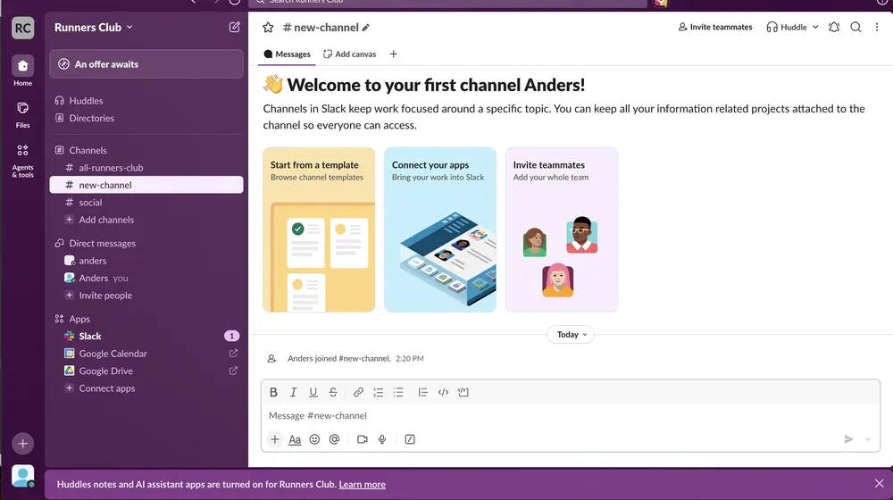
▲ Slack’s first channel greets the new user by name and offers three starting points as cards, so there is something to do right away. The cards lead to templates, connecting apps, and inviting teammates.
Usage
- Use when users arrive from different promises or entry points, and the first screen can reflect the one that brought them.
- Use when the next step is not obvious from the interface itself.
- Use when you want to point new users to a small number of good starting points.
- Do not use when the product can drop users straight into a meaningful first action, which is often the better welcome.
The card deck
Find more patterns like Welcome Screen in the UI Patterns card deck
A collection of 60 User Interface design patterns, presented in a manner easily referenced and used as a brainstorming tool.
Solution
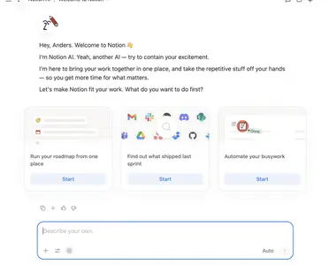
Greet the user, restate the outcome they came for, and point to what to do first. Keep it to one screen and make it easy to move past.
Greet and confirm
Use the user’s name, and say in one sentence what this place is for. The welcome is the first in-product touchpoint that can keep or break the promise that brought the user in, so make it sound like that promise.
Lead to the first action
Offer the next step that moves the user toward value, as a button or as a small set of starting points. A single primary action is strongest. If the product supports a few distinct first steps, such as starting from a template, connecting tools, or inviting a team, show them side by side and keep the set short.
Reflect how the user arrived
If the user came through an invitation, a campaign, or a template, say so. A user who was invited to a team should land in that team, with a welcome that names who invited them.
Let users move on
A welcome should be easy to dismiss, and should not return at every login. Where the product needs information to personalize the path, combine it with a short personalization form instead of stacking another screen.
Rationale
The welcome screen confirms the decision the user has just made, which makes them more likely to continue (commitment and consistency), and it gives direction at the moment uncertainty is highest. Without it, the user meets an interface that does not yet say what to do.
Discussion
Welcome screens that become tours
Welcome screens grow, because each new feature wants a mention. A welcome that turns into a feature tour, or one modal followed by another, delays the first action it was meant to bring closer. It should lead somewhere within one click.
One action or several
A single primary action is clearer and easier to measure. Several starting points work when they are genuinely different routes to the same goal, as when a user can start from a template, connect existing tools, or invite a team. Keep them equal in weight only when you do not know which the user needs, and use a personalization form to find out.
Welcome versus blank slate
A blank slate fills an empty screen with guidance for the content that belongs there. A welcome screen speaks to the person, and often sits on top of, or inside, a blank slate. In practice the two are often combined, as in the Slack example.
Measuring it
Track click-through on the primary action and the time from signup to the first meaningful action.
More examples of the Welcome Screen pattern