Personalization Form
Design Pattern
Alternate titles: Onboarding Survey, Welcome Survey, Onboarding Quiz, Use-case Picker.
Problem summary
Users arrive with different goals, roles, and levels of experience, but a single onboarding path treats them all the same.
Example
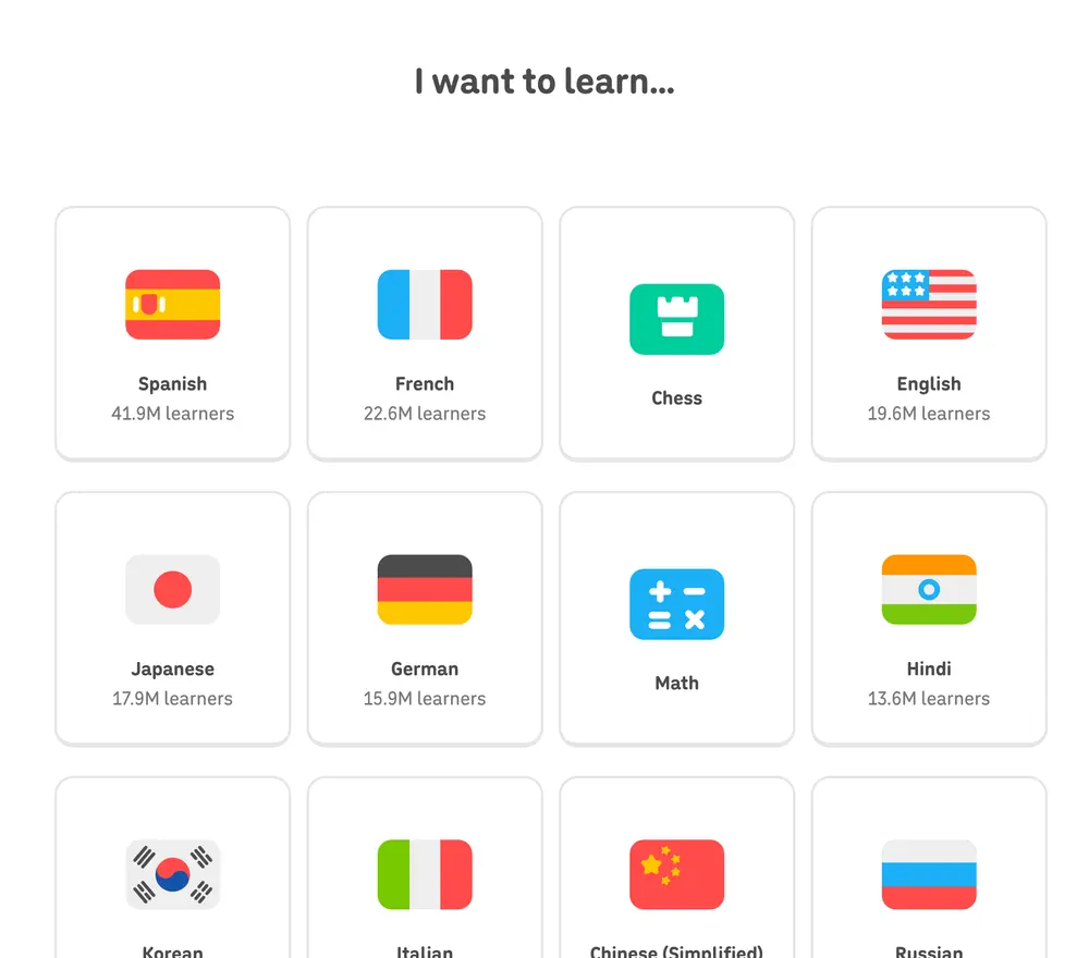
▲ Duolingo’s onboarding starts by asking what you want to learn. The answer decides the course, the placement, and every lesson that follows.
Usage
- Use when your product serves clearly different use cases, roles, or levels of expertise.
- Use when the answers will visibly change what the user sees next: the template, the first task, or the guidance.
- Use when a wrong first path is costly, for example when a beginner is dropped into an expert setup.
- Do not use when the answers would only be used for marketing segmentation.
- Do not use when the product has one dominant use case that almost everyone shares.
The card deck
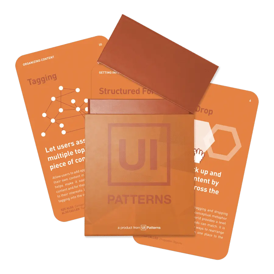
Find more patterns like Personalization Form in the UI Patterns card deck
A collection of 60 User Interface design patterns, presented in a manner easily referenced and used as a brainstorming tool.
Solution
Ask one to three short questions at the start of onboarding, and use the answers right away to tailor the first experience.
Ask few questions, with big answers
Typical questions are “What do you want to do first?”, “What is your role?”, and “How big is your team?”. Offer a handful of large, clearly worded options, ideally with icons, so answering takes a tap rather than thought. Include “Other” or “Something else”, and let users skip.
Say why you are asking
A short line such as “We’ll set up the right starting point for you” makes the form feel like a service. Users answer more willingly when they can see what they get for it.
Use every answer
Each answer should change something the user can see: the template they start from, the first task on their checklist, the example data, or the features shown first. If an answer changes nothing, remove the question.
Show the result
After the last question, show the tailored starting point immediately, and make it obvious that it was chosen for them. Let users change their answers later from settings.
Rationale
Different users need different first steps. A personalization form lets the product tailor the path to each user’s goal and experience, instead of guessing or showing everyone the same generic tour.
Answering also gives users a small sense of ownership over what follows. Having said what they want, they are more inclined to follow the path that was set up for it.
Discussion
Form creep
Personalization forms tend to grow, because every team wants one more question: marketing wants to know how the user heard about the product, sales wants company size, research wants a job title. Each question adds effort before the user has seen any value. Ask attribution and research questions later, or not at all.
Questions users can’t answer yet
New users may not know their role in the product, or which feature they will need. Ask about goals and situations they recognize (“Share team updates”) instead of product concepts (“Configure workspaces”).
Measuring it
Track completion of the form, and activation by answer. Comparing activation across answers shows whether each tailored path actually works for the users who choose it.