Settings
Design Pattern
Alternate titles: Options, Preferences.
Problem summary
The user needs a central place to indicate preferences for how the application should behave
Example

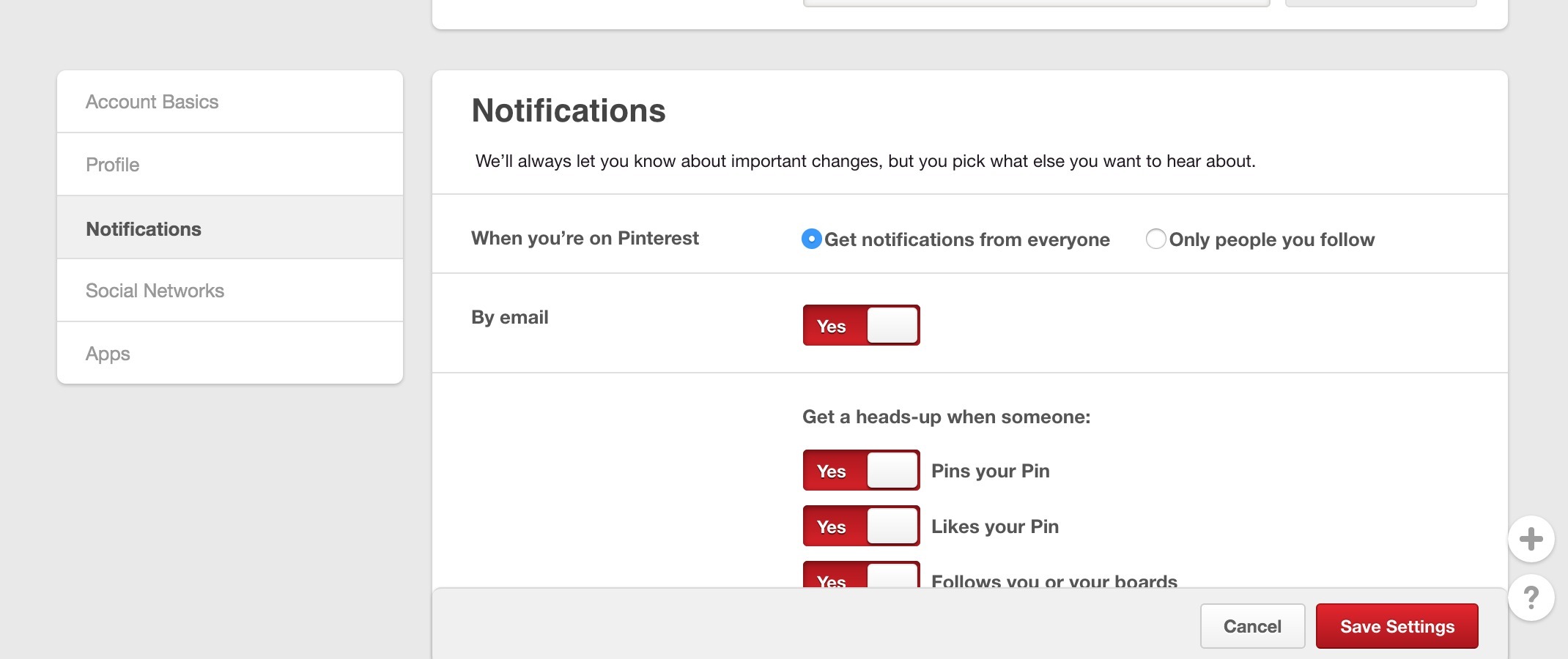
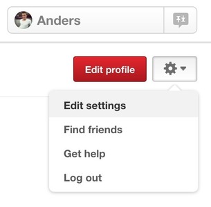
▲ Pinterest has grouped its settings into manageable chunks, which lets the user customize the experience to his specifications.
Usage
- Put preferences in the Settings area, when they are used by the majority of users
- Put prefernces in the Settings area, when they are used by a minority of users, but are essenatial to supporting their needs.
- Use to provide a place for infrequently accessed preferences.
- Use to capture user preferences
- Do not use settings for frequently accessed actions. Move these to a toolbar.
This card is part of the UI Patterns printed card deck
A collection of 60 User Interface design patterns, presented in a manner easily referenced and used as a brainstorming tool.
Get your deck!Solution
Let users indicate their preferences for how your product should behave. Provide a central place for users to customize your product to their specifications. Keep configurable options well-organized, predictable, and manageable in number. Group and move less important settings to their own screens.
Provide an overview
Let the user be able to quickly understand all available settings and their current values. If there are many settings to comprehend, prioritize the ones most likely to interest users. Group and move less important settings to seperate screens.
Good Defaults
Consider good initial values for preferences – choose the default most users would choose and be neutral and pose little risk.
When to group
To avoid in-comprehensive lists of preferences, consider clustering settings into multiple shorter lists. Good heuristics are (you might change numbers):
- 7 or fewer preferences: Don’t group at all.
- 9 to 16: Group related settings under two or more section dividers.
- 16 or more: Consider constructing subscreens, but keep a consistent terminology in mind: make sure titles of subscreens match the label of the setting which opens it.
More examples of the Settings pattern See all 2 example screenshots

User Interface Design Patterns
- Forms
- Explaining the process
- Community driven
- Tabs
- Jumping in hierarchy
- Menus
- Content
- Gestures
- Tables
- Formatting data
- Images
- Search
- Reputation
- Social interactions
- Shopping
- Increasing frequency
- Guidance
- Registration
Persuasive Design Patterns
- Loss Aversion
- Other cognitive biases
- Scarcity
- Gameplay design
- Fundamentals of rewards
- Gameplay rewards
