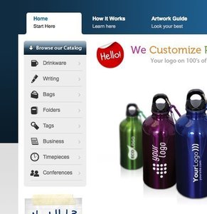
Horizontal Dropdown Menu
Design Pattern
Problem summary
The user needs to navigate among sections of a website, but space to show such navigation is limited.
Example
Usage
- Use when there are between 2 – 9 sections of content that need a hierarchical navigation structure.
- Use when your functionality resembles one of a desktop application. Imitate the metaphor.
- Do not use when there is a need to single out the location of the current section of the site. Then use the Navigation Tabs.
Solution
A list of main sections are displayed as links in a single vertical strip. When a user hovers their cursor over a list item or clicks a list item, a sub list is displayed (usually adjacent and below). The user can then follow the now horizontally extended list item down, and select the subsection they are interested in.
Traditionally, when the user’s cursor leaves a drop down menu, the menus are no longer visible. However, this is an unforgiving interaction method.
As humans, we do not always act perfectly as the system would like us to. To cope with human errors and to guide us to act as you would like us to, you can implement the following:
- On mouseout events (when the user takes his mouse away from the drop-down’ed box), add a delay before hiding the drop-down’ed box (typically 200-300 ms.)
- Make the area of each menu item wider than just the text of the menu item so that the user has more space to put his mouse cursor over.
- Change the cursor image as the user hovers over a list item.
Other issues you want to take notice of
There are many different kinds of drop-down menus out there. Some are purely javascript. These kinds of drop-down menus do not work well with search engines. To let the search engines index your page, you would want to have the menu formatted in HTML from the beginning of the page load, rather than building it in javascipt client-side after the page has loaded.
Rationale
Drop-down menus save space by organising and concealing information. Drop-down menus are not regarded as a technique that increases usability, as they can often be difficult to use.
Flyout menus allow for only showing top levels of the page’s hierarchy permanently, while still giving the option to show deeper levels on mouse over
More examples of the Horizontal Dropdown Menu pattern See all 3 example screenshots


User Interface Design Patterns
- Forms
- Explaining the process
- Community driven
- Tabs
- Jumping in hierarchy
- Menus
- Content
- Gestures
- Tables
- Formatting data
- Images
- Search
- Reputation
- Social interactions
- Shopping
- Increasing frequency
- Guidance
- Registration
Persuasive Design Patterns
- Loss Aversion
- Other cognitive biases
- Scarcity
- Gameplay design
- Fundamentals of rewards
- Gameplay rewards

2 comments
scornflakes on Apr 04, 2008
“Drop-down menus safe space” typo, should be “save space”.
countzer0 on Dec 25, 2008
Not to be a nit-picker but you have horizontal and vertical mixed up on this site !
Comments have been closed