Notifications
Design Pattern
Problem summary
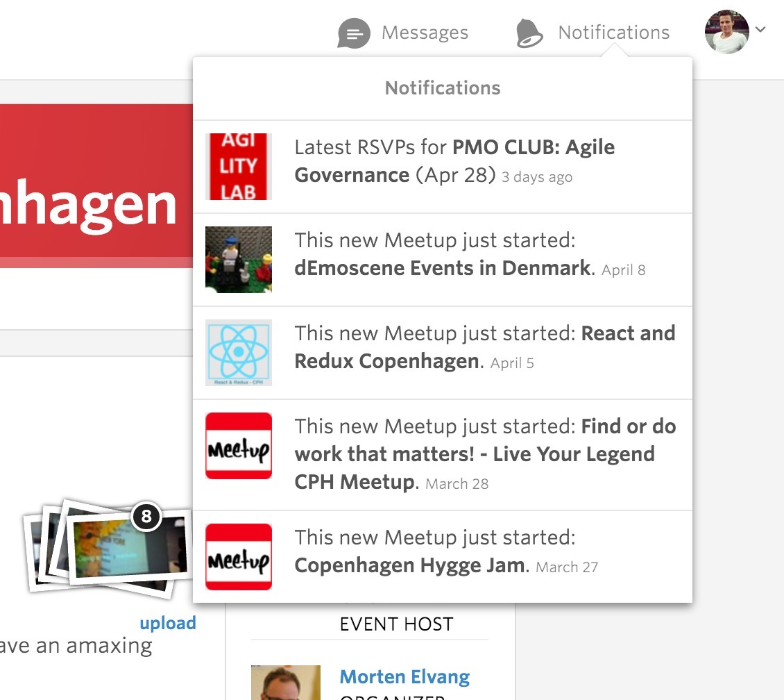
The user wants to be informed about important updates and messages
Example
Usage
- Use when you want to draw attention to important updates or messages.
- Do notify users about about time-sensitive information directed specifically at them.
- Do not notify users about information that is currently on screen (e.g. active chat conversations)
- Do not notify users about technical operations that do not require user involvement (such as syncing)
- Do not notify users about error messages that can be resolved without user action
This card is part of the UI Patterns printed card deck
A collection of 60 User Interface design patterns, presented in a manner easily referenced and used as a brainstorming tool.
Get your deck!Solution
Inform your users about relevant and timely events.
Notify users about important updates while they are focused elsewhere. Adjust the rate and relevancy of notifications aptly, as they can be interruptive. Empower users to disable or change notifications in their settings. Create personalized, summarized, and timely notifications that may serve as entry points to more detailed information.
Use notifications to draw attention to important updates: messages from friends, new friend requests, relevant nearby offers, and many more.
Across devices
Once a users has consumed a notification, he or she should not see it again. Similarly, users should be able to retrieve already consumed notifications on another device more suitable for consuming the content the user was notified about. Notifications should be synced to all of a user’s devices.
Minimize interruption
Notifications are obtrusive and interruptive in its nature. It is used to direct the user’s attention to important events while being focused elsewhere. Make careful considerations as to when to interrupt users. Do not notify users about information already on screen (e.g. active chat conversations), technical operations not requiring user involvement, and error states that can be resolved without user action.
Allow escape
Make notifications dismissible and let users disable or change the rate of notifications in your products settings.
Provide summaries
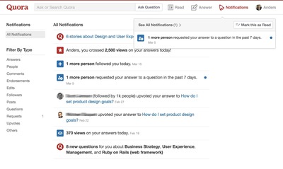
Combine multiple notifications of the same type into a single summary notification showing how many notifications of a particular kind are pending. Consider expanding the notification, providing detailed information of the summarized notifications, once clicked.
Provide actions
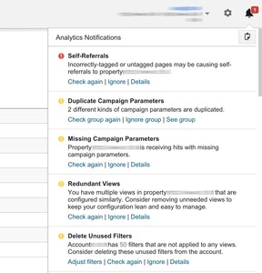
Bundle action buttons with notifications, for users to quickly handle the most common tasks for a particular notification, without opening the originating screen. Let actions be clear and unambiguous and only provide them if they do not duplicate the default action. Actions should be meaningful and time-sensitive, suit the content, and allow the user to accomplish a task.
1 Notifications Design Pattern at the Google Material Design Spec
More examples of the Notifications pattern See all 4 example screenshots
User Interface Design Patterns
- Forms
- Explaining the process
- Community driven
- Tabs
- Jumping in hierarchy
- Menus
- Content
- Gestures
- Tables
- Formatting data
- Images
- Search
- Reputation
- Social interactions
- Shopping
- Increasing frequency
- Guidance
- Registration
Persuasive Design Patterns
- Loss Aversion
- Other cognitive biases
- Scarcity
- Gameplay design
- Fundamentals of rewards
- Gameplay rewards


