Shopping Cart
Design Pattern
Alternate titles: Cart.
Problem summary
The online shopping experience needs to be realized through a real world analogy.
Example
Usage
- Use when the user can possibly buy more than one product.
- Use when the user can possibly buy more than one instance of a product.
- Use when the user may want to return later to carry on shopping
- Use when the user may want to return at a later time to conduct payment
- Do not use when you only have one product to sell.
- Do not use when your site is arranged in a way, so that it does not make sense for the user to buy more than one product at a time (for instance for Application Service Providers (ASPs) allowing a user to upgrade his service).
Solution
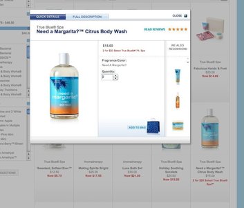
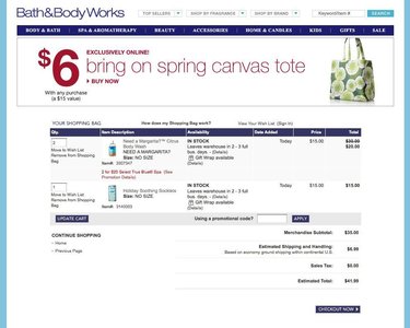
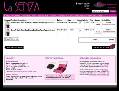
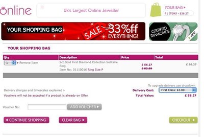
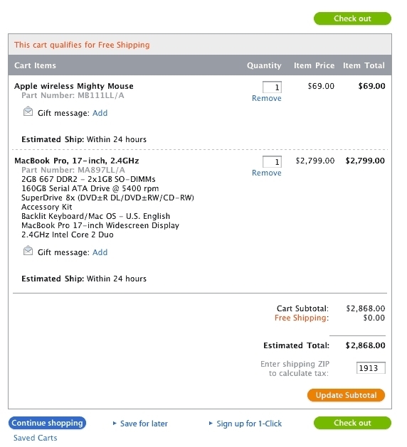
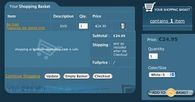
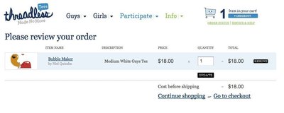
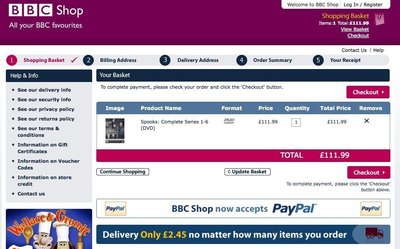
A shopping cart is a collection of selected products that the user can use to manage their online shopping experience. The user can add, update and remove products from their cart. Further, the user can choose to change the quantity of each product in the shopping cart. A subtotal cost is displayed for each of the items in the cart plus shipping charges, VAT, etc. At any time, the user can choose to continue shopping or proceed to checkout – meaning to paying and ordering what is in the shopping cart.
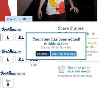
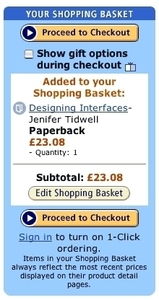
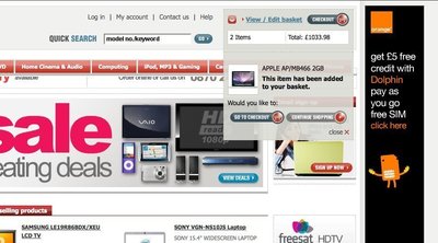
Whenever a product is presented, a complimenting “add to cart” button should be visible , this lets the user add the respective product to the product cart. The contents of the cart can viewed at any time, in detail by clicking on a “show cart” link.
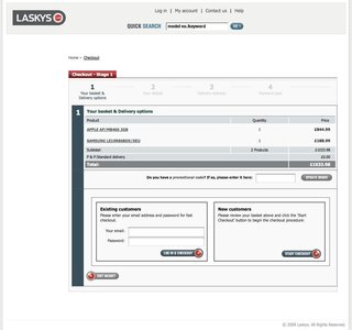
When the user chooses to checkout, he is presented with a final list of items on the order, as well as payment options (credit card, wire transfer or cash on delivery).
Rationale
The shopping cart is a well known metaphor for shopping online. The metaphor provides the user with the idea, that putting items in the shopping cart does not necessarily mean that he or she is buying those items, as they can be removed before checking out of the store. The shopping cart pattern allows the user to collect a number of items first in order to pay for them all at a later time. The checkout metaphor goes well with the shopping cart as it resembles the process at a real super market.
More examples of the Shopping Cart pattern See all 61 example screenshots
User Interface Design Patterns
- Forms
- Explaining the process
- Community driven
- Tabs
- Jumping in hierarchy
- Menus
- Content
- Gestures
- Tables
- Formatting data
- Images
- Search
- Reputation
- Social interactions
- Shopping
- Increasing frequency
- Guidance
- Registration
Persuasive Design Patterns
- Loss Aversion
- Other cognitive biases
- Scarcity
- Gameplay design
- Fundamentals of rewards
- Gameplay rewards

3 comments
Klaus Martin on Jun 18, 2008
Where is the main example from?
Anders Toxboe on Jun 19, 2008
Klaus Martin: Apple.com webstore
albert on Oct 09, 2009
is it osCommerce?
Comments have been closed