Expandable Input
Design Pattern
Problem summary
The user wants to experience a main interface with as much screen real estate and with a minimum of distractions
Example

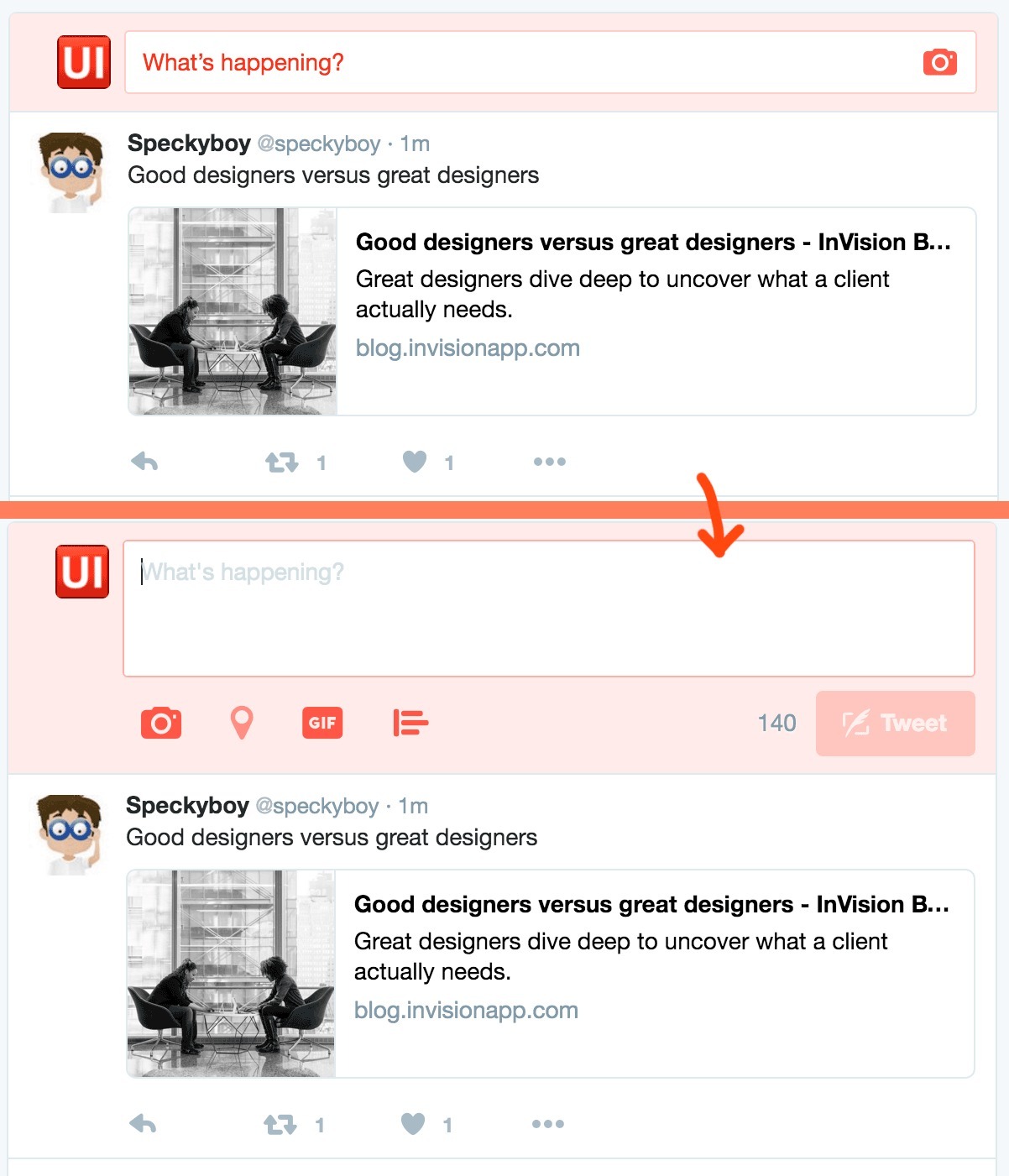
▲ Twitter.com has placed big input area, attracting important attention - with an input hint, at the top of the screen. As you click the input field, it expands - saving valuable above-the-fold screen space for content.
Usage
- Use when you want the main focus to be on the main interface rather than its input controls
- Use when you want to keep distractions out of the main interface
This card is part of the UI Patterns printed card deck
A collection of 60 User Interface design patterns, presented in a manner easily referenced and used as a brainstorming tool.
Get your deck!Solution
Expand the size of input fields as they come in focus or are filled with content
Design your controls in two modes: expanded and contracted. As the user taps a contracted control, it expands to its larger size. This can help keeping secondary functions out of the way until the user is in need of them.
Rationale
Expandable inputs can help unclutter user interfaces by staying out of sight until needed. For multiple purpose user interfaces, it can be helpful to let optional actions, such as searching, posting, or commenting, attract a minimum of attention.
User Interface Design Patterns
- Forms
- Explaining the process
- Community driven
- Tabs
- Jumping in hierarchy
- Menus
- Content
- Gestures
- Tables
- Formatting data
- Images
- Search
- Reputation
- Social interactions
- Shopping
- Increasing frequency
- Guidance
- Registration
Persuasive Design Patterns
- Loss Aversion
- Other cognitive biases
- Scarcity
- Gameplay design
- Fundamentals of rewards
- Gameplay rewards
