Reduction
Design Pattern
Problem summary
Reduce complex behavior to simple tasks, increasing the benefit/cost ratio and in turn influencing users to perform
Example

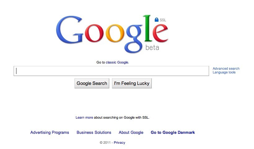
▲ Google reduces meaningful search on the web to something simple by relying on what was highlighted by other websites via back-links as being the most relevant for the user.
Usage
- Use when performing regular tasks of your system are complex and hard to comprehend in their entirety.
- Use to stand out from competition, which have not succeeded in making complex tasks simple.
- Use when users do essentially not care about advanced parts of the task.
- Use when tasks are not easily understood in their most complex form.
This card is part of the Persuasive Patterns printed card deck
The Persuasive Patterns Card Deck is a collection of 60 design patterns driven by psychology, presented in a manner easily referenced and used as a brainstorming tool.
Get your deck!Solution
Reduce otherwise complex functionality into something simple and easily understood. The process of hiding complexity implies removing possible areas of use in order to highlight others. Keep it simple. Make it easy. We prefer to use products and services that give us better return on the information we give them.
Reduction happens when the designer make informed and qualified guesses as to what users’ preferences are. Making design decisions that restrict a product’s usage to simple and few forms gives a product a direction. A direction that limits what a product can be used for.
The principle of reduction is about hiding complexity – making something very complex seem very simple. The process of hiding complexity implies removing possible areas of use in order to highlight others.
Keep it simple, make it easy.
Reduction implied to navigation.
A wide navigation structure with fewer levels performs better than a narrow navigation structure with more levels.
Reduction based on what other users did
A common way of implementing the principle of reduction, is for a system to make decisions on behalf of the user based on what other users in similar situations decided.
Amazon reduces the task of finding an interesting book to buy to something simple by suggesting books that users with similar interests found interesting.
Google reduces meaningful search on the web to something simple by relying on what was highlighted by other websites via backlinks as being the most relevant for the user.
- Hide complexity. Simplify activities into something simple and easily understood. The process of hiding complexity can imply removing possible areas of use in order to highlight others. Keep it simple. Make it easy.
- Increase benefit/cost ratio. When benefits outweigh friction, the more likely it is that a behavior will be performed.
- Apply good defaults. Reducing complex behavior into something more simple can imply providing fewer choices up front for the users. Make informed decisions based on the nature of their visit or what the majority of similar peers would decide. This will allow you to present a valuable result up front that can later be fine-tuned with more details.
Rationale
We prefer to use products and services that give us better return on the information we give them.
As humans, we are cognitively lazy. We like to get the maximum benefit for minimum return. We prefer to use products and services that give us better return on the information we give it.
Reduce otherwise complex activities to a few simple steps (or ideally a single step). By making a behavior easier to perform, the ratio between benefit and cost will increase and motivate people to engage in the behavior more frequently. Additionally, simplifying a behavior or activity may increase users’ self-efficacy (belief in own ability), to perform a specific behavior, which in turn can help develop more positive attitudes toward the behavior, get people to try harder to adopt the behavior, and perform it more frequently.
Having established the Captology Lab at Stanford (renamed to Behavior Design Lab), BJ Fogg was among the first to research persuasive technologies. Although somewhat ignored his book on Persuasion kicked off a new field of research and continues to grow in importance. Reduction was among the core persuasive strategies BJ Fogg discovered.
1 Amanda Shiga, Persuasion and Information Architecture
2 B. J. Fogg, Persuasive technology: using computers to change what we think and do, Morgan Kaufmann, 2003
User Interface Design Patterns
- Forms
- Explaining the process
- Community driven
- Tabs
- Jumping in hierarchy
- Menus
- Content
- Gestures
- Tables
- Formatting data
- Images
- Search
- Reputation
- Social interactions
- Shopping
- Increasing frequency
- Guidance
- Registration
Persuasive Design Patterns
- Loss Aversion
- Other cognitive biases
- Scarcity
- Gameplay design
- Fundamentals of rewards
- Gameplay rewards
