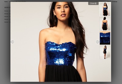
Gallery
Design Pattern
Alternate titles: Slideshow.
Problem summary
The user needs to browse a collection of high quality images
Example
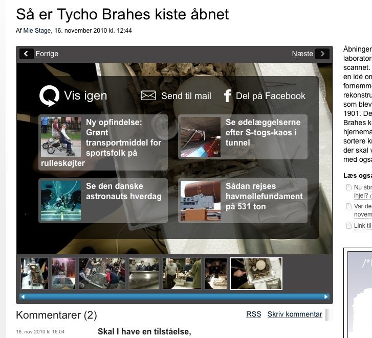
▲ When you browse to the end of this gallery at ing.dk, an overlay appears to let you share the story on facebook - or take you onwards to other stories. Much like the screen with related videos that appears at the end of youtube videos.
Usage
- Use when the user needs to browse through a series of images in a sequential way.
- Use to enforce a sense of beginning and end.
- Use when the user would like as much screen real estate as possible reserved for displaying images in high resolution.
- Do not use when the purpose is to give the user a quick overview of multiple images at one time
Solution
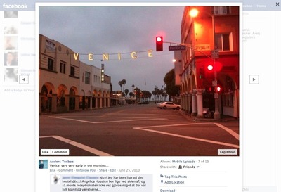
A gallery consists of multiple images that can be browsed one by one by navigating between them. Only one image is viewed at a time. Often, several different options for navigating the gallery is provided in order to accommodate several different browsing behaviors of the different kinds of users browsing the gallery. It is common for a gallery to display the context the current image image being views as in “Image 2 out of 18 images”, the shorter “2 out of 18”, or merely “2/18”.
Navigation options often include
- Previous and next image buttons
- A series of thumbnail images arranged in one of the following ways:
- Previous- and next images with links to these images
- The 2 or 3 of the nearest images (previous 2 or 3 and next 2 or 3 images) with links to these images
- A list of all images in the gallery arranged in a grid – often with 3, 4, or 5 images in each row.
- A text link after the image caption text saying “Next image”, “Next”, or the title of the next image.
- Tabs with image numbers linking to each image in the gallery.
- Clicking the current image itself tend to yield one of two effects: (1) Zoom the image or (2) navigate to the next image
- Keyboard arrow key listeners: left arrow fires a “show previous image” event, right arrow fires a “show next image” event.
Tips for designing a gallery
Provide thumbnails and numbers
Thumbnails allow the user to find out where he or she is in the gallery: the context of the current image. Thumbnails also provide a great way to keep the user in the flow of going to the next image; if the image seems interesting in thumbnail mode it might be worth a click from the user’s perspective.
Listing the gallery images as numbers allows for quick navigation. Highlight the current image to let the user know where he or she is in the gallery: the context of the current image.
Decide on auto (slideshow) or manual (or both)
Galleries (or slideshows) work in one of two ways: either they switch automatically from image to image after a set time interval, or buttons and other navigation elements are provided to let the user browse through images manually. Some galleries provide pause buttons and thus provides a mix between the two.
Reload the entire page or change only the important parts
Newer galleries tend to be based on javascript where only the image, its context, captions, and comments are changed as opposed to having a complete page reload each time the user browses to a new image. This javascript way of browsing allows for much quicker navigation between images and provides a much more smooth and pleasing experience from the users perspective.
Rationale
Galleries have been heavily used by media sites relying on banner impressions for a living to get as many pageviews out of the user as possible. A gallery with 20 images that shows in separate page views yields a much bigger returns in banner impressions than having an article with 20 images beneath each other. However, as the javascript galleries, where only part of the page is reloaded, becomes increasingly more popular, the days of the gallery with separate page loads seems more and more outdated. If you are still aiming for as many banner impressions as possible, consider having the banners change as well for every time the user browses to a new image.
1 Slideshows In Web Design: When And How To Use Them by Matt Cronin at smashingmagazine.com
More examples of the Gallery pattern See all 30 example screenshots
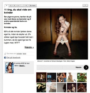


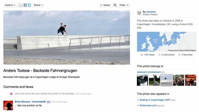

User Interface Design Patterns
- Forms
- Explaining the process
- Community driven
- Tabs
- Jumping in hierarchy
- Menus
- Content
- Gestures
- Tables
- Formatting data
- Images
- Search
- Reputation
- Social interactions
- Shopping
- Increasing frequency
- Guidance
- Registration
Persuasive Design Patterns
- Loss Aversion
- Other cognitive biases
- Scarcity
- Gameplay design
- Fundamentals of rewards
- Gameplay rewards


