Chunking
Design Pattern
Problem summary
Information grouped into familiar, manageable units is more easily processed and remembered
Example

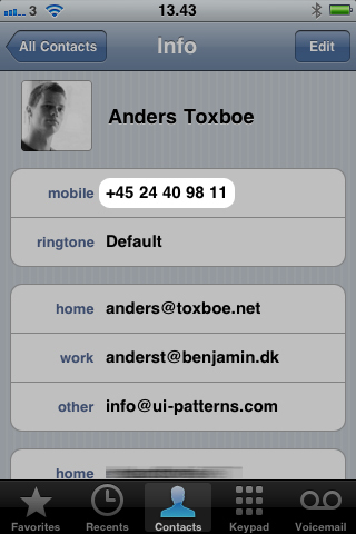
▲ When you enter a phone number into your iPhone, the phone number is automatically chunked into smaller bits of information that makes it easier for the user to read and remember. Breaking down the full phone number into more “logical†chunks makes the number easier to remember.
Usage
- Use when you want to guide users into perceiving information more easily
- Use when you have an excessive amount of information that is not readily understood in its full form
- Use to make it easier for users to recall or process information
- Do not use when the information must be searched, scanned, or analyzed.
- Do not use chunking as an argument for improved simplicity, legibility, or uncluttered page design4.
This card is part of the Persuasive Patterns printed card deck
The Persuasive Patterns Card Deck is a collection of 60 design patterns driven by psychology, presented in a manner easily referenced and used as a brainstorming tool.
Get your deck!Solution
Group information into a limited number of units or chunks, so that information is easier to process and recall.
Make information easier to understand and remember by breaking it down into smaller groups, or chunks. Chunking helps accommodate our limited capacity for processing information and storage in short-term memory.
Chunk larger piles of information into smaller chunks to make it easier for the user to comprehend and get an overview. Deciding on how information is chunked together can help form the user’s perception of what is important and worthwhile to remember.
Chunking text into paragraphs with headers allow scanning for a particular subject. The choice of headers and what should go into which paragraph help form the reader’s perceived meaning of the text.
How far should I chunk – and what?
Every kind of information can be chunked. You should however restrict yourself from grouping in too many chunks. There has been some discussion around what the maximum number of chunks that can be processed by short-term memory. Recent research2 suggests that the magic limit is four plus/minus one whereas older literature3 suggests up to 7 plus/minus two.
So always 4 to 5 menu items?
Do not use chunking to improve simplicity or to unclutter the design of a web page. Chunking is only to be used as an argument to ease the way we process information. Design decisions about the number of menu items, power points bullets, or radio buttons can’t be justified through chunking but likely through other arguments.
When to chunk…
Arguing for using the principle of chunking in design should only regard “the limits on our capacity for processing information”3. In other words, chunking is ideal when specific information must be memorized for later use or when an interface must compete against other stimuli for the attention of the working memory of the end user4.
- Group information into smaller chunks. Ease the cognitive load of complex tasks by grouping information into related features. By grouping items by similarity, you can far surpass the limits of storing single items. If 5 is the limit, then chunking into 5 groups f 5 dramatically expands the user’s capacity.
- Make scanning easier. Presenting content in chunks makes scanning easier for users and in turn improves their ability to comprehend and remember it. Create meaningful and visually distinct groups of content that make sense in the context of the larger whole. Separate headings from paragraph text.
- Auto-format inputs. Although chunking improves scannability, it can make typing more difficult. To circumvent this, consider letting input fields automatically chunk the input users are typing. Typical examples are for credit card expiration dates and phone numbers.
Rationale
A chunk is a unit of information in short-term memory – a string of letters, a word, or a series or numbers. By chunking information into small bits we seek to accommodate the limits of our short-term memory.
The goal of chunking is to aid processing of information. Chunking helps the process by breaking longer strings of information into bit-size chunks that are easier to remember and grasp – especially when the memory is faced with competing stimuli4.
In 1956, George Miller produced evidence that people can remember about seven chunks in short term memory, which was later corrected to three to five items in later research. Using this finding, chunking large sets of data into smaller chunks, makes them more managable to digest, processing one chunk at a time.
1 Universal Principles of Design, William Lidwell et. al., Rockport Publishers, 2003
2 “The Magical Number Four in Short-Term Memory: A Reconsideration of Mental Storage Capacity” by Nelson Cowan, Behavioral and Brain Sciences, 2001.
3 “The Magical Number Seven, Plus or Minus Two: Some Limits on Our Capacity for Processing Information” by George Miller, The Psychological Review, 1956, vol. 63, p. 71-97.
4 Chunking on interaction-design.org
5 “Chunks and Chunking ":https://www.nngroup.com/articles/chunking/#:~:text=UX%2DDefinition%3A%20In%20the%20field,mess%20of%20atomic%20information%20items by Kate Moran
User Interface Design Patterns
- Forms
- Explaining the process
- Community driven
- Tabs
- Jumping in hierarchy
- Menus
- Content
- Gestures
- Tables
- Formatting data
- Images
- Search
- Reputation
- Social interactions
- Shopping
- Increasing frequency
- Guidance
- Registration
Persuasive Design Patterns
- Loss Aversion
- Other cognitive biases
- Scarcity
- Gameplay design
- Fundamentals of rewards
- Gameplay rewards
