Tag Cloud
Design Pattern
Problem summary
The user wants to browse content by popularity in a visually appealing way.
Example
Usage
- Use when users of your website can add content and tags themselves.
- Use when your website has more than 10-20 different tags, each with different weight in post-count.
- Do not use to show the categories of a strict hierarchical structure
Solution
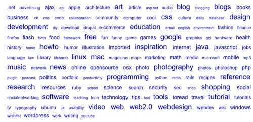
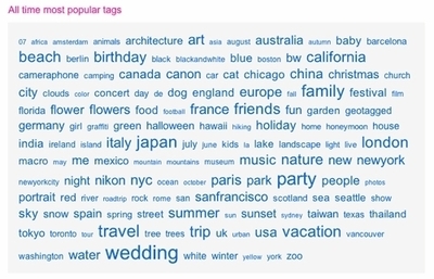
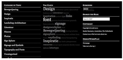
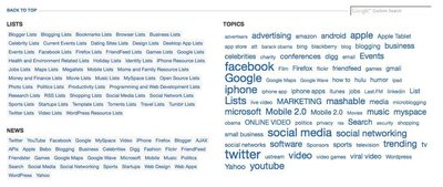
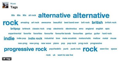
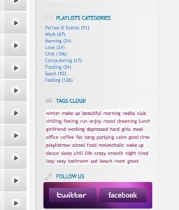
A tag cloud is a list of tags, where the font size of each tag is larger or bigger depending on its weight. Weight in tag clouds can be represented in three different ways:
- Size represents the number of times that a tag has been applied to a single item.
This kind of tag cloud can help define the distribution of how the item is categorized. - Size represents the number of items to which a tag has been applied
As a presentation of each tag’s popularity. - Size represents the quantity of content items in that category
Tags are used as a categorization method for content items1
There are several opinions on how tags should be ordered. Examples of ways to order tags are:
- Alphabetically
- Randomly
- By weight
- In clusters of semantically similar tags (similar tags appear next to eachother)
Rationale
Tag clouds helps visualize semantic fields; how some categories have greater importance than others.
It can also help give an impression of what content is to be found on a site and which categories of content the site is focused on.
Sources
This article has been commented 8 times.
More examples of the Tag Cloud pattern See all 13 example screenshots

From coda.co.za
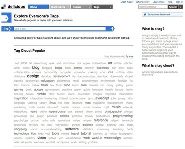
From delicious.com

From piano-faust.de

From psdthemes.com
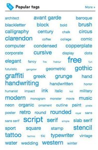
From myfonts.com
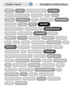
From gadgeterija.net
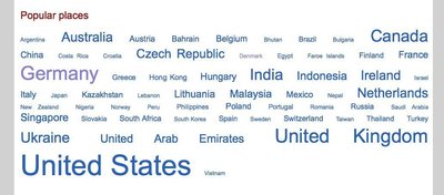
From upcoming.yahoo.com
User Interface Design Patterns
- Forms
- Explaining the process
- Community driven
- Tabs
- Jumping in hierarchy
- Menus
- Content
- Gestures
- Tables
- Formatting data
- Images
- Search
- Reputation
- Social interactions
- Shopping
- Increasing frequency
- Guidance
- Registration
Persuasive Design Patterns
- Loss Aversion
- Other cognitive biases
- Scarcity
- Gameplay design
- Fundamentals of rewards
- Gameplay rewards
8 comments
Curt Sampson on Mar 03, 2008
I’d be interested in seeing some commentary about how people use this, how often they use it, what it does that other things don’t, and, particularly, how it justfies the relatively large amount of screen real estate it uses.
Personally, looking back, I just realized that I click on something in a tag cloud perhaps once per year, and usually ignore them completely.
cjs@cynic.net
Sterling on Mar 24, 2008
Tag clouds don’t work and don’t really make sense. Why? Because there is absolutely no reason to say that a visitor is more interested in, or more likely to want to click on, or needs help finding, things that others have found interesting.
No one searches for things on Google because other people search for them.
A tag cloud would make more sense if the visual clues said something interesting (there are new items here, this is super cool, this is classic stuff, etc).
Janko on Mar 24, 2008
I am aware that many developers and designers want to implement tag clouds just because it is popular, but tag clouds aren’t very useful. Especially when you have a large number of tags. It looks messy, and doesn’t provide any information that can affect user’s choice.
Just imagine the Flickr example placed in sidebar width of 200px.
I prefer lists, such as Categories (with number of posts), most popular posts, most rated posts, etc.
Rick Winscot on Apr 11, 2008
I’ve always been a firm believer that the size of a control should be directly proportional to its intrinsic value. In order to make a tag cloud truly useful for its size – tags would have to be limited to a particular context… and cross correlated with an extensive user profile. In the end, the specificity needed to ascribe meaning and purpose to the navigation potential of a ‘cloud’ would negate its nature and scope (i.e. Stumble Upon). The best bang for the UI buck would be implementing something similar to the iTunes feature – ‘People who bought this album also bought…’ with a list of a half dozen items listed by popularity.
Marielle Winarto on Jul 24, 2008
There’s more to tagclouds than browsing by popularity. A tagcloud gives a birds-eye view of keywords for a website. Looking at a tagcloud gives an impression on the type of content: a good tagcloud describes.
Steffen on Aug 13, 2008
Tag Clouds machen Sinn, weil sie den Kunden relevante Schlagwörter bei Besuch der Seite geben.
Skelly on Sep 15, 2009
Most of the text clouds that I’ve see use color (not proximity) to show tag clusters (semantically similar tags). I find this grouping of tags to show how that relate to each other is just as useful as using the size to show popularity.
David Hyman on Jun 22, 2012
I have used a tagging system to store all the files on my laptop for years and I have found it to be extremely useful for finding files without having to remember where something is stored.
Tags are great because they allow content to be grouped together without having to be physically stored in the same place. For example, I can have a presentation that is tagged with “presentation” “sales” and “work”. When I click the “work” tag everything I have tagged with work shows up.
What I feel most tag clouds fail at is the fact that they don’t allow users to search using multiple tags. So in my previous example, show me everything that is tagged with “work” and “presentation”. Having the ability to preform multi-tag searches is the key to tag clouds being more flexible and scalable than other forms of file browsers (like Miler Columns and File Trees)
Comments have been closed