Input Prompt
Design Pattern
Problem summary
The user needs to enter data into the system
Example
Usage
- Use when the label of an input field does not fully explain what should be filled into it or when using such a label feels like over-explaining the interface.
- Use when an example text or question answers what should be filled into an input field just as well as a label.
- Use when you want to save the space that a label otherwise takes up.
- Use in combination with a label, to further explain what kind of input is needed.
Solution
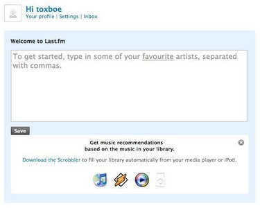
An input field is pre-filled with example text or a question that prompts the user with what to do or type.
The Input Prompt pattern is most successfully used with dropdown lists and text fields. As dropdown lists have a fixed set of choices, words like Select or Choose are used for prompts. For text fields, the prompting string often begins with a call to action: Enter, Type, Search. End the string with the noun the input is describing, for instance Enter city or Enter an address.
Text fields use the Input Prompt pattern combined with scripting to remove the prompt text from a field, when the user’s focus is set. Once the user enters the input field to type in content, the prompting text is removed and replaced with nothing so that the input field is free for the user to fill out.
Rationale
When a user fills out a form it is most often with the purpose of filling it out as quickly as possible to get on with the service offered. This is why the user often just scans through form fields and labels without giving the labels much of a glance. By using input prompts, immediate attention is drawn to what the user needs to fill in. The user can’t miss it. Although you must beware of removing labels entirely, as the input prompt is removed once focus has been set to the text field.
Input prompt is often used for small forms that are key to the core functionality of a site as inserting the label inside the text field itself helps save space. For more elaborate forms, there is often more than enough room available to explain each input field.
More examples of the Input Prompt pattern See all 3 example screenshots


User Interface Design Patterns
- Forms
- Explaining the process
- Community driven
- Tabs
- Jumping in hierarchy
- Menus
- Content
- Gestures
- Tables
- Formatting data
- Images
- Search
- Reputation
- Social interactions
- Shopping
- Increasing frequency
- Guidance
- Registration
Persuasive Design Patterns
- Loss Aversion
- Other cognitive biases
- Scarcity
- Gameplay design
- Fundamentals of rewards
- Gameplay rewards

3 comments
Bernard on Mar 09, 2009
One note of usage instead of labels. From UX point of view – while this might look like a cool way to provide labels, this works only for small forms and should really be used only when necessary. Because labels inside fields disappear when you enter data, there is a danger of loosing context – there is no label to refer to if you’re unsure what the question was.
It works great for small forms, like a search box though.
Bob on Apr 17, 2009
“The user needs …” The user may or may not need to do this (or anything else) — I think what you should say is the application needs user input.
Aleksander Brancewicz on Aug 20, 2010
Hi,
I would like to also highlight that there may be usability problems involved into this pattern.
Whenever you type you must make sure that label inside is cleared. Otherwise your searched text would something like combination of what you look for and the label like “searchAmsterdam”
Comments have been closed